• 751 days Will The ECB Continue To Hike Rates?
  • 751 days Forbes: Aramco Remains Largest Company In The Middle East
  • 753 days Caltech Scientists Succesfully Beam Back Solar Power From Space
  • 1,153 days Could Crypto Overtake Traditional Investment?
  • 1,158 days Americans Still Quitting Jobs At Record Pace
  • 1,160 days FinTech Startups Tapping VC Money for ‘Immigrant Banking’
  • 1,163 days Is The Dollar Too Strong?
  • 1,163 days Big Tech Disappoints Investors on Earnings Calls
  • 1,164 days Fear And Celebration On Twitter as Musk Takes The Reins
  • 1,166 days China Is Quietly Trying To Distance Itself From Russia
  • 1,166 days Tech and Internet Giants’ Earnings In Focus After Netflix’s Stinker
  • 1,170 days Crypto Investors Won Big In 2021
  • 1,170 days The ‘Metaverse’ Economy Could be Worth $13 Trillion By 2030
  • 1,171 days Food Prices Are Skyrocketing As Putin’s War Persists
  • 1,173 days Pentagon Resignations Illustrate Our ‘Commercial’ Defense Dilemma
  • 1,174 days US Banks Shrug off Nearly $15 Billion In Russian Write-Offs
  • 1,177 days Cannabis Stocks in Holding Pattern Despite Positive Momentum
  • 1,178 days Is Musk A Bastion Of Free Speech Or Will His Absolutist Stance Backfire?
  • 1,178 days Two ETFs That Could Hedge Against Extreme Market Volatility
  • 1,180 days Are NFTs About To Take Over Gaming?
How The Ultra-Wealthy Are Using Art To Dodge Taxes

How The Ultra-Wealthy Are Using Art To Dodge Taxes

More freeports open around the…

Zombie Foreclosures On The Rise In The U.S.

Zombie Foreclosures On The Rise In The U.S.

During the quarter there were…

The Problem With Modern Monetary Theory

The Problem With Modern Monetary Theory

Modern monetary theory has been…

  1. Home
  2. Markets
  3. Other

A Pretty Neat Intra-day Indicator

How to use the TICK for an entry point or day trading ...

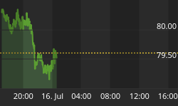
If you have ever looked at the TICK, it pretty much looks like "noise". With extremely lengthy bars on minute to daily data, it seems like useless data to many. Chart 1 below is an example of TICK data.

While doing research a few years ago, we tested moving averages on the daily ticks as well as many time intervals in minutes.

It was always useless data UNTIL ... we viewed the TICK in "1 minute" intervals and then set a smooth moving average of 80 that magical data appeared.

Take a look at the second chart below. It is a 1 minute chart over a 3 day interval. Actually, it is the SAME chart as above, except we show a "smoothed moving average of 80" instead of the ticks. And then, we drew two horizontal lines at the zero level.

Above the horizontal &line is positive, below is negative, and on the line is neutral.

In the chart, we overlaid the action of the SPY so that you can compare the 80 SMA TICK movements to the index.

Note the blue arrows ... when the 80 MVA green TICK line rises above the horizontal lines, it is a trend change signal for the SPY to reverse its trend.

When the 80 MVA green TICK line moves below the horizontal lines, it is a trend change signal to the downside.

As an intra-day trend change indicator, it isn't perfect, so we use additional indicators with it. But, even as shown below, it has a pretty neat correlation relative to the SPY and other indexes.


Back to homepage

Leave a comment

Leave a comment