


The good news is:
• The NASDAQ composite closed at a multi month high on Friday just 0.9% off its April high.
The negatives
The OTC finished 8 consecutive up days on Friday while NASDAQ new highs peaked on Monday.
The chart below covers the past 9 months showing the OTC in blue and a 10% trend (19 day EMA) of NASDAQ new highs (OTC NH) in green. Dashed vertical lines have been drawn on the 1st trading day of each month.
The trajectory of new highs is not what you would expect in a surging market.

The chart below is similar to the one above except is shows the S&P 500 (SPX) in red and NY NH has been calculated from NYSE new highs.
NY NH deteriorated more sharply than OTC NH.

Advance decline lines (ADL) are a running total of declining issues subtracted from advancing issues.
The chart below covers the past 2 years showing the OTC in blue and an ADL calculated from NASDAQ issues traded (OTC ADL) in green.
The OTC is 0.9% off its April high while the OTC ADL has not done as well as you would expect.

The McClellan Oscillator (MCO) is calculated by subtracting a 39 day EMA from a 19 day EMA. The Summation Index (SI) is a running total of the value of the MCO.
The chart below covers the past 9 months showing the OTC in blue and a short term momentum indicator applied to an SI calculated from NASDAQ advance - decline data.
This indicator gave a false negative in March, but otherwise has been pretty good at indicating short term tops as it is now.

You like to see volume increase as the market rises, it shows enthusiasm.
Since the late August lows the major indices are up13% - 19% with no increase in volume.
The chart below covers the past 9 months showing the OTC in blue and a 5% trend (39 day EMA) of NASDAQ volume (OTC Tot Vol T 5%) in orange.

The next chart covers the past 2 years showing the SPX in red and a 5% trend of NYSE volume (NY Tot Vol T 5%) in black.
NY Tot Vol T 5% is near an 8 year low.

A spectacular 2 month rally, just before an election, with no breadth or volume support lays a great foundation for conspiracy theories.
The positives
The chart below is an update of one I have been showing every week, it covers the past 9 months showing the OTC in blue and a 40% trend (4 day EMA) of the ratio of NASDAQ new highs to new highs + new lows (OTC HL Ratio) in red. Dashed horizontal lines have been drawn at 10% levels of the indicator; the line is solid at the neutral 50% level.
There are some trading systems that impose a "No Sell Filter" when a variation of this indicator is above 80%. The indicator danced along the 80% line all week. On Friday it was at 78%, still very strong.

The next chart is similar to the one above except is shows the SPX in red and NY HL Ratio has been calculated from NYSE data.
NY HL Ratio is still holding above 90%, very strong.

Seasonality
Next week includes the first 5 trading days of November during the 2nd year of the Presidential Cycle.
The tables below show the return on a percentage basis for the first 5 trading days of November during the 2nd year of the Presidential Cycle. OTC data covers the period from 1963 - 2009 and SPX data from 1928 - 2009. There are summaries for both the 2nd year of the Presidential Cycle and all years combined.
Average returns by all measures have been very positive. During the 2nd year of the Presidential Cycle, the coming week might easily be the strongest 5 days of the year. The OTC has only been down once (1994) during the 2nd year of the Presidential Cycle for a 91% win rate. The SPX has been down once since 1950 (1994) and 4 times since 1928 for an 80% win rate.
Report for the first 5 days of November.
The number following the year represents its position in the presidential cycle.
The number following the daily return represents the day of the week;
1 = Monday, 2 = Tuesday etc.
| OTC Presidential Year 2 | ||||||
| Day1 | Day2 | Day3 | Day4 | Day5 | Totals | |
| 1966-2 | -0.30% 2 | 0.57% 3 | 0.40% 4 | 0.02% 5 | 0.77% 1 | 1.45% |
| 1970-2 | 0.15% 1 | -0.17% 2 | 0.71% 3 | 0.45% 4 | 0.74% 5 | 1.87% |
| 1974-2 | -0.26% 5 | -0.68% 1 | 2.12% 2 | 0.18% 3 | 0.80% 4 | 2.17% |
| 1978-2 | 3.18% 3 | -0.02% 4 | 0.75% 5 | -0.36% 1 | -1.96% 2 | 1.60% |
| 1982-2 | 0.89% 1 | 1.46% 2 | 2.35% 3 | 1.01% 4 | 0.90% 5 | 6.60% |
| 1986-2 | 0.10% 1 | 0.21% 2 | 0.05% 3 | -0.23% 4 | -0.07% 5 | 0.06% |
| Avg | 0.81% | 0.16% | 1.20% | 0.21% | 0.08% | 2.46% |
| 1990-2 | 0.23% 4 | 1.77% 5 | 1.28% 1 | -0.07% 2 | -1.10% 3 | 2.12% |
| 1994-2 | -0.68% 2 | -0.05% 3 | 0.04% 4 | -0.78% 5 | -0.49% 1 | -1.97% |
| 1998-2 | 1.67% 1 | -0.68% 2 | 1.96% 3 | 0.74% 4 | 1.06% 5 | 4.74% |
| 2002-2 | 2.33% 5 | 2.63% 1 | 0.33% 2 | 1.27% 3 | -2.98% 4 | 3.59% |
| 2006-2 | -1.37% 3 | -0.01% 4 | -0.14% 5 | 1.51% 1 | 0.42% 2 | 0.41% |
| Avg | 0.43% | 0.73% | 0.69% | 0.53% | -0.62% | 1.78% |
| OTC summary for Presidential Year 2 1966 - 2006 | ||||||
| Averages | 0.54% | 0.46% | 0.90% | 0.34% | -0.17% | 2.06% |
| % Winners | 64% | 45% | 91% | 64% | 55% | 91% |
| MDD 11/7/2002 2.98% -- 11/7/1978 2.30% -- 11/7/1994 1.95% | ||||||
| OTC summary for all years 1963 - 2009 | ||||||
| Averages | 0.30% | 0.24% | 0.23% | 0.16% | -0.02% | 0.89% |
| % Winners | 66% | 53% | 66% | 60% | 53% | 72% |
| MDD 11/6/2008 9.63% -- 11/7/2007 3.86% -- 11/4/1993 3.61% | ||||||
| SPX Presidential Year 2 | ||||||
| Day1 | Day2 | Day3 | Day4 | Day5 | Totals | |
| 1930-2 | 0.89% 6 | 0.23% 1 | -2.98% 3 | 0.18% 4 | -3.36% 5 | -5.04% |
| 1934-2 | -0.45% 4 | 1.14% 5 | 0.90% 6 | 0.78% 1 | 1.88% 3 | 4.25% |
| 1938-2 | -0.53% 2 | 0.38% 3 | 0.30% 4 | -0.15% 5 | 0.30% 6 | 0.31% |
| 1942-2 | 0.64% 1 | -0.42% 3 | 0.21% 4 | 1.27% 5 | 0.73% 6 | 2.43% |
| 1946-2 | 1.55% 5 | 0.73% 6 | 0.99% 1 | -4.31% 3 | 0.82% 4 | -0.22% |
| Avg | 0.42% | 0.41% | -0.11% | -0.45% | 0.07% | 0.35% |
| 1950-2 | 0.15% 3 | 0.87% 4 | 0.61% 5 | -0.35% 6 | -2.12% 1 | -0.85% |
| 1954-2 | 0.35% 1 | 2.04% 3 | 1.17% 4 | -0.34% 5 | 0.95% 1 | 4.18% |
| 1958-2 | 0.45% 1 | 0.91% 3 | 0.81% 4 | -0.36% 5 | 0.59% 1 | 2.40% |
| 1962-2 | 1.06% 4 | 1.10% 5 | 1.04% 1 | 0.62% 3 | -0.66% 4 | 3.16% |
| 1966-2 | 0.76% 2 | 0.09% 3 | -0.40% 4 | 0.31% 5 | -0.10% 1 | 0.66% |
| Avg | 0.55% | 1.00% | 0.65% | -0.02% | -0.27% | 1.91% |
| 1970-2 | 0.31% 1 | 0.85% 2 | 0.20% 3 | -0.34% 4 | 0.14% 5 | 1.16% |
| 1974-2 | -0.03% 5 | -1.08% 1 | 2.78% 2 | -0.48% 3 | 0.62% 4 | 1.80% |
| 1978-2 | 3.97% 3 | -1.28% 4 | 0.60% 5 | -1.03% 1 | -1.41% 2 | 0.85% |
| 1982-2 | 1.32% 1 | 1.49% 2 | 3.91% 3 | -0.71% 4 | 0.22% 5 | 6.23% |
| 1986-2 | 0.75% 1 | 0.16% 2 | 0.15% 3 | -0.29% 4 | -0.04% 5 | 0.73% |
| Avg | 1.26% | 0.03% | 1.53% | -0.57% | -0.09% | 2.16% |
| 1990-2 | 0.99% 4 | 1.57% 5 | 0.88% 1 | -0.94% 2 | -1.80% 3 | 0.70% |
| 1994-2 | -0.83% 2 | -0.41% 3 | 0.30% 4 | -1.20% 5 | 0.17% 1 | -1.97% |
| 1998-2 | 1.17% 1 | -0.07% 2 | 0.71% 3 | 1.34% 4 | 0.64% 5 | 3.80% |
| 2002-2 | 1.71% 5 | 0.82% 1 | 0.78% 2 | 0.91% 3 | -2.29% 4 | 1.94% |
| 2006-2 | -0.74% 3 | -0.03% 4 | -0.22% 5 | 1.13% 1 | 0.22% 2 | 0.36% |
| Avg | 0.46% | 0.38% | 0.49% | 0.25% | -0.61% | 0.97% |
| SPX summary for Presidential Year 2 1930 - 2006 | ||||||
| Averages | 0.67% | 0.45% | 0.64% | -0.20% | -0.22% | 1.34% |
| % Winners | 75% | 70% | 85% | 40% | 60% | 80% |
| MDD 11/7/1930 6.07% -- 11/6/1946 4.31% -- 11/7/1978 3.10% | ||||||
| SPX summary for all years 1928 - 2009 | ||||||
| Averages | 0.25% | -0.03% | 0.26% | 0.02% | -0.09% | 0.40% |
| % Winners | 63% | 57% | 66% | 53% | 50% | 66% |
| MDD 11/11/1929 17.76% -- 11/6/2008 10.03% -- 11/6/1937 9.95% | ||||||
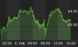
Money supply (M2)
The chart below was provided by Gordon Harms. Money supply growth has been accelerating.

November
Since 1963, over all years the OTC in November has been up 66% of the time with an average gain of 1.3%. During the 2nd year of the Presidential Cycle November has been up 73% time with an average gain of 3.5% making it the best month of the year. The worst November, 2000 (-22.1%) the best 1999 (+12.4%)
The average month has 21 trading days. The chart below has been calculated by averaging the daily percentage change of the OTC for each of the 1st 11 trading days and each of the last 10. In months when there were more than 21 trading days some of the days in the middle were not counted. In months when there were less than 21 trading days some of the days in the middle of the month were counted twice. Dashed vertical lines have been drawn after the 1st trading day and at 5 trading day intervals after that. The line is solid on the 11th trading day, the dividing point.
The blue line shows the average of the OTC in November over all years since 1963 while the green line shows the average during the 2nd year of the Presidential Cycle.

Since 1928 the SPX has been up 54% of the time in November with an average gain of 0.4%. During the 2nd year of the Presidential Cycle the SPX has also been up 55% of the time with an average gain of 1.5% making it the 3rd strongest month during the 2nd year of the Presidential Cycle. The best ever November for the SPX was 1928 (+10.4%) the worst 1948 (-11.7%).
The chart below is similar to the one above except it shows the daily performance over all years for the SPX in November in red and the performance during the 2nd year of the Presidential Cycle in cyan.

Since 1979 the Russell 2000 (R2K) has been up 65% of the time in November with an average gain of 1.5%. During the 2nd year of the Presidential Cycle the R2K has been up 71% of the time with an average gain of 3.5%. The best ever November for the R2K 2004 (+8.0%), the worst 2008 (-12.1%)
The chart below is similar to those above except it shows the daily performance over all years of the R2K in November in green and the performance during the 2nd year of the Presidential Cycle in cyan.

Since 1885 the Dow Jones Industrial Average (DJIA) has been up 57% of the time in November with an average gain of 0.6%. During the 2nd year of the Presidential Cycle the DJIA has only been up 53% of the time with an average gain of 0.9%. The best November ever for the DJIA 1928 up 14.9%, the worst 1973 (-13.3%)
The chart below is similar to those above except it shows the daily performance over all years of the DJIA in November in Magenta and the performance during the 2nd year of the Presidential Cycle in cyan.

Conclusion
My analysis of the market is heavily influenced by breadth and seasonality. For the last several years the record of seasonality has been spotty. Seasonality suggests the market should be very strong next week while my read of the breadth indicators suggest it is about to fall off a cliff.
I expect the major averages to be lower on Friday November 5 than they were on Friday October 29.
The major indices were mixed last week some up a little and others down so I am calling last weeks negative forecast a tie.
This report is free to anyone who wants it, so please tell your friends.
They can sign up at: http://alphaim.net/signup.html. If it is not for you, reply with REMOVE in the subject line.
In his latest musings, Jerry Minton looks at some of the most popular mutual funds and the efficiency of their decision making priorities. To read about it and to subscribe to his free newsletter go to www.alphaim.net.
Thank you,


