


The good news is:
• The Blue chip indices closed at a multi year highs on Thursday.
The negatives
You expect to see new highs expand in a rising market and that is not happening.
The chart below covers the past year showing the NASDAQ composite (OTC) in blue and a 10% trend (19 day EMA) of NASDAQ new highs (OTC NH) in green. Dashed vertical lines have been drawn on the 1st trading day of each month.
OTC NH has been deteriorating, making progressively lower highs with each higher high in the OTC index.

The next chart is similar to the one above except it shows the S&P 500 (SPX) in red and NY NH has been calculated from NYSE data. The pattern is similar.

Expanding leadership is a mark of a "Real" bull market and that has been missing.
The positives
New lows expand in a bear market and often increase as the indices are making new highs. New lows have remained at benign levels.
The chart below covers the past year showing the OTC in blue and 40% trend (4 day EMA) of the ratio of NASDAQ new highs to new highs + new lows (OTC HL Ratio) in red. Dashed horizontal lines drawn at 10% levels for the indicator. The line is solid at the neutral 50% level.
OTC HL Ratio recovered to the mid 80% level last week, very strong.

The chart below is similar to the one above except is shows the SPX in red and NY HL Ratio has been calculated from NYSE data.
NY HL Ratio recovered to the lower 90% level last week.

Seasonality
Next week includes the last trading day of January and the first 4 trading days of February during the 3rd year of the Presidential Cycle.
The tables below show the return on a percentage basis for the last day of January and the 1st 4 days of February during the 3rd year of the Presidential Cycle. OTC data covers the period from 1963 - 2010 and SPX data from 1928 - 2010. There are summaries for both the 3rd year of the Presidential Cycle and all years combined.
Average returns for the coming week have been modestly positive by every measure and stronger during the 3rd year of the Presidential Cycle than other years.
Report for the last day of January and first 4 days of February.
The number following the year represents its position in the presidential cycle.
The number following the daily return represents the day of the week;
1 = Monday, 2 = Tuesday etc.
| OTC Presidential Year 3 | ||||||
| Day1 | Day1 | Day2 | Day3 | Day4 | Totals | |
| 1963-3 | -0.48% 4 | 0.45% 5 | -0.42% 1 | -0.03% 2 | -0.03% 3 | -0.51% |
| 1967-3 | 0.37% 2 | 0.26% 3 | 0.19% 4 | 0.31% 5 | 0.21% 1 | 1.35% |
| 1971-3 | 0.91% 5 | -0.06% 1 | 0.93% 2 | 0.20% 3 | 0.63% 4 | 2.61% |
| 1975-3 | 1.15% 5 | 1.36% 1 | -0.85% 2 | 1.34% 3 | 0.55% 4 | 3.55% |
| 1979-3 | -0.55% 3 | -0.05% 4 | 0.05% 5 | -1.18% 1 | -0.02% 2 | -1.75% |
| 1983-3 | 0.58% 1 | -0.08% 2 | 0.05% 3 | 0.47% 4 | 0.89% 5 | 1.90% |
| 1987-3 | 1.04% 5 | 0.54% 1 | 0.55% 2 | 0.94% 3 | 0.64% 4 | 3.71% |
| Avg | 0.63% | 0.34% | 0.15% | 0.35% | 0.54% 2 | .01% |
| 1991-3 | 1.39% 4 | 0.84% 5 | 1.70% 1 | 1.74% 2 | 1.63% 3 | 7.30% |
| 1995-3 | 0.45% 2 | 0.41% 3 | 0.70% 4 | 1.10% 5 | 0.88% 1 | 3.55% |
| 1999-3 | 1.15% 5 | 0.17% 1 | -1.86% 2 | 1.06% 3 | -3.19% 4 | -2.66% |
| 2003-3 | -0.11% 5 | 0.22% 1 | -1.33% 2 | -0.36% 3 | 0.02% 4 | -1.56% |
| 2007-3 | 0.62% 3 | 0.18% 4 | 0.30% 5 | -0.21% 1 | 0.04% 2 | 0.93% |
| Avg | 0.70% | 0.36% | -0.10% | 0.67% | -0.13% 1 | .51% |
| OTC summary for Presidential Year 3 1963 - 2007 | ||||||
| Averages | 0.54% | 0.35% | 0.00% | 0.45% | 0.19% | 1.53% |
| % Winners | 75% | 75% | 67% | 67% | 75% | 67% |
| MDD 2/4/1999 3.98% -- 2/6/1979 1.74% -- 2/5/2003 1.68% | ||||||
| OTC summary for all years 1963 - 2010 | ||||||
| Averages | 0.24% | 0.24% | -0.05% | 0.09% | 0.00% | 0.51% |
| % Winners | 63% | 69% | 69% | 57% | 58% | 60% |
| MDD 2/5/2001 6.88% -- 2/6/2002 6.27% -- 2/6/2008 5.58% | ||||||
| SPX Presidential Year 3 | ||||||
| Day1 | Day1 | Day2 | Day3 | Day4 | Totals | |
| 1931-3 | -0.62% 6 | 0.44% 1 | 0.50% 2 | 0.55% 3 | -0.67% 4 | 0.19% |
| 1935-3 | 0.78% 4 | -0.55% 5 | 0.44% 6 | -1.10% 1 | -1.11% 2 | -1.54% |
| 1939-3 | 1.15% 2 | -1.46% 3 | 2.15% 4 | -0.65% 5 | 0.81% 6 | 2.00% |
| 1943-3 | 0.29% 6 | 0.48% 1 | 0.00% 2 | -0.76% 3 | -0.10% 4 | -0.09% |
| 1947-3 | 0.38% 5 | 0.51% 6 | 0.38% 1 | 0.19% 2 | 0.57% 3 | 2.04% |
| Avg | 0.40% | -0.12% | 0.69% | -0.35% | -0.10% | 0.52% |
| 1951-3 | -0.37% 3 | 0.51% 4 | 0.87% 5 | 0.55% 6 | 0.54% 1 | 2.10% |
| 1955-3 | 1.22% 1 | 0.25% 2 | -0.30% 3 | -0.46% 4 | 1.43% 5 | 2.12% |
| 1959-3 | 0.40% 5 | -0.38% 1 | 0.13% 2 | -0.40% 3 | -0.45% 4 | -0.71% |
| 1963-3 | 0.53% 4 | 0.17% 5 | -0.21% 1 | -0.09% 2 | 0.44% 3 | 0.83% |
| 1967-3 | -0.06% 2 | -0.21% 3 | 0.35% 4 | 0.73% 5 | -0.21% 1 | 0.60% |
| Avg | 0.34% | 0.07% | 0.17% | 0.06% | 0.35% | 0.99% |
| 1971-3 | 0.70% 5 | 0.56% 1 | 0.01% 2 | 0.21% 3 | -0.01% 4 | 1.47% |
| 1975-3 | 1.01% 5 | 1.09% 1 | -0.27% 2 | 1.73% 3 | -0.49% 4 | 3.06% |
| 1979-3 | -1.11% 3 | 0.03% 4 | -0.46% 5 | -1.42% 1 | -0.04% 2 | -3.00% |
| 1983-3 | 0.55% 1 | -1.61% 2 | 0.19% 3 | 0.72% 4 | 1.30% 5 | 1.15% |
| 1987-3 | -0.06% 5 | 0.86% 1 | -0.17% 2 | 1.32% 3 | 0.54% 4 | 2.51% |
| Avg | 0.22% | 0.19% | -0.14% | 0.51% | 0.26% 1 | .04% |
| 1991-3 | 0.89% 4 | -0.26% 5 | 1.54% 1 | 0.84% 2 | 1.94% 3 | 4.95% |
| 1995-3 | 0.41% 2 | 0.00% 3 | 0.51% 4 | 1.24% 5 | 0.52% 1 | 2.67% |
| 1999-3 | 1.12% 5 | -0.52% 1 | -0.86% 2 | 0.80% 3 | -1.86% 4 | -1.31% |
| 2003-3 | 1.31% 5 | 0.54% 1 | -1.41% 2 | -0.54% 3 | -0.64% 4 | -0.74% |
| 2007-3 | 0.66% 3 | 0.54% 4 | 0.17% 5 | -0.10% 1 | 0.07% 2 | 1.34% |
| Avg | 0.88% | 0.06% | -0.01% | 0.45% | 0.01% 1 | .38% |
| SPX summary for Presidential Year 3 1931 - 2007 | ||||||
| Averages | 0.46% | 0.05% | 0.18% | 0.17% | 0.13% | 0.98% |
| % Winners | 75% | 60% | 60% | 55% | 50% | 70% |
| MDD 2/6/1979 2.97% -- 2/6/2003 2.58% -- 2/4/1999 2.43% | ||||||
| SPX summary for all years 1928 - 2010 | ||||||
| Averages | 0.26% | 0.17% | 0.08% | -0.16% | 0.00% | 0.35% |
| % Winners | 64% | 63% | 60% | 46% | 50% | 60% |
| MDD 2/4/1933 7.59% -- 2/3/1938 5.05% -- 2/6/2008 4.94% | ||||||
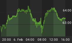
Money supply (M2)
The money supply chart was provided by Gordon Harms. M2 increased sharply last week.

February
Since 1963, over all years the OTC in February has been up 52% of the time with an average of no gain or loss. During the 3rd year of the Presidential Cycle February has been up 67% time with an average gain of 1.9%. The worst February ever, 2001 (-22.7%), the best 2000 (+15.9%)
The average month has 21 trading days. The chart below has been calculated by averaging the daily percentage change of the OTC for each of the 1st 11 trading days and each of the last 10. In months when there were more than 21 trading days some of the days in the middle were not counted. In months when there were less than 21 trading days some of the days in the middle of the month were counted twice. Dashed vertical lines have been drawn after the 1st trading day and at 5 trading day intervals after that. The line is solid on the 11th trading day, the dividing point.
The blue line shows the average of the OTC in February over all years since 1963 while the green line shows the average during the 3rd year of the Presidential Cycle.

Since 1928 the SPX has been up 52% of the time in February with an average loss of 0.4%. During the 3rd year of the Presidential Cycle the SPX has been up 65% of the time with an average gain of 1.2%. The best ever February for the SPX was 1931 (+11.0%) the worst 1933 (-15.1%).
The chart below is similar to the one above except it shows the daily performance over all years for the SPX in February in red and the performance during the 3rd year of the Presidential Cycle in green.

Since 1979 the Russell 2000 (R2K) has been up 53% of the time in February with an average gain of 0.5%. During the 3rd year of the Presidential Cycle the R2K has been up 50% of the time with an average gain of 1.4%. The best ever February for the R2K, 2000 (+14.7%), the worst 2009 (-13.5%)
The chart below is similar to those above except it shows the daily performance over all years of the R2K in February in black and the performance during the 3rd year of the Presidential Cycle in green.

Since 1885 the Dow Jones Industrial Average (DJIA) has been up 50% of the time in February with an average loss of 0.3%. During the 3rd year of the Presidential Cycle the DJIA has been up 65% of the time with an average gain of 1.5%. The best February ever for the DJIA 1931 up 12.4%, the worst 1933 (-13.0%)
The chart below is similar to those above except it shows the daily performance over all years of the DJIA in February in Magenta and the performance during the 3rd year of the Presidential Cycle in green.

Conclusion
The technical indicators are indecisive and seasonality is modestly positive.
I expect the major averages to be higher on Friday February 4 than they were on Friday January 28.
Last week the blue chips were down a little and the secondaries were up a little so I am calling last weeks positive forecast a tie.
This report is free to anyone who wants it, so please tell your friends. They can sign up at: http://alphaim.net/signup.html. If it is not for you, reply with REMOVE in the subject line.
In his latest newsletter, Jerry Minton takes a look at the promotional hype about investing in the emerging markets. To read "Emerging Bubble" and to sign-up for his free newsletter, visit the home page at www.alphaim.net.
Thank you,


