


A very interesting phenomenon has begun to develop recently surrounding the $VIX, and investors perceptions about what it should be doing. Ever since the market peak of May 2nd, investors have become more and more aware (and in some cases, perplexed) about the fact that the $VIX has not been surging as equities tumble. The conclusion being drawn is that since the $VIX is not spiking higher, the May 2nd top must not be 'the' top. At first glance, that seems to make a lot of sense since the $VIX is a measure of investor fear as reflected in the premiums they are willing to pay for 'protection' in the form of puts. We're going to revisit the conditions that were in place the last time we investigated the $SPX:$VIX ratio and compare them to what that ratio is revealing today.
On April 27th, we took an initial look at the S&P 500 as priced in $VIX units (the ratio of $SPX:$VIX). What it exposed at that time was that the market was likely due for a pullback. Indeed, only days later the May 2nd high was registered and the market has dropped ever since. But whether the May 2nd top was 'the' top or not, it has become apparent that the expectations of what the $VIX itself should be doing when the market sells off are correct, but investor expectations about 'when' the $VIX will explode higher are not.
In the chart below, we look back to April 27th when the first article was presented, and see what the ratio of the S&P 500 as priced in $VIX units looked like at that time. Here's the accompanying chart, complete with the annotations as they appeared in late April when the ratio suggested a top might be imminent:

The main point of interest at that time was the fact that the ratio had not only reached a fairly lofty level which had previously acted as resistance, but that it was apparently being rejected at that level. Admittedly, the ratio was nowhere near the extremes that had been attained back in early 2007. But neither did it 'have to' be. Nonetheless, the ratio was being rejected at a point of previous resistance... and that was the factor which we were keying upon at that time.
In the chart below, we see what this ratio looks like today... after 6 straight weeks of declines in equities. Nothing has changed except that equities have indeed fallen as the original analysis suggested, and the ratio itself has continued lower as we expected it might:

Before we continue, I want to touch upon one aspect of ratio analysis that is not properly understood. It contains an underlying beauty which is too often overlooked and which the vast majority of the time is completely misunderstood as offering a 'prediction'. The false assumption is that when a ratio changes direction, it necessarily indicates that both of the components will also change direction. This is not necessarily the case. When we do any ratio analysis, what we are looking for is a change in direction of that ratio, and that's it. That change might occur at previous support or resistance levels, or at trend lines, or in reaction to overbought or oversold levels. Less likely, it could even occur right out of the blue with little warning. But what is important is the fact that a change in direction of a ratio has occurred.

This is where many investors fail in their understanding of any ratio analysis; it doesn't matter which of the two components is contributing the lion's share of change. Specifically, if it has been clearly demonstrated that a change in a meaningful ratio is consistently accompanied a change in the direction of the target of study (in this case the $SPX), then the fact that the ratio has changed direction is all that matters. It has done its job. In this particular example, in the final week of April this ratio suggested that the S&P 500 was probably due to correct, and that's exactly what has happened since May 2nd. In retrospect, it is now clear that of the two components which make up the ratio, it has been the S&P 500 which has surrendered the vast majority of the impetus required to make the ratio drop. But past history already told us that would be the likely outcome if the ratio turned lower. Once the ratio has issued a signal, we then turn our focus to the subject of the analysis... in this case the S&P.
But questions still remain; "Why didn't the $VIX surge higher when the market recently lost 7.7% in 6 fast weeks?" Great question! Which leads to the following questions; "Whether we have seen 'the' top or not, once a true market top is in, when will the $VIX surge higher in confirmation?" "Will the $VIX turn out to be a truly useful tool and notify us when a top has occurred?" In order to try to answer those questions, I've added a panel to the charts you've already seen so that we can investigate exactly what was happening with the $VIX in previous market corrections. We already know that when the ratio drops, the markets correct (or at least that a correction is likely imminent). But what does the $VIX itself do? We investigate those questions beginning with the chart below:

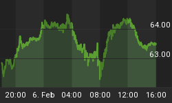
For a live and updated chart, click here
We've cleaned up this chart a bit by removing the price labels which are really quite unnecessary. More importantly, the additional panel at the top of the chart can be used to show us exactly what happened with the $VIX during previous market selloffs. The first observation that becomes abundantly clear is that an explosive move higher in the $VIX does not occur in the early stages of a selloff in equities. Does that not make perfect sense? In fact it does make sense because at market tops fear is for the most part very subdued. Yet invariably, as we approach market tops the ratio continues to fall without the $VIX itself rising. Therefore, the main contributing factor to the falling ratio is a drop in equities. At some point though, reality will strike home that equities are in trouble. And fittingly, that realization has never occurred in the early stages. Only when investors become truly convinced that "holy mackerel, we're in big trouble here after all", will the $VIX begin to contribute to the declining ratio. And when that realization finally strikes home, the move in the $VIX itself will be explosive. In fact, if we look at the pink line on the chart above, it becomes clear that on only two occasions since the 2007 high did the $VIX exceed the 32ish level. And although it may be a rather astounding revelation to many investors, the reality is that by time the $VIX really starts to surge, the vast majority of a major decline is already behind us. As our friend John Lounsbury astutely reminded me just today, the $VIX actually doesn't even peak until near a market bottom. It takes true fear to have that affect.

I want to make it clear that in presenting this study, I do not have a bias to argue for either the bearish scenario nor the bullish case. Admittedly, I am bearish and am quite convinced that there are underlying fundamental issues globally that strongly support a deflationary scenario. But I also openly admit that I could be entirely wrong about that. I simply want to point out that if we keep our eye on this ratio going forward, we will almost certainly gain further valuable guidance about the future path of the S&P. I have two main objectives today... to present an explanation that clarifies the questions about why the $VIX is not exploding higher at this stage of the game. And secondly, to provide the reader with links to a dynamic version of a couple of charts as they exist in my own library... for reference from this day forward.
Indeed, a valid argument for the bullish case can even be made by recognizing that at the present time, we do not see any negative divergence between equities and the ratio as existed back at the market top of 2007. Keep in mind that a neg. divergence is not mandatory. In fact, there currently exists a bullish divergence between the ratio and the S&P which suggests that a summer rally for equities is indeed possible. But if that's what the future brings, the ratio will reflect it immediately. Equities will rise, the $VIX will fall, and the ratio will surge higher once again. Such an occurrence would only serve to further prove the wonderful reliability of ratio analyses. The bottom line though, is that as long as the ratio is falling, equities are headed south. If the ratio does indeed bounce, equities could be headed sharply higher. Unfortunately, there is one more fly in the ointment which we must not overlook. In the chart above, the MACD and stochastics of the ratio itself strongly suggest that the ratio will actually continue to fall. You can see that issue being addressed in the chart below in blue text.

For a live and updated chart, click here
So we are clearly seeing mixed signals at present which is all the more reason to remain vigilant, especially in light of the fact that the market once again seems to be at a very important inflection point. It is certainly not my intention to conclude this article while the leaving the reader with the question "What the hell man, what's it gonna be? Are equities going to continue higher or aren't they?" Readers don't like that. I know... I'm a reader and I don't like it. So although your humble scribe does not have a crystal ball, I've at least explained what this ratio means, how incredibly dependable it is, and how to read it. In order to leave the reader equipped with this valuable tool which he can refer to every day going forward, I've provided two links (under the charts above) to a pair of dynamic charts which will be updated automatically and in real time. The first is specifically designed to watch this ratio from an agnostic point of view, and the second is intended for the purposes of watching the conflicting divergences which, once resolved, will almost certainly paint a clear vision of what lies ahead. Feel free to bookmark both links and refer to them at your leisure as the markets progress into the summer.
To summarize then, there are three main observations presented here in graphical form that are purely mathematical and which are not really open for dispute. They simply provide excellent guidance which investors are free to use (or ignore) as they see fit:
- When the ratio of $SPX:$VIX is falling, equities are either falling already, or will be falling soon.
- In the early stages of market tops, we should not expect the $VIX to be rising significantly.
- It is a mistake for investors to conclude that if the $VIX is not surging it represents a green light for higher equities prices. That is simply not the case. In the words immortalized by the great Forrest Gump; "To each, his own caca smells sweet. Do not be fooled by this."
Until next time,


