


Originally published June 26th, 2011.
As Stockcharts no longer see fit to run usable charts for gold and various other commodities - line charts are only suitable for school kids or journalists doing projects on the markets, not for serious analysis - we are going to use the chart for SPDR Gold Trust (GLD) as a stand in for gold. It is a very accurate proxy, and should continue to be, unless of course, the markets were suddenly to discover that they don't have the gold in their vaults that they say they have.
Our 4-year chart for GLD shows that holders of this ETF, and therefore of gold, have not really had anything to worry about for 2 years now, as the steady uptrend in gold has continued. Rather astonishingly, despite the recent severe deterioration in the charts of other commodities and markets, including PM stocks, gold has continued to hold up very well, although it did break sharply lower late last week which we will now look at in more detail on the 1-year chart.

On the 1-year chart for GLD we can see that after peaking at the end of April it fell sharply early in May at the time that silver plunged and then recovered well in a triangular pattern that formed above the 50-day moving average. After looking like it was breaking out upside on Wednesday, it gapped down on high volume on Thursday before breaking down from the Triangle and below its 50-day moving average on Friday. This was bearish action and puts us on the defensive, despite the longer-term uptrend remaining intact. While long-term investors need not be unduly perturbed by this and may only want to consider either trimming positions or hedging in the event that the long-term uptrend shown on the 4-year chart fails, traders have a variety of tactics at their disposal and may want to cut back positions here with a view to getting back in either on the price dropping back to the supporting trendline (with a close stop) or conversely on a break above $152. The point to grasp is that while the long-term charts for gold and GLD still look solid at this point, they could still take a hit if we get a 2008 style market meltdown shortly, and as this is considered very likely, we are going to take a look at the charts for the broad stockmarket and banking and oil sectors in this update. Here we should note that as we are much deeper into the debt crisis endgame than we were in 2008, gold may prove to be much more resilient than it was then, as it will be "one of the only games in town", and ultimately, once the inevitable hyperinflation kicks in, it will go through the roof.

Now we will veer off to see what is going on in the broad stockmarket and the banking sectors, because of the major implications for everything, especially commodities including gold and silver, and because of the potential for massive collateral damage to be inflicted again on Precious Metals stocks, the outlook for which we will examine towards the end of this update with a look at the HUI index.
Many observers have been wondering what kind of pattern is forming in the broad market, as quite clearly it has been losing traction and rounding over for months. What has been going on is that the market has been trapped beneath the confines of a large Distribution Dome that is drawn on the 1-year chart for the $&P500 index shown below. This is not some abstract academic notion, this is a VERY REAL delineation of an organized and orchestrated program of distribution from Smart Money to Dumb Money and the accuracy and importance of this Dome should be apparent from the fact that the index has reacted back after contacting it no less than 8 times already. Right now the market is churning, after having fallen quite sharply for many weeks back to a zone of strong support near to its rising 200-day moving average, and the only open question now is whether we get some sort of rally back up to the Dome boundary before the market throws in the towel and collapses - for once this key support fails we can expect a possibly brutal plunge. If we do see such a final last gasp rally it will serve to mark out the Right Shoulder of a potential Head-and-Shoulders top that is completing in the index, and here we should note that this rally could be very stunted - Right Shoulders often are - and it could even have occurred already with the one-day wonder rally we saw in the middle of last week. Could the index break above the Dome and abort its bearish implications? - it could, anything is possible in markets, but the chances of this happening are rated as low.

We have now deduced that a hyperinflationary depression is inevitable. There is no real recovery - they talk about growth of 2% or 3% but let's face it, any idiot could create growth of this magnitude by exploding the money supply as they have, and the fact that growth has not been greater, and this is taking their massaged figures at face value, and that no jobs have been created and the property market continues to weaken is an indication of how desperately sick the economy really is. The sort of austerity measures being inflicted on the Greeks are planned for everybody else as the lower and middle classes of countries around the world are being targeted to pick up the tab for the greed and incompetence and sheer recklessness of the banks, either via such austerity measures or by the Grand Larceny of rampant inflation and probably both, but what The Powers That Be haven't reckoned on, or maybe have, is that if the purchasing power of the lower and middle classes is ravaged, then corporate profitability overall will collapse, since an economy cannot be buoyed up solely by the purchases made by elite bankers and Wall St financiers of the products of Ferrari, Gucci, Lobb (shoes), Versace etc. This is why stockmarkets look set to tank regardless of how much money they print and shovel out to speculators. Perhaps those who talk about them wanting to engineer a total collapse so that can introduce a world government are right after all.
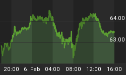
Oil stocks have been slavishly moving almost point for point with the broad market indices, which is made dramatically clear by our 1-year chart for the OIX oil index, on which an almost identical Dome pattern can be identified. This shows that this market is being driven by the same speculative flows as the stockmarket as a whole.

We know that many banks are in deep trouble, and it is only a combination of bailouts and fiddling the books to make things look much better than they really are that maintains the illusion amongst the masses that they are functioning normally - if they knew the truth there would be an instant global run on the banks. Our chart for the banking index shows that after the bear market rally of 2009, a large Head-and-Shoulders top has been forming that is now very close to completion. Once the neckline shown at the bottom of this pattern fails, and especially the support level shown below that, they are likely to go into freefall.

The relative chart for the banks, which shows the banking index relative to the S&P500 index, looks even more alarming. This chart shows a completed Head-and-Shoulders top with very bearishly aligned moving averages, and right now it appears to be "hanging on by its fingernails". It could go into freefall anytime, and the MACD reading which almost at neutrality, certainly allows for such a drop.

There are many who believe that gold and silver and PM stocks will move contra-cyclically, i.e. in the opposite direction, to the broad market if it caves in. As we know that was not the case in 2008, so how about now? While gold still looks pretty solid and in better shape than it did prior to the 2008 crash, silver looks a lot more vulnerable after its recent speculative blowout (see Silver Market update) - so what about PM stocks? Unfortunately for those who entertain the belief that it will be "different this time round", our 1-year chart for the HUI index shows that, in addition to underperforming gold horribly in recent months, it is rounding over beneath a Distribution Dome of similar duration to those that we have observed in the broad market and the OIX oil index, that has likewise forced it down to a key support level. So if the broad market caves in it can be expected to take down PM stocks with it. With the Dome already pressing down on the index it looks set to crash the key support level soon which could lead to a plunge. To abort this scenario the index must soon break above the Dome, which does not look likely at this point.

Even more ominously a larger Dome can be seen to have formed on the 4-year HUI index chart which is also bearing down on the index and looking set to force it lower. 485 - 490 is the key level to watch - if that fails, watch out below.

Let's end by recapping briefly on why there is now no way to avoid a hyperinflationary depression. The point of no return with regards to straightening out the world's debt problems was passed a long time ago so that any serious attempt to do so now would result in an immediate collapse into a deep depression, with unforeseeable political and social consequences, yet this collapse is now inevitable and the longer it is put off the worse it is going to be. This collapse will result in such anarchy and chaos that the world's business and political leaders simply cannot face it, so the name of the game is to put it off for as long as possible - to "kick the can down the road" an expression which you can now find in innumerable articles. The methods employed to do this are to print money in ever greater quantities to patch up the creaking system and stomp interest rates down to near zero for as long as possible. The artificial suppression of interest rates is having various undesirable consequences including the misallocation of capital into rampant leveraged speculation, which is what has fueled the recent commodity boom, and is a powerful disincentive to saving and capital formation. There is a popular argument that printing money in the direction of hyperinflation and holding interest rates to zero will keep markets rising in perpetuity as there will always be more money to play with, even if it is becoming increasingly worthless, but as we are already seeing in the US they are pushing on a piece of string. Despite the trillions of dollars manufactured over the past several years, there is no real recovery - house prices are still falling and there are virtually no new jobs. This newly created money has not found its way into the hands of the people, but rather has been used to bail out banks and Wall St and to line the pockets of their senior executives, and to finance leveraged speculation and much more seriously much of it is disappearing into a black hole to service burgeoning deficits and government spending, despite the ridiculously low interest rates, due to the sheer magnitude of these deficits and spending. The middle and lower classes are getting poorer and poorer, caught in a vice - squeezed by static or contracting incomes on one side and rising prices caused by the ballooning money supply on the other, and spending less, which means that corporate profitability is set to dwindle. With the prospect of declining corporate profits, the stockmarket must drop. When the stockmarket drops the mood of gloom will deepen and consumers will spend even less, and corporate profits will shrink even more - you get the picture - a downward spiral.
What the world needs is a "reset", and it's going to get it regardless of how much the powers that be resist it. In an ideal world the best way to handle it would be to simply declare all debts globally null and void, including and especially derivatives, and let the pieces fall where they will. If you are a creditor tough luck - you shouldn't have lent so much out in the first place and are guilty of attempted or actual usury. This approach would cause massive shock and awe and create anarchy and chaos for a while of course, and might even return the world to The Stone Age. For this reason business leaders and politicians understandably cannot countenance it, so the only way to get a handle on the careening out of control deficits that have run so amok that they cannot even be reined in by near zero interest rates, is to outpace and overrun them with massive inflation, and in effect inflate them into oblivion. This is the course that has now been adopted and while the hyperinflation that will be required to achieve this goal will have terrible consequences of course, it will not have the massive shock impact of a global default. The ordinary citizen will be expected to graciously cooperate in tackling the deficits by surrendering to savage austerity measures, which combined with rampant inflation will collapse living standards - it will be interesting to observe the the extent to which he or she will go along with this.


