


Study and Screening Process
Does the current market look more like 2004 or 2007? The answer is important because stocks did well from August 2004 to October 2007, but they performed very poorly between October 2007 and March 2009. The fundamental picture remains quite uncertain with:
- Debt problems in Europe and the U.S.
- Inflation in Asia
- Central bankers with limited ammo
Based on a detailed study we just completed looking at market profiles dating back to 1981, there are similarities between the current market's technical profile to both 2004 and 2007. The study can help us understand what to look for in 2011-2012 and if the implications lean toward bullish or bearish outcomes.
Why did our study begin in 1981? Fair question; the answer lies in the availability of detailed technical data. The study used historical values for the CCM Bull Market Sustainability Index (BMSI) and the CCM 80-20 Correction Index. You can use the links in the previous sentence to see the long list of technical parameters incorporated into these proprietary market models. This data is not easy to find going back into the 1970s.
The study looked at an extensive array of technical data based on daily, monthly, and weekly charts. The varied time frames help us zero in on periods in history where the balance of greed and fear in the markets was most similar to what we have today. After running historical data through the process shown in the flow chart below, four periods remained beginning in 1984, 2004, 2005, and 2007.

The video below compares these periods to the present day and highlights both bullish and bearish signals that may emerge in the coming weeks. These signals can help us better access the market's risk-reward profile within the context of today's fragile fundamental backdrop. The charts covered in the video are also shown below the video player for further study.
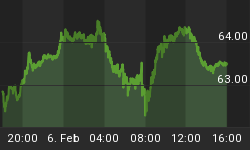
Commentary related to the charts below can be found in the video above.

The chart above is the present day market. The chart below shows the similar period in 1984 identified in the study. Notice how the present day chart above looks more like the right side of the 1984 chart below, which is the "healthy" side. If the current market begins to look like the left side of the chart below, it will increase the odds of bearish outcomes.

If the market begins to resemble the chart below from 2007, we would take a more defensive stance. From a risk-reward perspective, a key bearish development occurred in January 2008 when the slope of the 200-day moving average turned down (near red arrow).

The chart of 2004 below does share some significant similarities to July 2011. Even though the slope of the 200-day moving average did not roll over in 2004, the market still remained volatile and weak for roughly nine months. We could face a similar situation in 2011-2012. A positive slope on the 200-day moving average does not mean the market will be easy to navigate, but it does mean the odds still favor bullish outcomes over bearish outcomes.

The period in 2005 below may offer the best proxy relative to the current technical backdrop. Like 2004, a relatively healthy slope on the 200-day moving average did eventually lead to higher highs, but staying with the market was difficult.

How can all this help us? As long as the charts look similar to 2004 and 2005, then the odds will continue to favor higher highs in the months ahead. If that is the case going forward, we would hold more stocks and commodities and less cash. We have been and continue to be interested in gold (GLD) and silver (SLV). We also prefer to gain exposure to stocks via liquid and flexible vehicles, such as an S&P 500 exchange-traded fund (SPY). If the charts begin to take on characteristics seen in the first half of 1984 and early 2008, we would reduce our exposure to risk and increase our cash positions.


