


The good news is:
• It looks like a short term low has been established.
The negatives
Following the June low, new lows diminished quickly while new highs began increasing. So far new lows have fallen off pretty quickly, but there has been no build up of new highs.
The chart below covers the past 6 months showing the NASDAQ composite (OTC) in blue and a 10% trend of NASDAQ new highs (OTC NH) in green. Dashed vertical lines have been drawn on the 1st trading day of each month.
OTC NH turned upward quickly following the June low, but has continued to fall to multi year lows so far. The value of the indicator is 14 so it would require a little more than 14 new highs to turn the indicator upward.

The next chart is similar to the one above except it shows the S&P 500 (SPX) in red and NY NH has been calculated from NYSE data.
NY NH is at its lowest point since early 2009 and has a value of 18.

The next chart shows the OTC in blue and a 40% trend (4 day EMA) of the ratio of NASDAQ new highs to new highs + new lows (OTC HL Ratio) in red. Dashed horizontal lines have been drawn at 10% levels for OTC HL Ratio and the line is solid at the neutral 50% level.
OTC HL Ratio usually recovers quickly after a bottom has been reached. So far it has remained at a very low level.

The next chart is similar to the one above except it shows the SPX in red and NY HL Ratio has been calculated from NYSE data.
This chart looks a little better than the one above, but on Friday, an up day for the index, NY HL Ratio turned downward.

The positives
New lows have not declined as sharply as we would like, but they have declined hitting a low of 55 on the NASDAQ and 31 on the NYSE Wednesday before increasing a little.
The chart below covers the past 6 months showing the OTC in blue and a 10% trend (19 day EMA) of NASDAQ new lows (OTC NL) in orange. OTC NL has been plotted on an inverted Y axis so decreasing new lows move the indicator upward (up is good).
OTC NL has a recent pattern of higher lows and, hopefully, next week, higher highs. It will take more than 155 new lows to turn the indicator downward.

The next chart is similar to the one above except it shows the SPX in red and NY NL has been calculated from NYSE data.
The pattern of NY NL is quite positive. It will take more than 175 new lows on the NYSE to turn NY NL downward.

Seasonality
Next week includes the last 3trading days of August and first 2 trading days of September during the 3rd year of the Presidential Cycle.
The tables below show the return on a percentage basis for the last 3 trading days of August and first 2 trading days of September during the 3rd year of the Presidential Cycle.
OTC data covers the period from 1963 - 2010 and SPX data covers the period from 1928 - 2010. There are summaries for both the 3rd year of the Presidential Cycle and all years combined.
Average returns have been positive over all periods and stronger during the 3rd year of the Presidential Cycle.
Report for the last 3 days of August and the first 2 days of September.
The number following the year represents its position in the presidential cycle.
The number following the daily return represents the day of the week;
1 = Monday, 2 = Tuesday etc.
| OTC Presidential Year 3 | ||||||
| Day3 | Day2 | Day1 | Day1 | Day2 | Totals | |
| 1963-3 | 0.14% 3 | 0.20% 4 | 0.23% 5 | 0.28% 2 | 0.31% 3 | 1.17% |
| 1967-3 | -0.48% 2 | 0.11% 3 | 0.60% 4 | 0.98% 5 | 0.51% 2 | 1.72% |
| 1971-3 | 0.30% 5 | -0.54% 1 | -0.27% 2 | 0.21% 3 | 0.29% 4 | -0.01% |
| 1975-3 | 0.47% 3 | 1.95% 4 | 1.22% 5 | -1.42% 2 | 0.24% 3 | 2.46% |
| 1979-3 | 0.33% 3 | 0.01% 4 | 0.25% 5 | -1.30% 2 | -1.66% 3 | -2.35% |
| 1983-3 | -0.33% 1 | 0.17% 2 | 0.88% 3 | 0.73% 4 | 1.12% 5 | 2.58% |
| 1987-3 | -0.10% 4 | -0.33% 5 | 0.37% 1 | -0.54% 2 | -0.79% 3 | -1.39% |
| Avg | 0.14% | 0.25% | 0.49% | -0.46% | -0.16% | 0.26% |
| 1991-3 | 0.87% 3 | 0.02% 4 | -0.13% 5 | -0.91% 2 | -0.57% 3 | -0.73% |
| 1995-3 | -0.46% 2 | 0.90% 3 | 0.74% 4 | -0.06% 5 | 1.94% 2 | 3.06% |
| 1999-3 | -0.57% 5 | -1.67% 1 | 0.98% 2 | 0.42% 3 | -0.60% 4 | -1.44% |
| 2003-3 | 0.65% 3 | 1.01% 4 | 0.57% 5 | 1.71% 2 | 0.62% 3 | 4.57% |
| 2007-3 | 2.50% 3 | 0.08% 4 | 1.21% 5 | 1.30% 2 | -0.92% 3 | 4.18% |
| Avg | 0.60% | 0.07% | 0.67% | 0.49% | 0.09% | 1.93% |
| OTC summary for Presidential Year 3 1962 - 2007 | ||||||
| Averages | 0.28% | 0.16% | 0.55% | 0.12% | 0.04% | 1.15% |
| % Winners | 58% | 75% | 83% | 58% | 58% | 58% |
| MDD 9/5/1979 2.93% -- 8/30/1999 2.23% -- 9/4/1991 1.61% | ||||||
| OTC summary for all years 1963 - 2010 | ||||||
| Averages | -0.01% | -0.15% | 0.12% | 0.09% | 0.11% | 0.15% |
| % Winners | 60% | 63% | 72% | 60% | 65% | 60% |
| MDD 8/31/1998 15.22% -- 9/3/2002 6.23% -- 9/5/2001 5.68% | ||||||
| SPX Presidential Year 3 | ||||||
| Day3 | Day2 | Day1 | Day1 | Day2 | Totals | |
| 1931-3 | 1.01% 5 | 0.79% 6 | -1.70% 1 | 0.43% 2 | -1.87% 3 | -1.34% |
| 1935-3 | 0.63% 4 | 0.63% 5 | 0.71% 6 | -0.97% 2 | 1.34% 3 | 2.34% |
| 1939-3 | 2.78% 2 | -1.05% 3 | -1.58% 4 | 1.07% 5 | 2.04% 6 | 3.25% |
| 1943-3 | 0.09% 6 | -0.09% 1 | 1.11% 2 | 0.34% 3 | 0.00% 4 | 1.45% |
| 1947-3 | 0.13% 3 | -0.20% 4 | 0.66% 5 | 0.33% 2 | -0.26% 3 | 0.66% |
| Avg | 0.93% | 0.02% | -0.16% | 0.24% | 0.25% | 1.27% |
| 1951-3 | 0.79% 3 | 0.69% 4 | 0.17% 5 | 0.00% 2 | 0.60% 3 | 2.25% |
| 1955-3 | -0.07% 1 | -0.09% 2 | 0.61% 3 | 0.44% 4 | 0.53% 5 | 1.41% |
| 1959-3 | 0.96% 4 | -0.25% 5 | 0.18% 1 | -1.22% 2 | 0.08% 3 | -0.24% |
| 1963-3 | 0.73% 3 | 0.17% 4 | 0.47% 5 | 0.22% 2 | -0.03% 3 | 1.56% |
| 1967-3 | 0.26% 2 | 0.20% 3 | 0.61% 4 | 0.04% 5 | 0.57% 2 | 1.68% |
| Avg | 0.53% | 0.14% | 0.41% | -0.10% | 0.35% | 1.33% |
| 1971-3 | 0.24% 5 | -0.96% 1 | -0.49% 2 | 0.04% 3 | 0.22% 4 | -0.95% |
| 1975-3 | 0.56% 3 | 2.33% 4 | 0.56% 5 | -1.61% 2 | 0.64% 3 | 2.48% |
| 1979-3 | 0.00% 3 | 0.00% 4 | 0.28% 5 | -1.72% 2 | -0.97% 3 | -2.41% |
| 1983-3 | 0.07% 1 | 0.20% 2 | 1.12% 3 | -0.10% 4 | 0.47% 5 | 1.76% |
| 1987-3 | -0.95% 4 | -1.31% 5 | 0.84% 1 | -1.94% 2 | -0.53% 3 | -3.89% |
| Avg | -0.02% | 0.05% | 0.46% | -1.07% | -0.03% | -0.60% |
| 1991-3 | 0.91% 3 | -0.04% 4 | -0.26% 5 | -0.83% 2 | -0.56% 3 | -0.78% |
| 1995-3 | 0.17% 2 | 0.16% 3 | 0.17% 4 | 0.35% 5 | 0.95% 2 | 1.80% |
| 1999-3 | -1.01% 5 | -1.80% 1 | -0.27% 2 | 0.81% 3 | -0.90% 4 | -3.17% |
| 2003-3 | 0.01% 3 | 0.61% 4 | 0.52% 5 | 1.39% 2 | 0.42% 3 | 2.93% |
| 2007-3 | 2.19% 3 | -0.42% 4 | 1.12% 5 | 1.05% 2 | -1.15% 3 | 2.79% |
| Avg | 0.45% | -0.30% | 0.25% | 0.55% | -0.25% | 0.72% |
| SPX summary for Presidential Year 3 1931 - 2007 | ||||||
| Averages | 0.47% | -0.02% | 0.24% | -0.09% | 0.08% | 0.68% |
| % Winners | 80% | 45% | 75% | 60% | 55% | 65% |
| MDD 9/2/1987 3.85% -- 9/2/1999 3.15% -- 9/2/1931 3.12% | ||||||
| SPX summary for all years 1928 - 2010 | ||||||
| Averages | -0.03% | -0.09% | 0.12% | -0.03% | 0.14% | 0.12% |
| % Winners | 61% | 49% | 62% | 66% | 55% | 64% |
| MDD 8/31/1998 11.68% -- 9/4/1946 8.63% -- 9/3/2002 6.08% | ||||||
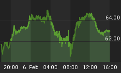
Money supply (M2)
The money supply chart was provided by Gordon Harms. M2’s spectacular assent leveled off a bit last week.

September
Since 1963, over all years, the OTC in September has been up 63% of the time with, on average, no gain or loss. During the 3rd year of the Presidential Cycle September has been up 58% time also with no average gain or loss. The worst September ever, 2001 (-15.4%), the best 2010 (+8.8%)
The average month has 21 trading days. The chart below has been calculated by averaging the daily percentage change of the OTC for each of the 1st 11 trading days and each of the last 10. In months when there were more than 21 trading days some of the days in the middle were not counted. In months when there were less than 21 trading days some of the days in the middle of the month were counted twice. Dashed vertical lines have been drawn after the 1st trading day and at 5 trading day intervals after that. The line is solid on the 11th trading day, the dividing point.
In the chart below the blue line shows the average of the OTC in September over all years since 1963 while the green line shows the average during the 3rd year of the Presidential Cycle over the same period.

Since 1928 the SPX has been up 46% of the time in September with an average loss of -1.0%. During the 3rd year of the Presidential Cycle the SPX has been up 45% of the time with an average loss of -0.7%. The best ever September for the SPX was 1939 (+15.2%) the worst 1931 (-30.2%).
The chart below is similar to the one above except it shows the daily average performance over all years for the SPX in September in red and the performance during the 3rd year of the Presidential Cycle in blue.

Since 1979 the Russell 2000 (R2K) has been up 56% of the time in September with an average loss of -0.3%. During the 3rd year of the Presidential Cycle the R2K has been up 63% of the time with an average loss of -0.1%. The best ever September for the R2K, 2009 (+8.2%), the worst 2001 (-13.3%)
The chart below is similar to those above except it shows the daily performance over all years of the R2K in September in black and the performance during the 3rd year of the Presidential Cycle in blue.

Since 1885 the Dow Jones Industrial Average (DJIA) has been up 46% of the time in September with an average loss of -1.0%. During the 3rd year of the Presidential Cycle the DJIA has been up 45% of the time with an average loss of -1.2%. The best September ever for the DJIA, there were 2, 1916 and 1939 both up 12.8%, the worst 1931 (-31.1%).
The chart below is similar to those above except it shows the daily performance over all years of the DJIA in September in Magenta and the performance during the 3rd year of the Presidential Cycle in blue.

Conclusion
The only technical positive is the decline in new lows and that has not been as much as you would like. Seasonally next week has been pretty good.
I expect the major averages to be higher on Friday September 2 than they were on Friday August 26.
Last weeks positive forecast, on the expectation of a bounce, was a miss.
This report is free to anyone who wants it, so please tell your friends. They can sign up at: http://alphaim.net/signup.html. If it is not for you, reply with REMOVE in the subject line.
In his latest newsletter, Jerry Minton looks at Alpha programs that are fully invested in the market at this time. You can follow his assessment at www.alphaim.net and sign up for his free newsletter on the home page.
Thank you,


