


Let's start with an update of an article I wrote on July 20th 2011.
If the pattern isn't broken soon, this could mean we are about to see 2008 all over again, and silver could drop another 50% from here:

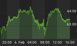
Chart courtesy Prorealtime.com
The following chart is an updated version of one I also posted a while ago. It shows that when the dollar drops, commodities rally (green zones), and that when the dollar rallies, commodities drop (red zones). Currently we are in a red zone.

Chart courtesy Stockcharts.com
The following chart shows us the Gold Miners Bullish Percentage Index. As we can see, when the BPGDM Index fell below 50 and the RSI reached oversold levels, Gold was usually at or very close to a bottom (see green Diamonds on the chart).
When the BPGDM index was above 70, gold often topped (see red Diamonds). Right now, the RSI is getting into oversold territory and the BPGDM index is at 30, meaning we might be at or very close to a bottom.

Chart courtesy Stockcharts.com
When we look at the 10Year Return for gold, we can see that those who bought gold 10 years ago, are now looking back at a return of 570%. That's a nice profit, but look at 1980. Those who bought gold in 1970 had made almost 2,000% by 1980. Compared to 1980, we are nowhere near a top in gold.

Chart: Own calculations
When we look at bond yields, we can see that from the early 60's to the early 80's, bonds yields rose as inflation was rising. Higher inflation caused gold to rise.
From the early 80's on, yields fell as a consequence of lower inflation. Gold also fell. That made sense.
However, from the early 2000's, gold has been on the rise, but yields kept falling, as reported inflation was low. Who or What is wrong: mr. Bernanke and his statistics, or Gold? When I look at the real cost of living, I tend to agree with Gold or statistics of Shadowstats.com instead of mr. Bernanke, who - as Marc Faber and Jim Rogers say - has never been right about anything.

Chart: Own calculations
Besides the 10Year Return of Gold, I also calculated the 10Year Return of Bond Holders. I noticed a similar pattern in 10Year Returns of Bonds and 10Year Returns of Gold, be it over a different period of time. The 10Year Return of Bonds is now in the same position as gold was in late 1998, right before the bull market started. If history is about to repeat, Bond Yields will start a bull market, meaning Bond Prices (which are inversely correlated with Bond Yields) will start a bear market pretty soon. Is the final pillar (which mr. Sinclair has been talking about for 10 years now) about to break?

Image courtesy JSMineset.com

Chart: Own calculations
Please have a look at the following chart which plots the weekly price of Gold right now compared to the gold Price in the late '70s:

Chart courtesy Prorealtime.com
Perhaps the stock markets are telling us we are in a similar position as in 1979 rather than in 2008:

Chart courtesy Prorealtime.com
The Total Return Index is also showing a similar pattern, which could mean we won't make new highs until late 2016 (and thus remain in Recession/Depression mode until then)

Chart courtesy thechartstore.com
For more updates and analyses, visit www.profitimes.com


