


The good news is:
• The Dow Jones Industrial Average (DJIA), NASDAQ composite (OTC) and S&P 500 (SPX) closed at multi year highs Friday.
The negatives
The market is overbought and the secondaries have been deteriorating.
The following charts are all updates of those I have been showing.
Weakness is beginning to develop.
The chart below shows the major indices from the December low through last Friday plotted on log scales to show their relative performance. Dashed vertical lines have been drawn on the 1st trading day of each month.
The legend shows the date range and 2 lines for each symbol. The first line beginning with the symbol shows percentage change of the index over the period shown, followed by the lowest low from the starting point and the highest high from the starting point. The second line begins with the Maximum Draw Down (MDD), the date it occurred and the annualized return over the period shown (CAR).
The DJIA, SPX and OTC closed at new multi year highs on Friday while the Russell 2000 (R2K) and S&P mid cap (MID) were down for the week.

New highs have been declining all month.
The chart below covers the past 6 months showing the SPX in red and a 10% trend (19 day EMA) of NYSE new highs in green.
The SPX and new highs have been going in opposite directions indicating deteriorating leadership.

The next chart is similar to the one above except it covers the past 2 years showing the OTC in blue and OTC NH has been calculated from NASDAQ data.
OTC NH has not been falling like NY NH, but it has flattened out well below the levels of previous highs.

The positives
Multi year index highs and no new lows are signs of strength.
The chart below covers the past 6 months showing the OTC in blue and a 40% trend (4 day EMA) of NASDAQ new highs divided by new highs + new lows (OTC HL Ratio) in red. Dashed horizontal lines have been drawn at 10% levels of the indicator; the line is solid at the neutral 50% level.
The value of OTC HL Ratio is 86%, down slightly from last week, but very strong. There are trading systems that impose a NO SELL filter when variations of this indicator are above 80%.

The chart below is similar to the one above except it shows the SPX in red and NY HL Ratio has been calculated from NYSE data.
At 99% this indicator cannot get much stronger.

Seasonality
Next week includes the last 3 trading days of February and first 2 trading days of March during the 4th year of the Presidential Cycle.
The tables below show the return on a percentage basis for the last 3 trading days of February and first 2 trading days of March during the 4th year of the Presidential Cycle.
OTC data covers the period from 1963 - 2010 and SPX data covers the period from 1928 - 2010. There are summaries for both the 4th year of the Presidential Cycle and all years combined.
Returns for the coming week have been modestly positive by all measures.
Report for the last 3 days of February and first 2 days of March.
The number following the year represents its position in the Presidential Cycle.
The number following the daily return represents the day of the week;
1 = Monday, 2 = Tuesday etc.
| OTC Presidential Year 4 | ||||||
| Day3 | Day2 | Day1 | Day1 | Day2 | Totals | |
| 1964-4 | -0.05% 3 | 0.32% 4 | -0.27% 5 | 0.56% 1 | -0.05% 2 | 0.51% |
| 1968-4 | -0.45% 2 | -0.05% 3 | 0.02% 4 | -0.94% 5 | -0.63% 1 | -2.04% |
| 1972-4 | 0.67% 5 | 0.09% 1 | 0.35% 2 | 0.73% 3 | 0.23% 4 | 2.07% |
| 1976-4 | 0.39% 3 | -0.69% 4 | -1.30% 5 | -0.01% 1 | 0.32% 2 | -1.29% |
| 1980-4 | -0.49% 3 | -0.17% 4 | 0.36% 5 | -0.73% 1 | -0.96% 2 | -1.99% |
| 1984-4 | 1.15% 1 | -0.70% 2 | 0.01% 3 | 0.37% 4 | 0.80% 5 | 1.63% |
| 1988-4 | 0.13% 4 | -0.06% 5 | 0.98% 1 | 0.10% 2 | 0.83% 3 | 1.98% |
| Avg | 0.37% | -0.31% | 0.08% | 0.09% | 0.25% | 0.48% |
| 1992-4 | 1.77% 3 | 0.25% 4 | -0.08% 5 | 0.32% 1 | -0.19% 2 | 2.06% |
| 1996-4 | -0.62% 2 | 0.13% 3 | -0.68% 4 | -1.27% 5 | -0.11% 1 | -2.55% |
| 2000-4 | -0.59% 5 | -0.27% 1 | 2.60% 2 | 1.86% 3 | -0.62% 4 | 2.97% |
| 2004-4 | 0.87% 3 | 0.47% 4 | -0.14% 5 | 1.38% 1 | -0.88% 2 | 1.71% |
| 2008-4 | 0.37% 3 | -0.94% 4 | -2.58% 5 | -0.57% 1 | 0.07% 2 | -3.64% |
| Avg | 0.36% | -0.07% | -0.17% | 0.34% | -0.35% | 0.11% |
| OTC summary for Presidential Year 4 1964 - 2008 | ||||||
| Averages | 0.26% | -0.14% | -0.06% | 0.15% | -0.10% | 0.12% |
| % Winners | 58% | 42% | 50% | 58% | 42% | 58% |
| MDD 3/3/2008 4.04% -- 3/4/1996 2.53% -- 3/4/1968 2.03% | ||||||
| OTC summary for aLl years 1963 - 2011 | ||||||
| Averages | 0.13% | -0.13% | -0.08% | 0.18% | 0.00% | 0.09% |
| % Winners | 55% | 57% | 51% | 63% | 51% | 59% |
| MDD 3/3/2009 8.38% -- 3/2/2001 8.27% -- 3/2/2007 5.85% | ||||||
| SPX Presidential Year 4 | ||||||
| Day3 | Day2 | Day1 | Day1 | Day2 | Totals | |
| 1928-4 | -0.47% 1 | 0.29% 2 | 0.58% 3 | 0.23% 4 | 0.00% 5 | 0.64% |
| 1932-4 | -0.12% 5 | 0.12% 6 | -0.72% 1 | 0.72% 2 | 4.31% 3 | 4.32% |
| 1936-4 | 2.37% 4 | -0.61% 5 | -0.34% 6 | 1.51% 1 | 1.42% 2 | 4.35% |
| 1940-4 | -0.16% 2 | 0.08% 3 | -0.16% 4 | -0.58% 5 | 0.17% 6 | -0.66% |
| 1944-4 | 0.00% 6 | 0.08% 1 | -0.59% 2 | 0.42% 3 | 0.08% 4 | 0.00% |
| 1948-4 | -0.64% 4 | -0.36% 5 | 0.50% 6 | 0.50% 1 | 0.64% 2 | 0.64% |
| Avg | 0.29% | -0.14% | -0.26% | 0.52% | 1.32% | 1.73% |
| 1952-4 | 0.13% 3 | 0.47% 4 | -0.13% 5 | 0.09% 6 | 0.04% 1 | 0.60% |
| 1956-4 | -0.11% 1 | 0.35% 2 | -0.20% 3 | 0.44% 4 | 0.59% 5 | 1.08% |
| 1960-4 | 0.34% 4 | 0.41% 5 | -0.07% 1 | -0.20% 2 | -0.70% 3 | -0.21% |
| 1964-4 | 0.24% 3 | -0.32% 4 | 0.23% 5 | 0.22% 1 | 0.32% 2 | 0.69% |
| 1968-4 | 0.39% 2 | -0.50% 3 | -0.80% 4 | -0.28% 5 | -1.34% 1 | -2.52% |
| Avg | 0.20% | 0.08% | -0.19% | 0.05% | -0.22% | -0.07% |
| 1972-4 | 0.69% 5 | 0.01% 1 | 0.36% 2 | 0.73% 3 | -0.03% 4 | 1.76% |
| 1976-4 | -0.33% 3 | -1.55% 4 | -0.40% 5 | 0.31% 1 | 0.54% 2 | -1.44% |
| 1980-4 | -1.40% 3 | -0.03% 4 | 1.17% 5 | -1.02% 1 | 0.25% 2 | -1.04% |
| 1984-4 | 1.14% 1 | -1.56% 2 | 0.15% 3 | 0.72% 4 | 0.66% 5 | 1.12% |
| 1988-4 | -1.08% 4 | 0.34% 5 | 2.04% 1 | -0.22% 2 | 0.28% 3 | 1.36% |
| Avg | -0.20% | -0.56% | 0.66% | 0.10% | 0.34% | 0.35% |
| 1992-4 | 1.19% 3 | -0.36% 4 | -0.28% 5 | -0.06% 1 | 0.10% 2 | 0.59% |
| 1996-4 | -0.50% 2 | -0.39% 3 | -0.67% 4 | 0.62% 5 | 1.00% 1 | 0.06% |
| 2000-4 | -1.48% 5 | 1.10% 1 | 1.36% 2 | 0.94% 3 | 0.19% 4 | 2.11% |
| 2004-4 | 0.40% 3 | 0.11% 4 | 0.00% 5 | 0.96% 1 | -0.59% 2 | 0.88% |
| 2008-4 | -0.09% 3 | -0.89% 4 | -2.71% 5 | 0.05% 1 | -0.34% 2 | -3.99% |
| Avg | -0.09% | -0.09% | -0.46% | 0.50% | 0.07% | -0.07% |
| SPX summary for Presidential Year 4 1928 - 2008 | ||||||
| Averages | 0.02% | -0.15% | -0.03% | 0.29% | 0.36% | 0.49% |
| % Winners | 43% | 52% | 43% | 71% | 71% | 71% |
| MDD 3/4/2008 3.95% -- 3/4/1968 2.88% -- 2/27/1976 2.27% | ||||||
| SPX summary for all years 1928 - 2011 | ||||||
| Averages | 0.06% | -0.04% | 0.05% | 0.15% | 0.16% | 0.38% |
| % Winners | 52% | 54% | 58% | 63% | 56% | 65% |
| MDD 3/3/2009 9.93% -- 2/27/1933 6.27% -- 3/2/2007 4.41% | ||||||
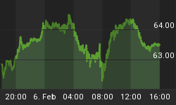
Money supply (M2)
The money supply chart was provided by Gordon Harms. M2 growth turned up a little last week.

March
Since 1963, over all years, the OTC in March, has been up 63% of the time with an average gain of 0.6%. During the 4th year of the Presidential Cycle March has been up 50% time with an average loss of -2.0%; helped considerably by a 16.5% loss in 1980. The best March for the OTC was 2009 (+15.6%), the worst 1980 (-16.5%).
The average month has 21 trading days. The chart below has been calculated by averaging the daily percentage change of the OTC for each of the 1st 11 trading days and each of the last 10. In months when there were more than 21 trading days some of the days in the middle were not counted. In months when there were less than 21 trading days some of the days in the middle of the month were counted twice. Dashed vertical lines have been drawn after the 1st trading day and at 5 trading day intervals after that. The line is solid on the 11th trading day, the dividing point.
In the chart below the blue line shows the average of the OTC in March over all years since 1963 while the black line shows the average during the 4th year of the Presidential Cycle over the same period.

Since 1928 the SPX has been up 61% of the time in March with an average gain of 0.4%. During the 4th year of the Presidential Cycle the SPX has been up 62% of the time with an average gain of 0.8%. The best March for the SPX was 2009 (+13.8%) the worst 1938 (-25.8%).
The chart below is similar to the one above except it shows the daily average performance over all years for the SPX in March in red and the performance during the 4th year of the Presidential Cycle in black.

Since 1979 the R2K has been up 67% of the time in March with an average gain of 1.1%. During the 4th year of the Presidential Cycle the R2K has been up 38% of the time with an average loss of -3.0%; aided by a -17.9% loss in 1980. The best March for the R2K, 2009 (+14.9%), the worst 1980 (-17.9%)
The chart below is similar to those above except it shows the daily performance over all years of the R2K in March in green and the performance during the 4th year of the Presidential Cycle in black.

Since 1885 the DJIA has been up 59% of the time in March with an average gain of 0.5%. During the 4th year of the Presidential Cycle the DJIA has been up 68% of the time in March with an average gain of 1.2%. The best March for the DJIA 2009 (+12.5%), the worst 1938 (-24.2%)
The chart below is similar to those above except it shows the daily performance over all years of the DJIA in March in black and the performance during the 4th year of the Presidential Cycle in grey.

Conclusion
The blue chip indices closed at new highs on Friday while the small cap indices were down. New highs deteriorated, but new lows remain insignificant. Seasonality for next week is modestly positive.
I expect the major averages to be higher on Friday March 2 than they were on Friday February 24.
Last week the blue chips were up a little while the secondaries were down a little so I am calling last weeks negative forecast a tie.
This report is free to anyone who wants it, so please tell your friends. They can sign up at: http://alphaim.net/signup.html. If it is not for you, reply with REMOVE in the subject line.
In his latest newsletter, Jerry Minton focuses on "The War against Savers". To find out what it is and what causes it, go www.alphaim.net to read the newsletter and sign up for a free subscription.
Good Luck,
YTD W 3 /L 3 /T 2


