


SHORT-TERM CORRECTION EXPECTED
Precision timing for all time frames through a multi-dimensional approach to technical
analysis: Cycles - Breadth - P&F and Fibonacci price projections
and occasional Elliott Wave analysis
"By the Law of Periodical Repetition, everything which has happened once must happen again, and again, and again -- and not capriciously, but at regular periods, and each thing in its own period, not another's, and each obeying its own law... The same Nature which delights in periodical repetition in the sky is the Nature which orders the affairs of the earth. Let us not underrate the value of that hint." ~ Mark Twain
Current Position of the Market
SPX: Very Long-term trend - The very-long-term cycles are down and, if they make their lows when expected (after this bull market is over) there will be another steep and prolonged decline into late 2014. It is probable, however, that the steep correction of 2007-2009 will have curtailed the full downward pressure potential of the 120-yr cycle.
SPX: Intermediate trend - SPX is back in an intermediate uptrend.
Analysis of the short-term trend is done on a daily basis with the help of hourly charts. It is an important adjunct to the analysis of daily and weekly charts which discusses the course of longer market trends.
Market Overview
From the last newsletter: "The base established on the P&F chart gives the initial spike a projection to 1374-1377..."
And from Thursday's Morning Comment:
Thursday, July 5 -- Morning Comment
The SPX is entering its ideal time-frame for a near-term top and it has already met the lower target of the 1374-1377 price projection band. Futures are down about 5 points in early profit-taking, but the market will probably wait until tomorrow's jobs report to determine if it should start correcting or extend its top-building pattern for another day or two.
The SPX has, once again, obliged by peaking at 1374.81 on Wednesday, re-testing the high on Thursday, and starting a full-fledged decline on Friday. That decline went past an initial projection, stopped at the next, and rallied into the end of the day for its first rally in a short-term downtrend. The overall trend remains: Long-term up, intermediate up, and short-term down! This minor correction is expected to continue into mid-month, and be followed by a resumption of the intermediate uptrend.
There do not seem to be any threatening storm clouds building up over the near-term stock market trend, but this could change by early August. The least that we might expect would be a decline into October which could be fairly severe. If it is not, the next worrisome time-frame for a significant decline, would be the first quarter of next year. Whichever it turns out to be, there are some longer-term warnings already brewing in some important leading indicators that have been lagging for some weeks and continue to do so. But this should have no effect over the next few weeks.
Of secondary interest is whether or not the SPX will make a new high before beginning its slide into October 2014, driven by bottoming long-term cycles. The odds that it does will increase if the "final" top is in 2013.
Let's look at the charts.
Chart analysis
We'll start with an uncomplicated analysis of the long-term trend, using the Weekly SPX Chart. It's undeniable that the index is in a long-term trend. Since its low of 2009, it has been making higher highs and higher lows. A preliminary warning that this trend is coming to an end will occur when the red horizontal line is penetrated to the downside. You can see that the long-term rise in prices is delineated by a broad channel, the (purple) bottom line of which closely matches the long-term (green) trend line that connects the 2009 and the 2011 lows. We can safely assume that until prices come out of the channel, we are still in a long-term uptrend, even though there could be some volatility in the intermediate uptrend, which just became confirmed by the lower indicator making a bullish cross and moving into positive territory.
Our concerns about an intermediate top in early August and a decline into October -- if justified - could very well send prices below the red trend line, but not necessarily below the channel line.


Since breadth matched with prices gives an excellent confirmation of the market trend, let's now show the NYSI (above) ( a superlative weekly trend indicator (courtesy of MarketCharts.com)] directly below the weekly SPX chart. The horizontal scales do not match exactly, but close enough so that you can compare the two charts without too much difficulty, especially in their recent positions.
Here again, a simple, but effective, analysis shows us that the intermediate uptrend is indeed up with the index solidly positive, and the RSI only slightly above neutral and still rising. No immediate problem on the horizon! But we can point to some potential longer-term negatives: The last correction of the NYSI went down to the level of its 2011 low, while the SPX remained well above its comparative low. Of more immediate concern, the MACD of the RSI is still negative and has not yet made a bullish cross. True, the MACD tends to lag the RSI which has given a confirmed buy signal, but it could spell trouble if it turns before becoming positive.
The Daily Chart shows that there are several trend lines that will have to be broken before we can give up on the long-term trend. If the October low remains above the lower channel line, whether or not the index makes a new high will depend on how much of a retracement it will have before it can start on its final journey into 2013.
The short-term has given a conditional sell signal. The price remains above the MA, and the oscillator has turned down but has not yet broken through the uptrend line and moved into negative territory.
Cycles and projection considered, it's likely that the decline will continue for another week or so.

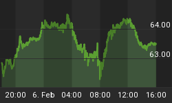
We can get a better feel for that on the Hourly Chart, where we can see clearly that the short-term uptrend has been broken, with the SPX moving outside of its short-term channel. It is also clear that this does not pose any threat to the intermediate trend at this time. The trend line is still far below, and some good support exists around the 1330-1332 level.
The indicator also gave a clear sell signal after showing some divergence. There was no follow-through selling into the close on Friday, and the pull-back looks as if it has already evolved into a near-term rally in a short-term downtrend.

Cycles
The mid-June top was caused by a small cluster of cycles. This action could be repeated in early August when more important cycles could cause a more important top.
In the meantime, the current short-term correction is likely to continue into about 7/17 and a cycle low.
Breadth
The NYMO (courtesy of StockCharts.com) is shown below, and it's easy to see why the NYSI continues to move up; the NYMO has been positive for a full month and shows no sign of relenting. The fact that it did not create negative divergence to the SPX at this top is a testimonial to the underlying strength of the market, and an indication that this will only be a short and shallow correction. The time to worry about a more important top will be when the McClellan oscillator pattern starts to diverge significantly from the SPX, as it did beginning in February. If something significant is going to happen in early August, a somewhat similar pattern should show up on the NYMO.

Sentiment Indicators
The SentimenTrader is still neutral and not even close to warning about a top, another indication that the intermediate trend is still up and not close to topping.
The VIX (volatility index)
The chart pattern made by the VIX (courtesy of Qcharts) nicely confirms the uptrend of the SPX. The two channels are moving in opposite directions and, as long as they do, we can assume that the intermediate trend is up.

The index did give a slight warning (green asterisk) that we were coming to a top when it failed to equal on the downside, the penetration of the SPX on the upside. This was not strong enough a signal to suggest that this will be anything more than a short-term correction. When the market is ready to make a more important top, it is likely to show a divergence pattern similar to what we saw in April and May.
XLF (Financial SPDR)
The hourly chart of the XLF continues to look pretty much like that of the SPX (see chart above), telling us that the uptrend is probably not yet in trouble. However, the weekly chart does show some disconnect between the two indices which could result in some sort of intermediate top ahead. As soon as we see relative weakness manifesting itself in the daily and hourly charts of the XLF, it will be time to become cautious about the possibility of an important top forming.

BONDS
TLT (20-yr T-Bond Fund) has now traded for one month in a narrow range, between 125 and 127. Previous tops are providing support, and it looks as if the index is making a high level consolidation area which can be interpreted as accumulation on the Point & Figure chart. When the pattern is complete -- perhaps in early August to coincide with the anticipated market high -- it should yield a clear projection for its continued uptrend.
If (when) TLT breaks out on the upside, it will probably be in conjunction with a decline in the SPX, and we should be able to estimate the severity of the decline by the size of the accumulation pattern that was created in TLT.

UUP (Dollar ETF) Daily Chart
UUP may be on its way to fulfilling its next projection of 23.30, but that would depend on continued weakness on the part of the EURO. On its recent thrust, UUP jumped all the way to the previous top and only needs to go fractionally higher to break out and signal a probable move to 23.30. Eventually, the index is expected to rise to 25 as the USD meets its 90+ projection.

GLD (ETF for gold)
The weekly log chart of GLD shows how perfectly the long-term trend line from 2008 supported the rise of prices, until it was broken after GLD reached its 185 projection. It also shows a classic back-test of the broken line and a continuation of the intermediate correction.
The red arrow tips show how regular the phases of the 25-wk cycle have been during that prolonged uptrend. The fact that the last cycle bottom, which occurred two weeks ago, did not break below the former 25-wk low gave rise to some expectation that GLD might be in a position to break out of its intermediate downtrend and challenge the top channel line. So far, at least, it does not seem ready to do this. The P&F chart does give it a potential move to 162, but that would only take it to the top of the declining channel, after which, it could be vulnerable to resuming its downtrend into November to fill its long-standing 141 target.

OIL(USO)
After a prolonged steep decline from its 2008 top, USO (weekly chart) finally made a low in early 2009, but has done little since except to make an extended consolidation pattern which may have come to an end in February. Although the index, after another steep but shorter decline, has found a temporary low slightly below the base of that pattern, its future prospects do not appear very bright. The Point & Figure chart gives it an eventual low of 8, which could very well materialize in 2014 if the stock market experiences the kind of decline which is expected into the 120-yr cycle low.

Summary
The SPX, which established another intermediate low at 1267, has found a short-term top at its 1374 projection and is in the process of correcting. The correction is expected to last for about another week, after which the index should resume its uptrend into early August.
By then, it should become clear if that time frame only brings about another intermediate correction, or if it is the start of something more.
FREE TRIAL SUBSCRIPTON
HOW GOOD ARE YOU? I challenge you to sign up for an introductory, four-week subscription now, and compare your market forecasts to mine! I will e-mail on-going, intra-day market updates with comments and explanations, plus summaries of the daily action and a weekly report. My service is ideally suited for traders, but it is also valuable to longer-term holders since price projections will be provided to you through Point & Figure analysis (which pin-points the probable extent of market moves) along with best-time estimates obtained from cycle analysis.
This is the unsolicited opinion that a trial member recently expressed about my service:
Dear Trial and current subscribers,
I have traded options for almost 17 years. I've tried many services for real time analysis for market trends up or down. Sounds simple, but it isn't. The trail is littered with wrong analysis. I gave Andre a try and it was the best decision I made. In my two option trades with Andre, I netted over $9,000 profit, the last trade especially, his timely signal on the SPX saved me from losing all my profit had I held 30 minutes longer.
Vinnie StJohn
Davie, FL
ARE YOU AS SUCCESSFUL AS YOU COULD BE? Fear or your ego may be getting in the way. Verify your own research! You may happily discover that there is a service which is uncommonly dependable and also reasonably priced...called Market Turning Points..
For a FREE 4-week trial, Send an email to: ajg@cybertrails.com
For further subscription options, payment plans, and for important general information, I encourage you to visit my website at www.marketurningpoints.com. It contains summaries of my background, my investment and trading strategies, and my unique method of intra-day communication with subscribers. I have also started an archive of former newsletters so that you can not only evaluate past performance, but also be aware of the increasing accuracy of forecasts.


