


Precision timing for all time frames through a multi-dimensional approach to technical
analysis: Cycles - Breadth - P&F and Fibonacci price projections
and occasional Elliott Wave analysis
"By the Law of Periodical Repetition, everything which has happened once must happen again, and again, and again -- and not capriciously, but at regular periods, and each thing in its own period, not another's, and each obeying its own law... The same Nature which delights in periodical repetition in the sky is the Nature which orders the affairs of the earth. Let us not underrate the value of that hint." ~ Mark Twain
Current Position of the Market
SPX: Very Long-term trend - The very-long-term cycles are down and, if they make their lows when expected (after this bull market is over) there will be another steep and prolonged decline into late 2014. It is probable, however, that the steep correction of 2007-2009 will have curtailed the full downward pressure potential of the 120-yr cycle.
SPX: Intermediate trend - SPX is in a limited intermediate uptrend which is estimated to end in August.
Analysis of the short-term trend is done on a daily basis with the help of hourly charts. It is an important adjunct to the analysis of daily and weekly charts which discusses the course of longer market trends.
Market Overview
"Ever since the SPX started its uptrend from 1267, I projected that the rally would end at about 1404. That was a target derived from a Point & Figure count taken across the base and confirmed by a Fibonacci measurement. While this is a preferred count, it is not an absolute, and there is a valid count to 1425 and some even higher."
This quote from last week's newsletter pretty much sums up the current situation. After reaching 1404 (actually 1407), SPX went into a two-week consolidation period but could not reverse its trend. Last Wednesday, it broke out to a new high and has been rising since, closing the week at 1418. Minor cycles which are due on Monday mid-day apparently do not have the strength to bring prices down and they may, in fact be, inverting.
SPX is now nearing the ca.1425 target with visibly deteriorating breadth (as you will see below in the McClellan oscillator) while prices are being squeezed into the apex of a wedge pattern -- both being signs of impending weakness. And let's not forget that we are within a spitting distance of the May high (1422.38). Important tops are usually a source of resistance when they are first reached. Put these factors together -- including the longer-term cyclic configuration, and the probable completion of a 5-wave pattern - and the odds of making a top as early as next week are pretty good!
Of course, we could keep on going higher and higher, but that would require a strong improvement in breath as we make a new market high! Unless this takes place, a reversal appears to be near at hand. What kind of a top? At least short-term, which will have to be monitored closely to see if it shows signs of developing into one of intermediate nature.
Chart analysis
I have already mentioned the pertinent points in the Market Overview. Let's look at them again with the Daily Chart in front of us. The wedge pattern is probably the most obvious. It started at the end of July and is in the process of completing 5 waves. That, in itself, is very bearish, but now look at the McClellan oscillator, below. During the entire advance it barely managed to stay positive, suggesting that participation in the uptrend was minimal.
Next, the two red lines at the top of the chart represent the resistance area created by the former top. Note that if SPX advances to 1425, it would be just barely above the top line. Unless prices can accelerate from that point on with strong support from the A/D, the possibility of a reversal next week is excellent.


For a confirmed sell, we would want to see SPX break the steepest trend line and decline below 1395. That would put it under the previous congestion level of the past two weeks. Should this happen, the momentum oscillator (which also shows negative divergence) and the McClellan oscillator would both give a strong sell signal. I will be able to make a projection about the extent of the decline as soon as the topping pattern is complete.
The signs that a top is imminent is also evident in the Hourly Chart. I am only displaying the wedge formation which started about July 18th. Below the price chart, I have attached an A/D chart which is a near representation of the McClellan oscillator on an hourly basis. You can see that it pretty well matches the momentum oscillator and shows a pattern of deceleration and negative divergence to price. It would take very little for both of these indicators to turn down and generate a sell signal --probably in conjunction with SPX breaking below the blue line.


Cycles
"With weekly and longer term cycles topping in August, this month was expected to bring about an end to the rally which started at 1267 on 6/04. While the early part of the month was favored, the topping formation could stretch for a little while longer."
It has!
Breadth
We have already seen that the McClellan oscillator -- which identifies the amount of breadth support for price on a daily basis -- and a similar hourly version of it are both showing deceleration and divergence, which is indicative of a topping formation. Now, let's look at the NYSI (Summation Index, courtesy of StockCharts.com) which gives us an idea of what breadth is doing on an intermediate basis.
Since the wedge formation started, in late July, the NYSI has only been able to hold its level during which time the SPX rose about 90 points. If that was not representative enough of market weakness, look at the level of the last high on the NYSI vs. where it is currently, while SPX is now in the process of challenging its corresponding high. So, not only do we have massive negative divergence on a near-term dimension, but on an intermediate dimension as well. And the RSI is still overbought! Is that the portrait of a healthy market trend?

Sentiment Indicator
And yet, the internal constitution of the market is not really matched by prevailing sentiment. I have not posted the SentimenTrader for some time because it remained essentially neutral. After a steady climb by the market for two and half months, it is finally beginning to move toward "Excessive Optimism".
We will see that same picture displayed by XIV, next. So what does it mean? I believe it means that the next correction will be limited in scope. That does not necessarily mean that after a short-term decline we go on to make a new high - although we could! It could also mean that we have an extended but moderate correction over the next few weeks. Let's see how it plays out!

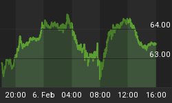
The XIV (inverted volatility index)
We will, once again, look at the inverted VIX vs. SPX on an hourly basis (charts courtesy of Qcharts).
There are several ways to analyze VIX as a market indicator. I prefer to compare it to the SPX and look for relative strength changes. This is why I prefer XIV over VIX. It is easier to spot these differences on an hourly chart. It's not fool-proof, but it seems to work the majority of the time.
In July, the index gave a false signal. For about a week, it showed some divergence to the SPX, but by early August, it was back in sync. The warning was all the more credible because other market indicators (e.g. RUT) were saying the same thing. After early August, all the indicators that had been diverging miraculously caught up with the main indices and have continued their supporting trend until the past few days when they started to diverge again.
On Friday, XIV only made a double-top while SPX made a marginal new high. If this divergence persists or increases, it will be another signal that we could be near a reversal.

XLF (Financial SPDR)
This is another leading indicator whose daily chart is not telling a bullish story, no matter how you look at it.
From a purely technical perspective, the last five waves of the chart show the same wedge pattern that appears in the SPX. This comes at a time when the index is entering a significant level of overhead resistance. The indicator is showing negative divergence and is ready to break its uptrend line at the least provocation.
The SPX is currently challenging its early April high, but XLF is well below its corresponding top. That is a lot of relative weakness. Granted, it is long-term relative weakness and near-term, XLF just made a new high along with SPX. But that may be as far as it goes! The small doji on the candlestick chart is normally the sign of a top.

BONDS
TLT's sharp correction of the last few days has brought it to an interesting juncture. To begin with, the index had a short-term P&F projection of 21-22 which was filled on Thursday, followed by a bounce on Friday. The projection corresponds to the level of an internal support line which is parallel to its lower intermediate trend line. We should take notice that the index is currently trading in the upper reaches of its long-term channel line which currently runs at about 108.
TLT is also sitting on an important area of support, and trading just above its 200-DMA and a one-year trend line connecting the July 2011 and March 2012 lows.
Recent action has created an oversold condition with positive divergence on the daily chart indicator. The hourly chart also shows some positive divergence in its indicator.
121 looks like a good level from which TLT could re-bound, but if it does break this level, the P&F count would extend to about 110, a level which corresponds to the March low.
On the upside, TLT has an unfilled count to 137 and possibly much higher, longer-term counts to ca.160 as well.

UUP (Dollar ETF) Daily Chart
This chart shows UUP in a long-term downtrend since the end of 2008, but that does not tell the whole story. The USD made its high in 2001 at 120 and declined to 72, making a low in 2008. Since then, it has been engaged in building what looks like a massive base structure. Some analysts feel that this is not a base, but simply a consolidation on the way to new lows. That's a rather pessimistic outlook that I do not share because I do not see anything in the price action to support that view.
On the weekly chart of UUP (below), you can see that it is now in a long-term up-move that started last September. Although it is currently impeded by its 200-wk MA, it does not look in danger of reversing that uptrend which, in any case, has a P&F projection to 25 (USD 90). In fact, it looks just about ready to extend that move to its next phase projection of 23.30. That would go hand-in-hand with a top in the SPX.

GLD (ETF for gold)
What about gold? Let's see if we can offer a ray of hope for those despondent gold bugs who are longing for their tarnished idol to recover its shine.
The index has retraced about 50% of its last advance, which is about normal for a correction, so it could be ready to move on - if that's in the cards! It has been making a good consolidation pattern over the past three months, but has not been able to get above its nemesis: the 200-DMA. Since it is an index which tends to move with the Market, it does not augur well for gold to have a market in the process of topping.

If it cannot break-out to the upside in short-order, the best scenario would be to extend its basing pattern for a later opportunity to resume its uptrend. However, if it breaks below 149 its supporters might have to wait quite a while longer for the metal to regain its gloss.
OIL (USO)
USO has essentially filled its P&F count of 36 and is beginning to run into solid resistance from a level which extends back to 02/11, as well as from its 200-DMA. Odds are good that it will begin to retrace, especially if the market does as well.

Summary
SPX is now approaching its secondary target of 1425 and signs of a top are everywhere. If they are not immediately erased by strong market behavior (which is unlikely), a reversal should occur in the next few days.
FREE TRIAL SUBSCRIPTON
Market Turning Points is a service which is uncommonly dependable and reasonably priced providing intra-day market updates with comments and explanations, plus a daily summary and a weekly report. My service is ideally suited to traders, but it is also valuable to longer-term holders since price projections are provided using Point & Figure analysis, along with best-time estimates obtained from cycle analysis.
For a FREE 4-week trial, Send an email to: ajg@cybertrails.com
For further subscription options, payment plans, and for important general information, I encourage you to visit my website at www.marketurningpoints.com.


