


If you recall, on Friday, we discussed how Institutional Investors had "control over the direction" of the market, On Monday (yesterday), we discussed how (daily) Inflowing Liquidity levels are also a key element in today's market movements.
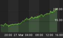
Since then, we have had a lot of requests to "see" a chart showing the daily Accumulation/Distribution levels for Institutional Investors. Fair enough ... below is the chart as of yesterday:
As you can see on the chart, the trend lines had converged last Friday with another large down tick yesterday. (Yesterday, the VIX was conflicting with a tick that was way above its Bollinger band. The significance of that, is that the pattern has occurred twice since last December with a turn around up move on the NYA Index the next day. The previous two patterns had a gap-down move at the open on the VIX the next day. This morning also had a gap-down move on the VIX at the open.)
Note: For it to be a healthy tick today, the daily VIX tick should have this kind of look:
This is a tick where the close on the VIX is clearly lower than the open.
One thing that I want to point out on today's chart below, are the two blue trend lines from December to April that we drew on the NYA Index and the Institutional Accumulation/Distribution part of the chart.
If you notice, the NYA trend line has been moving up, while the Institutional Accumulation/Distribution trend line has been going since December.
What does this mean? It means that most of the money flowing into the market has not been coming from Institutional Investors. In fact, Institutional Investors have been Accumulating less and less as the market has been moving higher and higher. This also suggests that Institutional Investors have been profit taking as time moves on, and at some point they will over-burden the market with their selling. (FYI ... this chart can be found as a daily update in Section 4 as chart 7 on the Standard subscriber site.)


