


The good news is:
• The NASDAQ composite (OTC) closed at a multi year high last Tuesday.
The negatives
Most of the Major indices are near their all time highs while the number of issues hitting new highs has been declining for months.
The chart below covers the past 6 months showing the S&P 500 (SPX) in red and a 10% trend (19 day EMA) of NYSE new highs (NY NH) in green. Dashed vertical lines have been drawn on the 1st trading day of each month.
NY NH appears to have stalled at a very low level.

The next chart is similar to the one above except it shows the OTC in blue and OTC NH, in green, has been calculated from NASDAQ data.
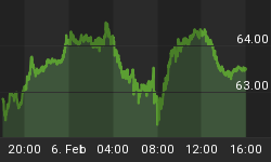
The OTC closed at a multi year high last Tuesday while OTC NH was near a 6 month low.

The positives
For all practical purposes, new lows remain non existent.
The chart below covers the past 6 months showing the OTC in blue and a 40% trend (4 day EMA) of NASDAQ new highs divided by (new highs + new lows), (OTC HL Ratio) in red. Dashed horizontal lines have been drawn at 10% levels for the indicator, the line is solid at the neutral 50% level.
OTC HL Ratio finished the week at a very strong 89%. There are trading systems that impose a NO SELL filter when variations of this indicator are above 80%.

The next chart is similar to the one above except it shows the SPX in red and NY HL Ratio, in blue, has been calculated from NYSE data.
NY HL Ratio has also moved into positive territory finishing the week at 67%.

Seasonality
Next week includes the 5 trading days prior to the 3rd Friday of September during the 1st year of the Presidential Cycle.
The tables below show the daily percentage return for the 5 trading days prior to the 3rd Friday of September during the 1st year of the Presidential Cycle.
OTC data covers the period from 1963 - 2012 while SPX data runs from 1953 - 2012. There are summaries for both the 1st year of the Presidential Cycle and all years combined. Prior to 1953 the market traded 6 days a week so that data has been ignored.
Average returns for the coming week have been negative by all measures.
Report for the week before the 4th Friday of September.
The number following the year is the position in the Presidential Cycle.
Daily returns from Monday through the 4th Friday.
| OTC Presidential Year 1 | ||||||
| Year | Mon | Tue | Wed | Thur | Fri | Totals |
| 1965-1 | 0.30% | 0.26% | -0.22% | 0.26% | -0.69% | -0.09% |
| 1969-1 | 0.40% | 0.41% | 0.77% | -0.17% | -0.27% | 1.14% |
| 1973-1 | 0.21% | 0.10% | 0.75% | 0.59% | -0.06% | 1.58% |
| 1977-1 | -0.39% | -0.12% | -0.47% | -0.29% | 0.10% | -1.17% |
| 1981-1 | 0.08% | -0.62% | -1.78% | 0.22% | -2.00% | -4.11% |
| 1985-1 | 0.00% | 0.00% | 0.00% | 0.00% | 0.00% | 0.00% |
| 1989-1 | -0.15% | 0.03% | -0.07% | 0.06% | 0.23% | 0.11% |
| Avg | -0.06% | -0.15% | -0.39% | 0.14% | -0.43% | -0.90% |
| 1993-1 | 0.01% | -0.90% | 1.63% | 0.90% | 0.32% | 1.97% |
| 1997-1 | 0.54% | 0.47% | -0.59% | -0.50% | 0.20% | 0.11% |
| 2001-1 | 0.00% | 0.00% | 0.00% | 0.00% | 0.00% | 0.00% |
| 2005-1 | -0.70% | -0.65% | -1.16% | 0.20% | 0.29% | -2.02% |
| 2009-1 | 0.24% | 0.39% | -0.69% | -1.12% | -0.79% | -1.97% |
| Avg | 0.02% | -0.17% | -0.20% | -0.13% | 0.00% | -0.48% |
| OTC summary for Presidential Year 1 1965 - 2009 | ||||||
| Avg | 0.05% | -0.06% | -0.18% | 0.01% | -0.27% | -0.44% |
| Win% | 70% | 60% | 30% | 60% | 50% | 50% |
| OTC summary for all years 1963 - 2012 | ||||||
| Avg | -0.19% | -0.10% | -0.01% | -0.28% | -0.13% | -0.71% |
| Win% | 40% | 50% | 55% | 38% | 48% | 42% |
| SPX Presidential Year 1 | ||||||
| Year | Mon | Tue | Wed | Thur | Fri | Totals |
| 1953-1 | -0.31% | 1.40% | 0.13% | 0.04% | 0.26% | 1.52% |
| 1957-1 | -2.00% | 0.68% | -1.21% | 0.26% | -0.05% | -2.32% |
| 1961-1 | -0.65% | -0.79% | 0.42% | 0.04% | -0.40% | -1.38% |
| 1965-1 | 0.03% | -0.30% | 0.46% | -0.40% | 0.18% | -0.03% |
| 1969-1 | 0.46% | 0.00% | -0.14% | -0.76% | -0.64% | -1.08% |
| Avg | -0.49% | 0.25% | -0.07% | -0.16% | -0.13% | -0.66% |
| 1973-1 | 0.15% | 0.64% | 0.72% | 0.23% | -0.60% | 1.15% |
| 1977-1 | -0.65% | 0.04% | -0.82% | -0.01% | -0.05% | -1.50% |
| 1981-1 | 0.84% | -0.48% | -0.88% | -0.55% | -1.95% | -3.02% |
| 1985-1 | 0.00% | 0.00% | 0.00% | 0.00% | 0.00% | 0.00% |
| 1989-1 | 0.48% | -0.05% | -0.02% | -0.22% | 0.39% | 0.58% |
| Avg | 0.21% | 0.04% | -0.25% | -0.14% | -0.55% | -0.70% |
| 1993-1 | -0.82% | -0.46% | 0.72% | 0.34% | -0.02% | -0.25% |
| 1997-1 | 0.52% | -0.37% | -0.78% | -0.70% | 0.78% | -0.55% |
| 2001-1 | 0.00% | 0.00% | 0.00% | 0.00% | 0.00% | 0.00% |
| 2005-1 | -0.56% | -0.79% | -0.91% | 0.37% | 0.06% | -1.83% |
| 2009-1 | -0.34% | 0.66% | -1.01% | -0.95% | -0.61% | -2.25% |
| Avg | -0.30% | -0.24% | -0.50% | -0.24% | 0.05% | -1.22% |
| SPX summary for Presidential Year 1 1953 - 2009 | ||||||
| Avg | -0.22% | 0.02% | -0.26% | -0.18% | -0.20% | -0.84% |
| Win% | 46% | 42% | 38% | 46% | 38% | 23% |
| SPX summary for all years 1953 - 2012 | ||||||
| Avg | -0.39% | -0.03% | -0.09% | -0.19% | -0.13% | -0.82% |
| Win% | 31% | 47% | 51% | 39% | 41% | 36% |
Money Supply (M2)
The money supply chart was provided by Gordon Harms. Money supply growth remained aligned with the elevated trend last week.

Conclusion
The market remains a little overbought and seasonality for next week is negative.
I expect the major averages to be lower on Friday September 20 than they were on Friday September 13.
Last weeks negative forecast was a miss.
This report is free to anyone who wants it, so please tell your friends. They can sign up at: http://www.alphaim.net/signup.html. If it is not for you, reply with REMOVE in the subject line.
In his latest newsletter, Jerry Minton explains the Alpha Seasonal Index as published by Thomson Reuters. The letter is free and you can sign up at: http://alphaim.net/
Good Luck,
YTD W 19/L 11/T 7


