


The good news this morning is the country doesn't appear to be suffering the effects of Stockholm syndrome. Whew. The bad news, however - is Washington still holds us hostage from time to time.
To cut to the chase, although both assets more or less had trended together from 2008 into the third quarter of 2011, gold and equities have basically taken mirrored paths - ever since our beloved patriots down in Washington resolved their last congressional civil war.
We were hoping this fall for a correlation transition to more unity between assets, but for the moment they appear to be marching with their respective biases - very much like our fearless representatives...

Here's a quick around the horn of a few trends we have been following.

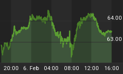
For recent context - see Here.


For recent context - see Here.

For recent context - see Here.


For recent context - see Here.


For recent context - see Here.


