


The good news is:
• New lows have remained at non threatening levels.
The negatives
The chart below covers the past 6 months showing the S&P 500 (SPX) in red and a 10% trend (19 day EMA) of NYSE new highs (NY NH) in green. Dashed vertical lines have been drawn on the 1st trading day of each month.
The SPX closed just 1.3% off its all time high while NY NH finished near its low for the year.

The next chart is similar to the one above except it shows the NASDAQ composite (OTC) in blue and OTC NH, in green, has been calculated from NASDAQ data.
The OTC closed just 0.7% off its multi year high while OTC NH is nearer its recent lows.

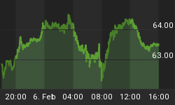
The next chart represents a clear example of what has been going on. It shows 3 indicators derived from the component issues of the Guggenheim energy fund along with the fund shown in red.
The general pattern has been, until recently, the indicators track or lead the price of the fund. As of Friday the fund hit a new multi year high while the indicators have deteriorated to a level near previous bottoms.

The positives
New lows picked up a bit last Tuesday and Wednesday, but declined to minimal levels Thursday and Friday.
The chart below covers the past 6 months showing the OTC in blue and a 40% trend (4 day EMA) of NASDAQ new highs divided by (new highs + new lows), (OTC HL Ratio) in red. Dashed horizontal lines have been drawn at 10% levels for the indicator, the line is solid at the neutral 50% level.
OTC HL Ratio fell sharply early last week, but recovered somewhat Thursday and Friday.

The next chart is similar to the one above except it shows the SPX in red and NY HL Ratio, in blue, has been calculated from NYSE data.
NY HL Ratio also rallied at the end of the week, but remains a little weaker than OTC HL Ratio.

Seasonality
Next week includes the 5 trading days prior to the 3rd Friday of October during the 1st year of the Presidential Cycle.
The tables below show the daily percentage return for the 5 trading days prior to the 3rd Friday of October during the 1st year of the Presidential Cycle.
OTC data covers the period from 1963 - 2012 while SPX data runs from 1953 - 2012. There are summaries for both the 1st year of the Presidential Cycle and all years combined. Prior to 1953 the market traded 6 days a week so that data has been ignored.
Average returns for the coming week have been modestly positive by all measures.
Report for the week before the 3rd Friday of October.
The number following the year is the position in the Presidential Cycle.
Daily returns from Monday through 3rd Friday.
| OTC Presidential Year 1 | ||||||
| Year | Mon | Tue | Wed | Thur | Fri | Totals |
| 1965-1 | 0.13% | 0.39% | 0.37% | 0.26% | 0.04% | 1.19% |
| 1969-1 | 0.65% | 1.26% | 1.27% | 0.83% | 0.36% | 4.37% |
| 1973-1 | -0.85% | 0.01% | -0.42% | 0.14% | 0.38% | -0.74% |
| 1977-1 | 0.09% | 0.11% | -0.81% | 0.15% | -0.06% | -0.51% |
| 1981-1 | 0.01% | 0.33% | -1.30% | 0.22% | 0.21% | -0.53% |
| 1985-1 | 0.89% | 0.25% | 0.60% | 0.55% | 0.05% | 2.33% |
| 1989-1 | -1.35% | -0.23% | 0.73% | 1.62% | -0.03% | 0.75% |
| Avg | -0.24% | 0.10% | -0.24% | 0.54% | 0.11% | 0.26% |
| 1993-1 | 0.44% | 0.63% | 0.84% | 0.83% | 0.26% | 2.99% |
| 1997-1 | 0.18% | -0.53% | -0.54% | -1.38% | -1.93% | -4.20% |
| 2001-1 | -0.42% | 1.52% | -2.00% | 0.39% | 1.12% | 0.61% |
| 2005-1 | 0.26% | -0.69% | 1.71% | -1.11% | 0.68% | 0.86% |
| 2009-1 | -0.01% | 0.04% | 1.51% | 0.05% | -0.76% | 0.83% |
| Avg | 0.09% | 0.19% | 0.31% | -0.24% | -0.13% | 0.22% |
| OTC summary for Presidential Year 1 1965 - 2009 | ||||||
| Avg | 0.00% | 0.26% | 0.16% | 0.21% | 0.03% | 0.66% |
| Win% | 67% | 75% | 58% | 83% | 67% | 67% |
| OTC summary for All years 1963 - 2012 | ||||||
| Avg | 0.15% | -0.02% | -0.03% | 0.19% | -0.09% | 0.18% |
| Win% | 61% | 54% | 49% | 64% | 54% | 50% |
| SPX Presidential Year 1 | ||||||
| Year | Mon | Tue | Wed | Thur | Fri | Totals |
| 1953-1 | 0.00% | -0.38% | 0.47% | 1.14% | 0.79% | 2.02% |
| 1957-1 | 0.73% | 1.04% | -0.82% | -1.65% | -0.79% | -1.47% |
| 1961-1 | -0.28% | 0.03% | 0.50% | 0.35% | 0.04% | 0.65% |
| 1965-1 | 0.57% | -0.02% | -0.01% | -0.16% | 0.21% | 0.58% |
| 1969-1 | 1.06% | 1.22% | 0.02% | 0.68% | -0.11% | 2.86% |
| Avg | 0.52% | 0.38% | 0.03% | 0.07% | 0.03% | 0.93% |
| 1973-1 | -1.25% | 0.13% | -0.20% | 0.04% | 0.19% | -1.09% |
| 1977-1 | -0.10% | -0.01% | -1.16% | 0.31% | -0.38% | -1.33% |
| 1981-1 | -0.20% | -0.35% | -1.64% | 0.77% | -0.43% | -1.86% |
| 1985-1 | 1.13% | -0.16% | 1.02% | -0.17% | -0.33% | 1.50% |
| 1989-1 | 2.00% | -0.49% | 0.18% | 1.57% | 0.01% | 3.26% |
| Avg | 0.32% | -0.18% | -0.36% | 0.50% | -0.19% | 0.10% |
| 1993-1 | 0.12% | 0.05% | 0.08% | 1.16% | 0.57% | 1.99% |
| 1997-1 | 0.12% | 0.23% | -0.47% | -1.09% | -1.16% | -2.37% |
| 2001-1 | -0.15% | 0.69% | -1.86% | -0.79% | 0.46% | -1.65% |
| 2005-1 | 0.30% | -1.00% | 1.50% | -1.50% | 0.15% | -0.56% |
| 2009-1 | 0.44% | -0.28% | 1.75% | 0.42% | -0.81% | 1.52% |
| Avg | 0.16% | -0.06% | 0.20% | -0.36% | -0.16% | -0.22% |
| SPX summary for Presidential Year 1 1953 - 2009 | ||||||
| Avg | 0.32% | 0.05% | -0.04% | 0.07% | -0.11% | 0.27% |
| Win% | 64% | 47% | 53% | 60% | 53% | 53% |
| SPX summary for all years 1953 - 2012 | ||||||
| Avg | 0.24% | -0.04% | -0.14% | 0.14% | -0.12% | 0.08% |
| Win% | 64% | 38% | 47% | 58% | 47% | 60% |
Money Supply (M2)
The money supply chart was provided by Gordon Harms. Money supply growth rose a little last week.

Conclusion
Last week was volatile with most prices ending higher, however, the breadth indicators deteriorated. The Fed has been propping up the financial markets with $85B a month, but, like the housing market in 2007-8, that can only last so long. The rally may continue for a while longer, but, it will break.
I expect the major averages to be lower on Friday October 18 than they were on Friday October 11.
Last week the OTC was down while all of the other indices were up so I am calling last weeks positive forecast a tie.
This report is free to anyone who wants it, so please tell your friends. They can sign up at: http://www.alphaim.net/signup.html. If it is not for you, reply with REMOVE in the subject line.
In his latest newsletter Jerry Minton discusses the Standard and Poor's Versus Active Funds (SPIVA) report and offers a simple method to significantly outperform both the indices and actively managed funds. You can subscribe to his free letter at: http://www.alphaim.net/
Good Luck,
YTD W 19/L 12/T 10


