


The good news is:
• We are about to enter the strongest period of the 4 year Presidential Cycle. It runs from the last few days of October during the 2nd year of the Presidential Cycle through August of the 3rd year.
The negatives
When a bottom has been reached new lows and downside volume disappear. Although the levels have declined substantially from a couple weeks ago, they remain uncomfortably high.
The chart below covers the past year showing the S&P 500 (SPX) in red and a 5% trend (39 day EMA) of NYSE downside volume, (NY DV) in maroon. NY DV has been plotted on an inverted Y axis so decreasing downside volume moves the indicator upward (up is good). Dashed vertical lines have been drawn on the 1st trading day of each month.
The SPX has recovered to within 2.3% of its all time high while NY DV is near its highest level of the year.

The next chart is similar to the one above except is shows the NASDAQ composite (OTC) in blue and OTC DV has been calculated from NASDAQ data.
OTC DV has been a little bit stronger than NY DV, but is also at an discomforting level.

You expect new highs to be at low levels near cyclical bottoms, but the blue chip indices are less than 3% off their all time highs while new highs are near 3 year lows.
The chart below covers the past year showing the SPX in red and a 10% trend (19 day EMA) of NYSE new highs (NY NH) in green.
NY NH is just off its lowest level of the past 3 years.

The next chart is similar to the one above except it shows the OTC in blue and OTC NH, in green, has been calculated from NASDAQ data.
OTC NH is also just off its lowest level of the past 3 years.

The next few weeks will be important. All of the major indices appear to be in down trends and must go to new highs soon to break those down trends.
The positives
A modest increase in new highs along with a substantial decrease in new lows has put a positive bias on indicators derived from the relationship of those data sets.
The chart below covers the past year showing the SPX in red and 40% trend (4 day EMA) of NYSE new highs divided by new highs + new lows (NY HL Ratio), in blue. Dashed horizontal lines have been drawn at 10% levels of the indicator, the line is solid at the neutral 50% level.
NY HL Ratio is in comfortably positive territory at 73% and that is off its lowest level in over 3 years just over a week ago.

The next chart is similar to the one above except it shows the OTC in blue and OTC HL Ratio has been calculated from NASDAQ data.
OTC HL Ratio just barely made it into positive territory Friday, an impressive recovery from its lowest level of the past 3 years.

Seasonality
Next week includes the last 5 trading days of October during the 2nd year of the Presidential Cycle.
The tables below show the change, on a percentage basis, of the OTC and SPX for the last 5 trading days of October during the 2nd year of the Presidential Cycle.
OTC data covers the period from 1963 to 2013 while SPX data runs from 1928 through 2013. There are summaries for both the 2nd year of the Presidential Cycle and all years combined.
Average returns for the coming week have been mixed. The strong period begins with the last 2 days of October.
Report for the last 5 days of October.
The number following the year represents its position in the Presidential Cycle.
The number following the daily return represents the day of the week;
1 = Monday, 2 = Tuesday etc.
| OTC Presidential Year 2 | ||||||
| Day5 | Day4 | Day3 | Day2 | Day1 | Totals | |
| 1966-2 | 0.27% 2 | 0.45% 3 | 0.82% 4 | 1.33% 5 | 0.40% 1 | 3.26% |
| 1970-2 | 0.48% 1 | -0.76% 2 | -1.04% 3 | -0.55% 4 | 0.22% 5 | -1.65% |
| 1974-2 | 0.45% 5 | -0.60% 1 | 1.87% 2 | 1.90% 3 | 0.54% 4 | 4.15% |
| 1978-2 | 0.02% 3 | -2.61% 4 | -2.33% 5 | -2.47% 1 | -1.14% 2 | -8.53% |
| 1982-2 | -1.40% 1 | -0.51% 2 | 1.09% 3 | -0.16% 4 | 0.36% 5 | -0.62% |
| 1986-2 | -0.02% 1 | 0.17% 2 | 0.35% 3 | 0.73% 4 | -0.08% 5 | 1.15% |
| 1990-2 | -0.36% 4 | -1.58% 5 | -1.06% 1 | -0.29% 2 | 0.00% 3 | -3.30% |
| Avg | -0.26% | -1.03% | -0.02% | -0.06% | -0.06% | -1.43% |
| 1994-2 | -0.39% 2 | 0.66% 3 | 0.55% 4 | 1.13% 5 | 0.17% 1 | 2.13% |
| 1998-2 | 1.84% 1 | -0.43% 2 | 1.09% 3 | 1.20% 4 | 0.81% 5 | 4.51% |
| 2002-2 | 2.50% 5 | -1.15% 1 | -1.16% 2 | 2.01% 3 | 0.23% 4 | 2.43% |
| 2006-2 | 0.50% 3 | 0.96% 4 | -1.20% 5 | 0.56% 1 | 0.12% 2 | 0.94% |
| 2010-2 | 0.46% 1 | 0.26% 2 | 0.24% 3 | 0.16% 4 | 0.00% 5 | 1.13% |
| Avg | 0.98% | 0.06% | -0.10% | 1.01% | 0.27% | 2.23% |
| OTC summary for Presidential Year 2 1966 - 2010 | ||||||
| Averages | 0.36% | -0.43% | -0.07% | 0.46% | 0.14% | 0.47% |
| % Winners | 67% | 42% | 58% | 67% | 83% | 67% |
| MDD 10/31/1978 8.29% -- 10/30/1990 3.27% -- 10/29/1970 2.33% | ||||||
| OTC summary for all years 1963 - 2013 | ||||||
| Averages | -0.55% | 0.20% | -0.08% | 0.26% | 0.43% | 0.28% |
| % Winners | 38% | 43% | 63% | 55% | 67% | 51% |
| MDD 10/28/1987 11.13% -- 10/31/1978 8.29% -- 10/27/1997 7.01% | ||||||
| SPX Presidential Year 2 | ||||||
| Day5 | Day4 | Day3 | Day2 | Day1 | Totals | |
| 1930-2 | 0.79% 1 | 0.45% 2 | -1.74% 3 | -1.20% 4 | -2.31% 5 | -4.00% |
| 1934-2 | -1.46% 5 | 0.11% 6 | -0.57% 1 | 0.34% 2 | 0.23% 3 | -1.34% |
| 1938-2 | -1.27% 3 | 0.53% 4 | -1.43% 5 | -0.23% 6 | 0.46% 1 | -1.93% |
| 1942-2 | -0.95% 2 | -0.85% 3 | -0.11% 4 | 0.65% 5 | 0.64% 6 | -0.62% |
| 1946-2 | -0.07% 6 | -2.04% 1 | -0.90% 2 | 0.42% 3 | 3.63% 4 | 1.04% |
| 1950-2 | -2.19% 4 | 0.82% 5 | 0.10% 6 | -0.91% 1 | -0.41% 2 | -2.59% |
| Avg | -1.19% | -0.29% | -0.58% | 0.05% | 0.91% | -1.09% |
| 1954-2 | -0.53% 1 | -0.06% 2 | 0.25% 3 | -0.44% 4 | -0.63% 5 | -1.41% |
| 1958-2 | -0.77% 1 | 0.38% 2 | 1.15% 3 | 0.16% 4 | 0.12% 5 | 1.03% |
| 1962-2 | -0.94% 4 | -0.27% 5 | 2.16% 1 | 1.47% 2 | -0.04% 3 | 2.38% |
| 1966-2 | 0.61% 2 | 0.86% 3 | 0.82% 4 | 0.01% 5 | -0.05% 1 | 2.25% |
| 1970-2 | -0.55% 1 | -0.23% 2 | 0.37% 3 | -0.08% 4 | -0.13% 5 | -0.62% |
| Avg | -0.44% | 0.13% | 0.95% | 0.22% | -0.15% | 0.73% |
| 1974-2 | -0.14% 5 | -0.04% 1 | 3.91% 2 | 2.03% 3 | -0.55% 4 | 5.20% |
| 1978-2 | -0.18% 3 | -1.32% 4 | -1.50% 5 | 0.50% 1 | -2.01% 2 | -4.51% |
| 1982-2 | -4.00% 1 | 0.87% 2 | 0.59% 3 | -1.25% 4 | 0.09% 5 | -3.69% |
| 1986-2 | 0.21% 1 | 0.21% 2 | 0.70% 3 | 1.15% 4 | 0.11% 5 | 2.38% |
| 1990-2 | -0.78% 4 | -1.76% 5 | -0.93% 1 | 0.72% 2 | -0.02% 3 | -2.76% |
| Avg | -0.98% | -0.41% | 0.56% | 0.63% | -0.48% | -0.68% |
| 1994-2 | 0.15% 2 | 0.24% 3 | 0.70% 4 | 1.70% 5 | -0.30% 1 | 2.49% |
| 1998-2 | 0.15% 1 | -0.65% 2 | 0.26% 3 | 1.67% 4 | 1.18% 5 | 2.60% |
| 2002-2 | 1.72% 5 | -0.83% 1 | -0.91% 2 | 0.97% 3 | -0.55% 4 | 0.40% |
| 2006-2 | 0.35% 3 | 0.50% 4 | -0.85% 5 | 0.04% 1 | 0.00% 2 | 0.05% |
| 2010-2 | 0.21% 1 | 0.00% 2 | -0.27% 3 | 0.11% 4 | -0.04% 5 | 0.02% |
| Avg | 0.52% | -0.15% | -0.21% | 0.90% | 0.06% | 1.11% |
| SPX summary for Presidential Year 2 1930 - 2010 | ||||||
| Averages | -0.46% | -0.15% | 0.09% | 0.37% | -0.03% | -0.17% |
| % Winners | 38% | 52% | 52% | 71% | 43% | 52% |
| MDD 10/31/1930 5.15% -- 10/31/1978 4.45% -- 10/25/1982 4.00% | ||||||
| SPX summary for all years 1928 - 2013 | ||||||
| Averages | -0.51% | 0.14% | -0.04% | 0.39% | 0.21% | 0.17% |
| % Winners | 36% | 60% | 53% | 57% | 57% | 55% |
| MDD 10/29/1929 21.78% -- 10/26/1987 8.28% -- 10/31/1933 6.96% | ||||||
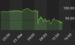
Money Supply (M2)
The money supply chart was provided by Gordon Harms. M2 growth has fallen sharply in the past few weeks.

Conclusion
We have seen a sharp recovery from the bottom and the next 2 weeks seasonally have been 2 of the strongest of the year.
I expect the major averages to be higher on Friday October 31 than they were on Friday October 24.
This report is free to anyone who wants it, so please tell your friends. They can sign up at: http://www.stockmarket-ta.com/signup.html. If it is not for you, reply with REMOVE in the subject line.
These reports are archived at: http://www.safehaven.com/
Good Luck,
YTD W 13 / L 16 / T 14


