


The good news is:
• The next 6 months are, by far, the strongest 6 month period in the 4 year Presidential Cycle.
The negatives
It is difficult to make a negative case because the market has been following the average seasonal pattern pretty closely. That pattern has been to drift upward on low volume.
The positives
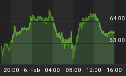
The chart below covers the past 6 months showing the NASDAQ composite (OTC) in blue and a 40% trend (4 day EMA) of NASDAQ new highs divided by new highs + new lows (OTC HL Ratio), in red. Dashed vertical lines have been drawn on the 1st trading day of each month and dashed horizontal lines have been drawn at 10% levels of the indicator, the line is solid at the neutral 50% level.
OTC HL ratio declined a bit last week, but closed the week at a comfortable 73%.

The next chart is similar to the one above except is shows the SPX in red and NY HL Ratio, in blue, has been calculated from NYSE data.
NY HL Ratio also declined, but finished the week at a very strong 82%.

Seasonality
Next week includes the 5 trading days prior to the 2nd Friday of January during the 3rd year of the Presidential Cycle.
The tables below show the daily change, on a percentage basis for the 5 trading days prior to the 2nd Friday of January during the 3rd year of the Presidential Cycle.
OTC data covers the period from 1963 to 2013 while SPX data runs from 1953 through 2013. There are summaries for both the 2nd year of the Presidential Cycle and all years combined. Prior to 1953 the market traded 6 days a week so that data has been ignored.
Average returns for the coming week have been positive by all measures and extremely strong during the 3rd year of the Presidential Cycle.
Report for the week before the 2nd Friday of January
The number following the year is the position in the Presidential Cycle.
Daily returns from Monday to 2nd Friday.
| OTC Presidential Year 3 | ||||||
| Year | Mon | Tue | Wed | Thur | Fri | Totals |
| 1963-3 | -0.42% | -0.03% | -0.03% | 0.42% | -0.93% | -1.00% |
| 1967-3 | 0.76% | 0.50% | -0.24% | 1.72% | 0.61% | 3.35% |
| 1971-3 | 0.59% | 0.36% | 1.40% | 0.13% | 1.07% | 3.55% |
| 1975-3 | 0.83% | 0.24% | -0.63% | 1.41% | 2.12% | 3.98% |
| 1979-3 | -0.11% | 0.61% | -0.31% | 0.39% | 0.80% | 1.38% |
| 1983-3 | 3.10% | -2.09% | 0.86% | 0.23% | 0.88% | 2.98% |
| 1987-3 | 2.24% | 1.34% | 1.77% | 1.36% | 0.82% | 7.53% |
| 1991-3 | -1.91% | -0.34% | -0.43% | 1.25% | -0.03% | -1.46% |
| Avg | 0.83% | -0.05% | 0.25% | 0.93% | 0.92% | 2.88% |
| 1995-3 | 0.32% | 0.59% | -0.10% | -0.01% | 0.86% | 1.66% |
| 1999-3 | 1.72% | -2.68% | -0.17% | -1.73% | 3.14% | 0.28% |
| 2003-3 | 2.47% | 0.72% | -2.13% | 2.67% | 0.64% | 4.37% |
| 2007-3 | 0.16% | 0.23% | 0.63% | 1.04% | 0.72% | 2.79% |
| 2011-3 | 0.17% | 0.33% | 0.75% | -0.07% | 0.73% | 1.92% |
| Avg | 0.97% | -0.16% | -0.20% | 0.38% | 1.22% | 2.20% |
| OTC summary for Presidential Year 3 1963 - 2011 | ||||||
| Avg | 0.76% | -0.02% | 0.10% | 0.68% | 0.88% | 2.41% |
| Win% | 77% | 69% | 38% | 77% | 85% | 85% |
| OTC summary for all years 1963 - 2014 | ||||||
| Avg | 0.36% | -0.07% | -0.03% | 0.47% | 0.19% | 0.92% |
| Win% | 65% | 54% | 52% | 73% | 69% | 65% |
| SPX Presidential Year 3 | ||||||
| Year | Mon | Tue | Wed | Thur | Fri | Totals |
| 1955-3 | 1.30% | -0.31% | -0.28% | -0.42% | -0.42% | -0.13% |
| 1959-3 | 0.40% | -0.13% | -1.26% | 0.93% | 0.67% | 0.61% |
| 1963-3 | -0.02% | 0.97% | -0.23% | 0.19% | 0.22% | 1.12% |
| 1967-3 | 0.77% | 0.00% | 0.80% | 0.53% | 0.74% | 2.83% |
| 1971-3 | -0.23% | 0.80% | -0.17% | 0.26% | 0.25% | 0.91% |
| Avg | 0.44% | 0.33% | -0.23% | 0.30% | 0.29% | 1.07% |
| 1975-3 | 0.51% | -0.07% | -1.38% | 1.61% | 2.02% | 2.70% |
| 1979-3 | -0.33% | 0.54% | -0.56% | 0.33% | 0.84% | 0.81% |
| 1983-3 | 1.10% | -0.68% | 0.62% | -0.65% | 0.63% | 1.02% |
| 1987-3 | 2.33% | 0.23% | 1.01% | 0.76% | 0.56% | 4.90% |
| 1991-3 | -1.73% | -0.17% | -1.08% | 0.98% | 0.22% | -1.79% |
| Avg | 0.38% | -0.03% | -0.28% | 0.61% | 0.86% | 1.53% |
| 1995-3 | 0.03% | 0.18% | 0.00% | -0.01% | 0.94% | 1.15% |
| 1999-3 | -0.88% | -1.93% | -0.41% | -1.80% | 2.57% | -2.45% |
| 2003-3 | 2.25% | -0.65% | -1.41% | 1.94% | 0.00% | 2.12% |
| 2007-3 | 0.22% | -0.05% | 0.19% | 0.63% | 0.49% | 1.48% |
| 2011-3 | -0.14% | 0.37% | 0.90% | -0.17% | 0.74% | 1.70% |
| Avg | 0.30% | -0.42% | -0.15% | 0.12% | 0.95% | 0.80% |
| SPX summary for Presidential Year 3 1955 - 2011 | ||||||
| Avg | 0.37% | -0.06% | -0.22% | 0.34% | 0.70% | 1.13% |
| Win% | 60% | 43% | 33% | 67% | 87% | 80% |
| SPX summary for all years 1953 - 2014 | ||||||
| Avg | 0.11% | -0.17% | -0.23% | 0.25% | 0.05% | 0.01% |
| Win% | 56% | 41% | 44% | 72% | 53% | 53% |
Money Supply (M2)
The money supply chart was provided by Gordon Harms. M2 growth fell last week.

Presidential Year 3 (PY3)
PY3 is, on average, the strongest of the 4 years in the Presidential Cycle and most of that strength occurs in the 1st 6 months.
Since 1963, over all years, the OTC has been up 73% of the time with an average yearly gain of 13.4%. During PY3 the OTC has been up 85% time with an average gain of 31.5%. The best PY3 ever for the OTC was 1999 (+85.6%), the worst 2011 (-1.8%).
The charts below show the average daily return over all years and for PY3. Dashed vertical lines have been drawn on the 1st trading day of each month.
In the chart below the blue line shows the average of the OTC over all years since 1963 while the grey line shows the average during PY3 over the same period.

Since 1928, over all years, the SPX has been up 67% of the time with an average yearly gain of 7.6%. During PY3 the SPX has been up 85% of the time with an average yearly gain of 14.1%. The best PY3 ever for the SPX was 1935 (+41.4%), the worst 1931 (-47.1%).
The chart below is similar to the one above except it shows the average daily performance over all years for the SPX in red and the performance during PY3 in grey.

Since 1979, over all years, the Russell 2000 (R2K) has been up 71% of the time with an average yearly gain of 11.8%. During PY3 the R2K has been up 67% time with an average gain of 19.7%. The best PY3 ever for the R2K was 2003 (+45.4%), the worst 1987 (-10.3%).
The chart below is similar to those above except it shows the daily performance over all years of the R2K in magenta and the performance during PY3 in grey.

Since 1885, over all years, the Dow Jones Industrial Average (DJIA) has been up 66% of the time with an average yearly gain of 7.2%. During PY3 the DJIA has been up 81% time with an average yearly gain of 11.3%. The best PY3 ever for the DJIA was 1915 (+81.7%), the worst 1931 (-52.7%).
The chart below is similar to those above except it shows the daily performance over all years of the DJIA in cyan and the performance during the PY3 in grey.

Conclusion
The market shed its overbought status last week and appears ready to rally into what has been seasonally a very strong week.
I expect the major averages to be higher on Friday January 9 than they were on Friday January 2.
Last weeks positive forecast was a miss.
This report is free to anyone who wants it, so please tell your friends. They can sign up at: http://www.stockmarket-ta.com/signup.html. If it is not for you, reply with REMOVE in the subject line.
These reports are archived at: http://www.safehaven.com/
As usual, you got what you paid for from my weekly forecasts last year.
The final score for the year was: W 19 / L 17 / T 17, about as close to a coin toss as you are going to get. I start the new year every year fresh.
The rules are: To be a win the DJIA, SPX, OTC and R2K must all have moved in the direction I forecast. It is a loss when they all go opposite my forecast and if they do not all go in the same direction it is recorded as a tie. Most of my losses this year came from being overly pessimistic.
Good Luck,
YTD W 0 / L 0 / T 0


