


The stock market rebound continues grinding higher. It's not earnings or data that is pushing equity prices higher as both are mixed to mediocre. It is primarily U.S. Federal Reserve low rate policy and worldwide Central Bank accommodation that has global markets recovering from last month's crash. Stocks ended higher a third consecutive week as investors appeared to shrug off weak corporate earnings and mixed economic data. The rally over the past three weeks has been very narrow in scope with two-thirds of the stocks on the S&P 500 still below their 200-day moving average. The S&P 500's three weeks of gains marked its longest winning streak since May, extending a rebound from the market's August sell-off.
For the week, the S&P 500 Index rose a modest 0.8% while the Blue Chip-heavy Dow Jones Industrial Average's hit a third straight week of gains by rising 0.9%. The Nasdaq index finished the week popping up 1.5% and the small cap Russell 2000 was actually flat for the week. About 6.6 billion shares changed hands on U.S. exchanges, compared with the 7.5 billion daily average for the past 20 trading days, according to Thomson Reuters data.

A tool to help confirm the overall market trend is the Bullish Percent Index (BPI). The Bullish Index is a popular market "breadth" indicator used to gauge the internal strength/weakness of the market. It is the number of stocks in an index (or sector) that have point & figure buy signals relative to the total number of stocks that comprise the index (or sector). So essentially it is the percentage of stocks that have buy signals. Like many of the market internal indicators, it is used both to confirm a move in the market and as a non-confirmation and therefore divergence indication. If the market is strong and moving up, the BPI should also be moving higher as more and more stocks are purchased. As highlighted in the updated chart below, the S&P 500 Bullish Percentage Index has gotten extremely overbought as the recent market uptrend is converting into a neutral trading range. The market will probably need to absorb this overbought condition before the prices break above the trading range.

In the chart below, the Aggregate Bond ETF (AGG) represents the "bond" market and the Equal-Weight S&P 500 ETF (RSP) is the stock market benchmark. The stock market rebound has not come at the expense of the bond market where as money continues to flow in and fear of a rate hike seems pretty low.

A standard chart that we use to help confirm the overall market trend is the Momentum Factor ETF (MTUM) chart. Momentum Factor ETF is an investment that seeks to track the investment results of an index composed of U.S. large- and mid-capitalization stocks exhibiting relatively higher price momentum. This type of momentum fund is considered a reliable proxy for the general stock market trend. We prefer to use the Heikin-Ashi format to display the Momentum Factor ETF. Heikin-Ashi candlestick charts are designed to filter out volatility in an effort to better capture the true trend. As highlighted in the updated chart below, the recent market uptrend is converting into a flat trading range. Also noted is neutral momentum, which supports the analysis suggesting a relatively narrow, trading range.

Market Outlook
Forecasts for S&P 500 earnings improved slightly as more companies reported results. Third-quarter earnings are now expected to have fallen 3.9 percent, compared with Monday's forecast for a decline of 4.8 percent, according to Thomson Reuters data. As evidenced in the graph below, most of the major asset classes have been struggling since the start of the second quarter. The Real Estate sector is booming as it benefits from the prospect of continued low interest rates. We need a strong fourth quarter to pull these asset classes into positive territory.

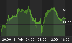
During the week, the dollar fell to a four week low versus a currency basket after weaker-than-expected readings of domestic retail sales and producer prices further cut expectations the Fed would raise rates later this year. "The U.S. retail data have taken all the singing and dancing away from the U.S. dollar, which is under heavy selling pressure and hence we are experiencing another massive upward move for the precious metal," Naeem Aslam, chief market analyst at Ava Trade, said. "The data represents the most naked form of consumer confidence and it showed that the U.S. consumers are holding back. This has pushed out the rate hike expectations which were the biggest drag on gold prices." As reported in Reuters. Gold is a non-yielding asset and similar to Treasury bonds it is benefitting from ultra-low rates.

We like to compare the DOW Industrials and Transports to confirm the current market trend. Notice in the current chart below how the Transportation index is breaking down. This should be considered a strong negative against the DOW Industrials breaking out to new highs. Transports have been a leading indicator for overall market direction and if this behavior continues it signals the blue-chip index is near a top.

The chart below provides further insight into the strength of the current trend. Note that the small capitalization Russell 2000 index is lagging the larger cap DOW and S&P indexes. The dollar is crashing which benefits larger companies that comprise the large cap indexes. A sinking dollar equates to cheaper export prices for domestic companies. Lower Russell 2000 prices suggest investors are trading "Risk off" and unless this index catches up to the large cap indexes it cast some doubt on how much higher the market will rise.

The CBOE Volatility Index (VIX) is known as the market's "fear gauge" because it tracks the expected volatility priced into short-term S&P 500 Index options. When stocks stumble, the uptick in volatility and the demand for index put options tends to drive up the price of options premiums and sends VIX higher. Last week we observed, "...the VIX and S&P intersected as the stocks moved up and volatility sank. We now have a confirmation that the market has bottomed and converted into an uptrend..." It is reasonable to expect the VIX to continue heading downward while the S&P index creeps higher.

While equity indexes posted weekly gains, the Volatility Index dropped 11% this week. The VIX is consolidating at lower levels and is currently near $15. Last week's analysis said, "...the VIX is in a confirmed downtrend with bearish momentum...there is room for the VIX to continue falling before being oversold..." As highlighted in the updated chart, the Volatility Index continues to crash in a confirmed downtrend with more room to fall.

Put/Call Ratio is the ratio of trading volume of put options to call options. The Put/Call Ratio has long been viewed as an indicator of investor sentiment in the markets. Times where the number of traded call options outpaces the number of traded put options would signal a bullish sentiment, and vice versa. Technical traders have used the Put/Call Ratio for years as an indicator of the market. Most importantly, changes or swings in the ratio are seen as instances of great importance as this is commonly viewed as a change in the tide of overall market sentiment. Last week we mentioned, "...traders are now extremely bullish...traders are buying more calls to bet on stocks as earning season progresses. Plus there are rumors floating around suggesting that many of the big hedge funds and prop trading firms had 'lifted' their downside protection hedges..." This analysis is playing out as advertised as traders continue buying calls to place bets during quarterly earnings season. This allows traders to make bullish trades and minimize risks with a limited capital outlay.

The American Association of Individual Investors (AAII) Sentiment Survey measures the percentage of individual investors who are bullish, bearish, and neutral on the stock market for the next six months; individuals are polled from the ranks of the AAII membership on a weekly basis. The current survey result is for the week ending 10/14/2015. The most recent AAII survey showed 34.10% are Bullish and 27.10% Bearish, while 38.80% of investors polled have a Neutral outlook for the market for the next six months. We recently said, "...as the market is bouncing higher...AAII survey supports follow-through on the current bullish market move..." As this analysis has been validated, the current AAII survey signals moderately higher market prices.

The Nation Association of Active Investment Managers (NAAIM) Exposure Index represents the average exposure to US Equity markets reported by NAAIM members. The blue bars depict a two-week moving average of the NAAIM managers' responses. As the name indicates, the NAAIM Exposure Index provides insight into the actual adjustments active risk managers have made to client accounts over the past two weeks. The current survey result is for the week ending 10/14/2015. Third-quarter NAAIM exposure index averaged 56.15%. Last week the NAAIM exposure index was 38.30%, and the current week's exposure is 44.27%. Last week we said "...NAAIM equity exposure is starting to bounce after falling to the lows for the year..." Professional money managers followed through on last week's bounce. The current NAAIM Exposure index is the highest since the beginning of August.

Trading Strategy
According to the Stock Trader's Almanac, this is the S&P 500's best October start since 2011 and good enough to be the eighth best start since 1950. Historically when the first nine trading days of October produced a gain, full month October finished with a gain 78.5% of the time and November and December combined were positive 76.2% of the time. Twenty-three of 42 past early October gains (54.8%) held and grew by month end. In the graph below we can see that over the past month, 9 of the 10 major S&P sectors are positive. Healthcare is the only losing sector during this period. The recent rally is led by cyclical stocks, which are composed of the Energy, Materials, and Industrials sectors. We recently recommended reducing bearish bias and moderately increasing bullish bets.

Feel free to contact me with questions,


