


The good news is:
• Except for the Dow Jones Industrial Average (DJIA), all of the major averages closed at multi year highs on Friday. (Same as last week)
Last week was similar to the previous week. Before I write this report I collect a bunch of charts that illustrate what is going on. This week all of the charts that caught my eye were updates of from last week.
The average seasonal pattern for the 2nd year of the Presidential Cycle shows the market peaking in late April and bottoming in early to mid October. The strongest part of the 4 year Presidential Cycle occurs from October of year 2 to October of Year 3. In 2006 the market bottomed in mid July and continued upward for the rest of the year; 2010 appears to be following a similar pattern.
The first chart covers a 6 month period from mid June 2006 through mid December 2006 showing the S&P 500 (SPX) in red the NASDAQ composite (OTC) in blue the Russell 2000 (R2K) in green and the S&P mid cap (MID) in black. Dashed vertical lines have been drawn on the 1st trading day of each month. The indices have been plotted on log scales to show their relative performance.

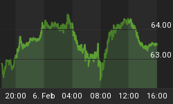
The next chart is similar to the one above except it shows the current year ending last Friday. The patterns and performance are similar.

The next chart shows how the same indices performed from the 2006 bottom up to an early 2007 high prior to a rather nasty break in late February.

The negatives
Advance - Decline lines (ADL) are a running total of declining issues subtracted from advancing issues.
The chart below covers the past year showing the SPX in red and the NYSE ADL in blue.
The SPX closed at a multi year high Friday while the NYSE ADL again failed to confirm that high.

NYSE new highs continued to fall last week hitting a 3 week low of 120 on Thursday.
The chart below covers the past year showing the SPX in red and a 10% trend of NYSE new highs (NY NH) in green.
NY NH fell while the SPX rose to a new multi year high.

The next chart is similar to the one above except it shows the OTC in blue and OTC NH has been calculated from NASDAQ data.
OTC NH was a little weak while the OTC hit a multi year high.

The next chart shows the SPX in red and a 10% trend of NYSE new lows (NY NL) in blue. NY NL has been plotted on an inverted Y axis so decreasing new lows move the indicator upward (up is good).
Last week new lows increased while the SPX was rising.

The positives
The chart below is an update of one I have been showing every week, it covers the past year showing the OTC in blue and a 40% trend (4 day EMA) of the ratio of NASDAQ new highs to new highs + new lows (OTC HL Ratio) in red. Dashed horizontal lines have been drawn at 10% levels of the indicator; the line is solid at the neutral 50% level.
There are trading systems that impose a No Sell filter when variations of this indicator are above 80%. It held close to 90% all week.

The next chart is similar to the one above except is shows the SPX in red and NY HL Ratio shown in dark blue has been calculated from NYSE data.
NY HL Ratio continued to underperform OTC HL Ratio, however, both are very strong.

The chart below covers the past 6 months showing the OTC in blue and an advance - decline line calculated from NASDAQ data (OTC ADL) in green.
OTC ADL closed at a 6 month high on Friday.

Seasonality
Next week includes the 5 trading days prior to Christmas during the 2nd year of the Presidential Cycle.
The tables below show the return on a percentage basis for the 5 trading days prior to Christmas during the 2nd year of the Presidential Cycle. OTC data covers the period from 1963 - 2009 and SPX data from 1953 - 2009. There are summaries for both the 2nd year of the Presidential Cycle and all years combined. Prior to 1953 the market traded 6 days a week so that data has been ignored. I also looked at performance prior to the 4th Friday in December and the figures were similar.
Returns by all measures have been modestly positive.
5 days before Christmas.
The number following the year represents its position in the presidential cycle.
The number following the daily return represents the day of the week;
1 = Monday, 2 = Tuesday etc.
| OTC Presidential Year 2 | ||||||
| Day5 | Day4 | Day3 | Day2 | Day1 | Totals | |
| 1966-2 | 0.18% 1 | -0.38% 2 | 0.47% 3 | 0.84% 4 | 0.34% 5 | 1.46% |
| 1970-2 | 0.28% 5 | -0.44% 1 | 0.12% 2 | -0.17% 3 | 0.13% 4 | -0.08% |
| 1974-2 | 0.74% 3 | -0.29% 4 | -1.33% 5 | -1.38% 1 | 0.76% 2 | -1.49% |
| 1978-2 | -2.62% 1 | 0.35% 2 | 0.52% 3 | 0.45% 4 | 0.93% 5 | -0.37% |
| 1982-2 | 1.48% 5 | -0.46% 1 | 0.28% 2 | 1.10% 3 | 0.56% 4 | 2.96% |
| 1986-2 | -0.26% 4 | 0.24% 5 | -0.27% 1 | -0.72% 2 | 0.25% 3 | -0.76% |
| Avg | -0.08% | -0.12% | -0.13% | -0.14% | 0.52% | 0.05% |
| 1990-2 | 1.22% 2 | 0.28% 3 | 0.29% 4 | 0.35% 5 | -0.32% 1 | 1.82% |
| 1994-2 | -0.16% 1 | 0.09% 2 | 1.22% 3 | 0.26% 4 | 0.39% 5 | 1.79% |
| 1998-2 | 2.06% 5 | 2.49% 1 | -0.80% 2 | 2.43% 3 | -0.44% 4 | 5.75% |
| 2002-2 | -2.19% 3 | -0.54% 4 | 0.66% 5 | 1.37% 1 | -0.67% 2 | -1.38% |
| 2006-2 | -0.88% 1 | -0.25% 2 | -0.08% 3 | -0.48% 4 | -0.61% 5 | -2.30% |
| Avg | 0.01% | 0.41% | 0.26% | 0.78% | -0.33% | 1.14% |
| OTC summary for Presidential Year 2 1966 - 2006 | ||||||
| Averages | -0.01% | 0.10% | 0.10% | 0.37% | 0.12% | 0.67% |
| %Winners | 55% | 45% | 64% | 64% | 64% | 45% |
| MDD 12/23/1974 2.97% -- 12/19/2002 2.73% -- 12/18/1978 2.62% | ||||||
| OTC summary for all years 1963 - 2009 | ||||||
| Averages | 0.08% | 0.03% | -0.09% | 0.27% | 0.32% | 0.62% |
| %Winners | 55% | 48% | 55% | 66% | 66% | 57% |
| SPX Presidential Year 2 | ||||||
| Day5 | Day4 | Day3 | Day2 | Day1 | Totals | |
| 1954-2 | 0.26% 5 | 0.89% 1 | 0.14% 2 | -0.11% 3 | 0.08% 4 | 1.26% |
| 1958-2 | 0.43% 4 | -0.15% 5 | -0.67% 1 | -0.54% 2 | 1.29% 3 | 0.36% |
| 1962-2 | -0.48% 2 | 0.82% 3 | 0.38% 4 | -0.29% 5 | -0.02% 1 | 0.42% |
| 1966-2 | -0.38% 1 | -0.38% 2 | 0.52% 3 | 0.38% 4 | -0.27% 5 | -0.13% |
| 1970-2 | 0.20% 5 | -0.31% 1 | 0.11% 2 | 0.07% 3 | 0.57% 4 | 0.63% |
| 1974-2 | 0.47% 3 | -0.37% 4 | -1.09% 5 | -1.42% 1 | 1.39% 2 | -1.01% |
| 1978-2 | -1.98% 1 | 0.86% 2 | 0.47% 3 | 0.03% 4 | 1.69% 5 | 1.06% |
| 1982-2 | 1.62% 5 | -0.89% 1 | 1.72% 2 | 0.16% 3 | 0.64% 4 | 3.25% |
| 1986-2 | -0.32% 4 | 1.20% 5 | -0.39% 1 | -0.97% 2 | 0.17% 3 | -0.31% |
| Avg | 0.00% | 0.10% | 0.16% | -0.43% | 0.89% | 0.72% |
| 1990-2 | 1.24% 2 | 0.05% 3 | -0.02% 4 | 0.49% 5 | -0.56% 1 | 1.19% |
| 1994-2 | -0.19% 1 | -0.18% 2 | 0.55% 3 | 0.02% 4 | 0.03% 5 | 0.23% |
| 1998-2 | 0.68% 5 | 1.25% 1 | 0.07% 2 | 2.07% 3 | -0.18% 4 | 3.88% |
| 2002-2 | -1.31% 3 | -0.77% 4 | 1.30% 5 | 0.18% 1 | -0.55% 2 | -1.15% |
| 2006-2 | -0.32% 1 | 0.22% 2 | -0.14% 3 | -0.37% 4 | -0.53% 5 | -1.15% |
| Avg | 0.02% | 0.11% | 0.35% | 0.48% | -0.36% | 0.60% |
| SPX summary for Presidential Year 2 1954 - 2006 | ||||||
| Averages | -0.01% | 0.16% | 0.21% | -0.02% | 0.27% | 0.61% |
| %Winners | 50% | 50% | 64% | 57% | 57% | 64% |
| MDD 12/23/1974 2.86% -- 12/19/2002 2.08% -- 12/18/1978 1.98% | ||||||
| SPX summary for all years 1953 - 2009 | ||||||
| Averages | 0.12% | 0.04% | 0.06% | -0.02% | 0.28% | 0.47% |
| %Winners | 52% | 42% | 55% | 47% | 70% | 67% |
Money supply (M2)
The money supply chart was provided by Gordon Harms. In spite of QE2 money supply growth declined a little last week.

Conclusion
Seasonality is likely to dominate the rest of the year. Monday and Tuesday could be weak, but, after that, the pattern is likely to be a modest upward bias on very low volume.
I expect the major averages to be higher on Friday December 24 than they were on Friday December 17.
Last weeks forecast was a miss. This report is free to anyone who wants it, so please tell your friends. They can sign up at: http://alphaim.net/signup.html. If it is not for you, reply with REMOVE in the subject line.
In his latest newsletter Jerry Minton looks at the idea that continuous exposure to stocks is the way to get the "average" long-term return of the market. If you are retired or about to retire, you will want to read "Unnecessary Risks" at www.alphaim.net and sign-up for Jerry's free bi-weekly newsletter.
Thank you,


