


Always look at any Short Term charts in the perspective of its Long Term view.
I received a call last week from an investor named John who was "up in arms" and panicked by what he was seeing on the New York Stock Exchange's daily "New Lows". The New Lows indicator tell's you how many stocks are falling lower and lower.
That is what happens during a correction ... more and more stocks go down, and then as people try to get out in a panic, the stocks go lower and more stocks are added to the list. This generally continues until stocks are undervalued enough for buyers to swarm in, thus ending the panic selling.
So why was John calling in a panic?
It was because he was looking at a chart on the New Lows that showed less than a year and a half of data. For some indicators like the New Lows, you cannot get a true picture of what they are saying unless you go back far enough historically to see what the behavior looks like during bear markets. So today, we will look at the John's time period and then go back deeper in time to see how that changes your perception of what is really going on.
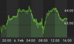
First, below is the chart time period that John was looking at. The chart looked great until last May, and then it looked ugly ... as if there were a lot of stocks being sold in a panic.
But, what is considered a lot of stocks from a long term perspective? And look at the amount of stocks reaching New Lows ... sometimes as high as 100 or more and sometimes below 10. So, are those numbers really significant when there are thousands of stocks in the market?
To get a better perspective of what is really going on, let's go to the second chart ...

This second chart goes back almost three and a half years and into the past bear market.
*** Now, take a look at the number of stocks reaching New Lows during the bear market versus what has been going on since last May.
Comparatively, the current amount of New Lows looks quite tame compared to what happened in 2007, 2008, and the beginning of 2009. Back then, there was up to 692 stocks per day hitting new lows, and yesterday .... there was 5.
Five ... not a very large number when you look at it from a longer term perspective, is it?
You may have noticed the black horizontal line on the chart. I draw that particular line at a level of 50 on all my New Lows charts. The reason, is that historically, the market is under duress when the New Lows are above 50.
*** As an indicator, a New Lows chart is less useful when used by itself. It is much better to use the New Lows in conjunction with a group of other indicators to get the big picture.
*** And, it is much better to look at indicators over long periods of time to see their behavior relationship with the market.
So, John's basis for panicking was not well founded by looking only at the New Lows. It would be MUCH better if John was looking at data like Institutional Accumulation or Distribution, inflowing Liquidity levels, and Acceleration levels in a rally rather than momentum.
Tomorrow is New Year's day, and many people are busy making New Year's resolutions. Most investors continue to invest with the same old knowledge, using the same old charts. The markets are changing, and some new data sources are becoming extremely important. A resolution by investors to "learn more about market behavior" this year probably wouldn't be a bad idea.
Pick up a new book and add some new tools to your trading this year. Books like "The Master Swing Trader" are good, "Entries and Exits" is excellent, or books that are more technical like Tom DeMark's books are also excellent.
We hope you have a safe and fun New Year ... and, we will see you again on Monday.


