

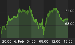


The stock market fell, fairly hard. The S&P ended the day down 1.9%, just a smidge above the lows from late Feb although the actual close was the lowest since the end of January. The similarity of the last couple of weeks of price action to that which we saw in November is probably lost on no one (but just in case, see the two charts below). The only difference of note so far is that in November, right before the next stage of the rocket higher, the market tested the range lows but managed to close well above them while in this case, we're closing right at the bottom of the range. In any event I wouldn't take the November experience to be a roadmap of any sort, but the similarities are at once eerie and encouraging given what ensued after November.

The S&P in November.

The S&P, recently.
With our quota of encouraging anecdotes fulfilled for the day, we may continue. 10y note yields also reached the lowest levels seen since January. However, 10y TIPS yields fell to 0.88%, as low as they have been since early December. 10-year inflation swaps, however, are just a bit off their highs for the year. Indeed, over the last month nominal yields are down about 34bps at the 10y point, but TIPS yields are -49bps while 10y breakevens are +15bps.
The combination of these two details - a decline in nominal rates that is almost entirely the product of a decline in real rates rather than of a decline in inflation expectations, plus softening equity markets - would lead the market detective in me to suspect that a change in growth expectations is in the air. On this point we get some confirmation from a general softening in commodities. Crude was down -1.8% and gasoline -0.5% despite news that Saudi police had opened fire on protestors today, one day ahead of the 'Day of Rage' scheduled for tomorrow. But Grains were -1.4%, Livestock -0.2%, Softs -4.3% (mostly Coffee and Sugar), and Precious Metals -1.6% (the source for all of these summary numbers is the one-day change in the relevant DJ-UBS Spot commodity subindex).
Some observers saw the decline in nominal yields and in stock prices as indicative of a flight to quality, perhaps because Spain was downgraded one notch by Moody's today with a continuing negative outlook or on the Saudi police-shooting-of-protestors news. But if that were the case, I would have expected to see a bigger move in bonds of the periphery countries (10y Spanish yields were up a whopping 1bp while Greek bonds rallied) or a rise in oil prices. And yet, neither of those things happened. This might be just a plain old re-assessment of growth dynamics.
Why that reassessment would happen today is a little beyond me. Sure, Initial Claims were worse-than-expected at 397k, but that series still appears to be trending lower overall (the big miss, though, means that volatility is still a big problem for analysts trying to evaluate the series). And yet, that still seems to be the cleanest explanation.
The quarterly Flow-of-Funds (Z.1) report was released by the Fed today, showing - and this is what leads the news - that household net worth rose $2.1 trillion on the quarter due mostly to gains in the equity markets. That sounds like a big number, and would make us feel pretty good if we didn't all know by now just how ephemeral those stock gains are. And, in fact, other parts of the Z.1 help remind us of that fact. With this report in hand, we can update Tobin's Q to the end of the year and find that the ratio of market value to replacement cost is about 1.1, which is roughly 45% above the average since 1952.That means we can now officially say that with the exception of the equity bubble, stocks have not been as richly priced on Tobin's Q as they are now in the entire post-war period (see Chart).

Tobin's Q (shown as a ratio to the average Q)
The Z.1 also allows us to update a couple of other goodies. The first chart below shows the public debt (state, local, and federal, plus Fannie Mae and Freddie Mac as of 2008), private debt, and total debt as a percentage of GDP. It is pretty clear what is going on here. The federal government has essentially stepped in to try and make up for the deleveraging in the private sector.

Uncle Sam is helping us keep levered as a society. Thanks, Sam!
Total public sector debt outstanding as a proportion of GDP rose in Q4 from 88.7% to 90.6%. As recently as 2008Q2, it was 52.4%. Overall debt is 340% of GDP, down from 341% last quarter and 363% in the first quarter of 2009. But before getting too excited about this deleveraging, reflect that as of June 2008, total debt was 340% of GDP. In other words, all the credit crisis has done is to shift the debt from the private side of the ledger to the public side of the ledger. I've noted in the past that the division of debt between public and private is important for the inflation dynamic. Societies with heavy burdens of private debt tend to disinflation; societies with heavy burdens of public debt tend to inflation. As the next chart shows, before the crisis the total private debt had reached a level about 5.5x the size of the state and local debt. Since mid-2008, the ratio has fallen back to 2.75x.

Okay, we're back. Now stop the big deficits. Come on, stop. Please?
Can you see any place in this chart where we might expect to see a leverage-induced bubble in asset markets? The good news is that the current level of 2.75x was a fairly normal division prior to 1997 or so. The bad news is that there is no sign that the ratio is going to stop falling any time soon.
Another way to look at the debt dynamic is in the chart below. Abstracting from the absolute level of debt, which sectors have been adding to it and subtracting from it?

It isn't households doing most of the deleveraging.
It's financials near-term and businesses long-term.
Can you see any place in this chart where we might be unsurprised to see an increase in overleveraged financial institutions? Another interesting aspect of the chart is the slow decline in the share of debt outstanding that the business sector represents.

Okay, I got a little carried away on charts today.
Yes! Businesses are getting less levered. Is this good, or bad? Well, the good news is that a company with less financial leverage is safer, in a business sense. Credits, overall, have been strengthening in the last couple of years (duh!) and in general businesses are less levered than they were in the 1980s and in the first half of the 1990s (of course, I'm not considering here operating leverage, which has definitely increased with computers and improved mechanization and which also increases the volatility of earnings by increasing the fixed:variable costs ratio). The bad news is that declining leverage implies a decline in ROE if all else is equal, since return on equity is just Profits/Sales * Sales/Assets * Assets/Equity (the DuPont equation) and this last term is leverage.
And you might reflect on another possible implication of the fact that businesses are trimming debt relative to equity. It suggests that, even with the miniscule level of interest rates, businesses perceive equity as being cheaper than debt as a place to raise money. In other words, they are happy to sell you more equity at the prices you're paying.


