


Investors understand that the VIX moves opposite to the market, so when the VIX moves lower, investors expect the market to move higher.
BUT ... as you will see in today's first chart, it doesn't always do that, and the REASON WHY can be seen in today's second chart posted below.
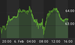
So let's look at the first VIX chart and see how the market can act differently than the VIX.
First, note the blue line,blue arrows, and label 1 to 3 on the VIX. It shows a down trend for the VIX, and that should correspond with the NYA Index moving up the whole time.
But it doesn't. In the middle of the down trend, the NYA Index trades down for 6 days and then resumes its expected direction with the VIX. (Don't forget that the VIX moves opposite to the market when looking at this chart.)
By the way, take a look at the red label #4 on the VIX. It shows when the VIX broke its trend line to the upside, and that is when the NYA Index should have moved down as it did.
But, back to the 6 day discrepancy in movement ... WHY did it happen? See the next chart for the answer.

This chart is the same as the one above with one exception.
That exception is that we added a 5 day exponential moving average of the NYSE's daily Down Volume. (Symbol: DVOL)
Look at this chart and you will see WHY the NYA Index went down at label 2 even though the VIX was trending lower. It is because the Down Volume was trending up which meant that a greater number of stocks were being sold off.
Now look at label 4 where BOTH the VIX and the DVOL were increasing together. As you would expect, the NYA went down during that 5 day period.
Conclusion: So, when you are setting up a VIX chart to help you with the market, be sure to also add the NYSE's DVOL so that you can see the REASON WHY discrepanciesare occurring.
P.S. Not a subscriber yet? Consider joining us and reap the benefits of data,charts, and models that you cannot find anywhere else.


