


The good news is:
• The market has had two positive weeks in a row.
The negatives
The market has been responding to moves in currencies more than anything else. The European Central Bank (ECB) charter does not allow it to buy sovereign debt, so, unlike our Fed; the ECB is unable to bail out its irresponsible constituents. Until the ECB finds a way around those restrictive provisions of its charter the Euro should outperform the Dollar and equities should rise.
The charts below show the S&P 500 (SPX) in red, the Dollar index in green and an indicator showing a moving correlation of those indices in black. Dashed horizontal lines have been drawn at 25%, 50% & 75% levels for the indicator. Dashed vertical lines have been drawn on the 1st trading day of each month.
The first chart covers the past 3 months.
The indicator shows the percentage of the previous 20 trading days the 2 indices have been correlated. The current value at 20% means they have been inversely correlated 80% of the time during the previous 20 trading days.

The next chart is similar to the one above except is covers the past year. There has been a pretty strong negative correlation for quite a while and, for the past several months; it has been at an extreme.

The positives
About 50% of the issues traded on the NYSE are fixed income related. Fixed income issues are doing well so breadth data from the NYSE has a very positive bias. Breadth data from the NASDAQ, which has few fixed income issues, has been neutral to slightly negative.
The chart below covers the past 6 months showing the SPX in red and a 40% trend (4 day EMA) of NYSE new highs divided by new highs + new lows (NY HL Ratio) in dark blue. Dashed horizontal lines have been drawn at 10% levels for the indicator; the line is solid at the neutral 50% level.
With a value in the mid 80's this indicator is very strong.

The next chart is similar to the one above except it shows the NASDAQ composite (OTC) in blue and OTC HL Ratio, in red, has been calculated from NASDAQ data.
OTC HL Ratio tagged the 50% level last week before falling. Not good, but, not terrible.

The next chart is a bit of an odd ball, but a more positive interpretation of the data shown in the chart above. OTC HL MoM Diff is calculated by subtracting the momentum of NASDAQ new lows from new highs.
OTC HL MoM Diff maintained a more positive trajectory than many of the other indicators.

Seasonality
Next week includes the 5 trading days prior to the 3rd Friday in December during the 3rd year of the Presidential Cycle.
The tables below show the return on a percentage basis for the 5 trading days prior to the 3rd Friday of December during the 3rd year of the Presidential Cycle.
OTC data covers the period from 1963 - 2010 and SPX data covers the period from 1953 - 2010. There are summaries for both the 3rd year of the Presidential Cycle and all years combined. Prior to 1953 the market traded 6 days a week so that data has been ignored.
Average returns for the coming week have been positive by all measures and stronger during the 3rd year of the Presidential Cycle than other years.
Report for the week before the 3rd Friday of December.
The number following the year is the position in the Presidential Cycle.
Daily returns from Monday through 3rd Friday.
| OTC Presidential Year 3 | ||||||
| Year | Mon | Tue | Wed | Thur | Fri | Totals |
| 1963-3 | -0.28% | -0.40% | 0.17% | 0.09% | -0.37% | -0.79% |
| 1967-3 | -0.33% | -0.21% | 0.66% | 0.59% | 0.37% | 1.09% |
| 1971-3 | 0.32% | -0.08% | 0.35% | 0.51% | 0.46% | 1.56% |
| 1975-3 | -0.49% | 0.87% | 0.81% | 0.36% | -0.20% | 1.35% |
| 1979-3 | 0.35% | -0.56% | -0.05% | 0.41% | -0.07% | 0.10% |
| 1983-3 | -0.20% | -0.36% | -0.90% | -0.39% | 0.24% | -1.61% |
| 1987-3 | 2.25% | 1.06% | 2.10% | 0.08% | 2.32% | 7.82% |
| Avg | 0.45% | 0.19% | 0.46% | 0.20% | 0.55% | 1.84% |
| 1991-3 | 0.52% | -0.74% | 0.03% | -0.98% | 0.23% | -0.95% |
| 1995-3 | -0.08% | -0.89% | 0.42% | -1.73% | -0.74% | -3.03% |
| 1999-3 | 1.05% | -2.36% | 1.41% | 2.57% | 1.02% | 3.69% |
| 2003-3 | -1.58% | 0.31% | -0.15% | 1.81% | -0.26% | 0.13% |
| 2007-3 | -2.32% | 0.84% | 0.19% | 1.53% | 1.94% | 2.17% |
| Avg | -0.48% | -0.57% | 0.38% | 0.64% | 0.44% | 0.40% |
| OTC summary for Presidential Year 3 1963 - 2007 | ||||||
| Avg | -0.07% | -0.21% | 0.42% | 0.40% | 0.41% | 0.96% |
| Win% | 42% | 33% | 75% | 75% | 58% | 67% |
| OTC summary for all years 1963 - 2010 | ||||||
| Avg | -0.02% | 0.11% | -0.06% | -0.02% | 0.20% | 0.22% |
| Win% | 50% | 52% | 49% | 58% | 60% | 60% |
| SPX Presidential Year 3 | ||||||
| Year | Mon | Tue | Wed | Thur | Fri | Totals |
| 1955-3 | -1.02% | 0.07% | -0.84% | -0.02% | 0.16% | -1.66% |
| 1959-3 | 0.27% | -0.24% | 0.12% | -0.19% | 0.48% | 0.44% |
| 1963-3 | 0.32% | 0.59% | -0.15% | -0.31% | -0.16% | 0.30% |
| 1967-3 | -0.31% | -0.12% | 0.35% | 0.14% | -0.46% | -0.41% |
| 1971-3 | 0.29% | -0.31% | 0.89% | 1.22% | 0.52% | 2.61% |
| 1975-3 | 0.30% | 0.95% | 0.25% | 0.31% | -0.70% | 1.11% |
| 1979-3 | 0.38% | -0.94% | -0.09% | 0.06% | -0.62% | -1.22% |
| 1983-3 | 0.32% | -0.42% | -0.97% | -1.02% | 0.45% | -1.64% |
| 1987-3 | 2.92% | 0.25% | 2.17% | -2.06% | 2.54% | 5.83% |
| Avg | 0.84% | -0.09% | 0.45% | -0.30% | 0.44% | 1.34% |
| 1991-3 | 0.00% | -0.45% | 0.19% | -0.25% | 1.18% | 0.67% |
| 1995-3 | 0.33% | -0.12% | 0.47% | -0.77% | -0.09% | -0.18% |
| 1999-3 | -0.13% | -0.85% | 0.73% | 0.38% | 0.16% | 0.29% |
| 2003-3 | -0.57% | 0.66% | 0.13% | 1.18% | -0.05% | 1.35% |
| 2007-3 | -1.50% | 0.63% | -0.14% | 0.49% | 1.67% | 1.15% |
| Avg | -0.38% | -0.02% | 0.28% | 0.21% | 0.57% | 0.66% |
| SPX summary for Presidential Year 3 1955 - 2007 | ||||||
| Avg | 0.11% | -0.02% | 0.22% | -0.06% | 0.36% | 0.62% |
| Win% | 57% | 43% | 64% | 50% | 57% | 64% |
| SPX summary for all years 1953 - 2010 | ||||||
| Avg | 0.05% | 0.18% | 0.05% | -0.04% | 0.18% | 0.42% |
| Win% | 56% | 51% | 53% | 47% | 60% | 62% |
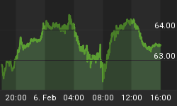
Money supply (M2)
The money supply chart was provided by Gordon Harms. M2 growth leveled off last week.

Conclusion
For now, the financial markets are the beneficiaries of the Fed's on going efforts to destroy the dollar.
I expect the major averages to be higher on Friday December 16 than they were on Friday December 9.
This report is free to anyone who wants it, so please tell your friends. They can sign up at: http://alphaim.net/signup.html. If it is not for you, reply with REMOVE in the subject line.
In his latest newsletter (In The Zone) Jerry Minton looks at the history of the annual "power zone"... no bear market in thirty years. To read it and subscribe to this free newsletter go to www.alphaim.net.
Thank you,


