


The good news is:
• Hard to find.
The negatives
Over the past 2 weeks new lows have practically disappeared. This usually indicates a bottom for prices, but that appears not to be the case this time. There are precedents and I will show you how the indicators worked in 2008 - 2009. Not that I expect a 2008 - 2009 like bear market, but we may be in for a worse than average correction.
The first chart shows the NASDAQ composite (OTC) in blue and a 10% trend (19 day EMA) of NASDAQ new highs (OTC NH), in green. Dashed vertical lines have been drawn on the 1st trading day of each month.
OTC NH has continued falling despite prices moving upwards.

The next chart is similar to the one above except it covers the period from April 2008 - April 2009.
There was a false start at the end of 2008 (the dotted red vertical line), but the rally did not really get going until new highs began increasing steadily.

The next chart is similar to the first one except it shows the S&P 500 (SPX) in red and NY NH has been calculated from NYSE data.
No new highs here.

Here is how it worked in 2008 - 2009. Like the current period, indicators on the NYSE were weaker than those on the NASDAQ.

The next chart shows the SPX in red and a 40% trend (4 day EMA) of NYSE new highs divided by new highs + new lows (NY HL Ratio), in blue. Dashed horizontal lines have been drawn at 10% levels for the indicator, the line is solid at the 50%, neutral level.
This indicator and the one derived from NASDAQ data will be the those to watch. It will remain below the neutral line as long as there have been more new lows than new highs.
Prices have risen over the past 2 weeks, but this indicator has been unresponsive.

The next chart is similar to the one above except it covers the 2008-2009 period.
NY HL Ratio did as good a job as anything at defining the 2008 - 2009 bear market.

The next chart is similar to those immediately above except is shows the OTC in blue and OTC HL Ratio has been calculated from NASDAQ data.
OTC HL Ratio has been stronger than NY HL Ratio, but it has remained in negative territory for nearly 2 months.

Here is how the indicator worked in the 2008 - 2009 period.

The positives
My best bottom indicator is derived from new lows and it is not working properly.
The chart below covers the past 6 months showing the SPX in red and a 10% trend of NYSE new lows (NY NL), in blue. NY NL has been plotted on an inverted Y axis so decreasing new lows move the indicator upward (up is good).
NY NL began moving sharply upward nearly 2 weeks ago, but prices have been faltering.

The next chart is similar to the one above except it covers the past year.
You can see how NY NL has been a good indicator of short term bottoms.

The next chart is similar to first one in this group except it shows the OTC in blue and OTC NL has been calculated from NASDAQ data.
OTC NL has also been moving sharply upward while prices have been faltering.

Seasonality
Next week includes the 4 trading days prior to the 2nd Friday of September during the 3rd year of the Presidential Cycle. The tables below show the daily change, on a percentage basis for that period.
OTC data covers the period from 1963 to 2014 while SPX data runs from 1953 to 2014 There are summaries for both the 3rd year of the Presidential Cycle and all years combined. Prior to 1953 the market traded 6 days a week so that data has been ignored.
Average returns for the coming week have been mixed and slightly stronger during the 3rd year of the Presidential Cycle than other years.
Report for the week before the 2nd Friday of September.
The number following the year is the position in the Presidential Cycle.
Daily returns from Monday to 2nd Friday.
| OTC Presidential Year 3 | ||||||
| Year | Mon | Tue | Wed | Thur | Fri | Totals |
| 1963-3 | -0.06% | -0.17% | 0.39% | -0.06% | -0.14% | -0.03% |
| 1967-3 | 0.00% | 0.51% | 0.12% | 0.30% | 0.15% | 1.08% |
| 1971-3 | 0.00% | 0.50% | 0.05% | -0.03% | -0.12% | 0.40% |
| 1975-3 | -0.41% | -1.11% | -1.78% | -0.52% | -0.17% | -3.99% |
| 1979-3 | 0.57% | -0.35% | 0.18% | 0.45% | 0.82% | 1.67% |
| 1983-3 | 0.00% | 1.13% | -0.16% | 0.34% | 0.15% | 1.47% |
| 1987-3 | 0.00% | -1.99% | 0.36% | 0.98% | 0.61% | -0.04% |
| 1991-3 | 0.22% | -1.31% | 0.68% | 1.24% | -0.85% | -0.02% |
| Avg | 0.12% | -0.72% | -0.14% | 0.50% | 0.11% | -0.18% |
| 1995-3 | 0.00% | 1.94% | 0.48% | 0.65% | 0.85% | 3.92% |
| 1999-3 | 0.00% | -0.12% | -1.10% | 1.54% | 1.23% | 1.56% |
| 2003-3 | 1.63% | -0.80% | -2.65% | 1.22% | 0.48% | -0.11% |
| 2007-3 | -0.26% | 1.50% | -0.21% | 0.35% | 0.04% | 1.42% |
| 2011-3 | 0.00% | -0.26% | 3.04% | -0.78% | -2.42% | -0.42% |
| Avg | 0.69% | 0.45% | -0.09% | 0.60% | 0.04% | 1.27% |
| OTC summary for Presidential Year 3 1963 - 2011 | ||||||
| Avg | 0.28% | -0.04% | -0.04% | 0.44% | 0.05% | 0.53% |
| Win% | 50% | 38% | 62% | 69% | 62% | 54% |
| OTC summary for all years 1963 - 2014 | ||||||
| Avg | -0.32% | -0.03% | -0.10% | 0.08% | 0.09% | -0.10% |
| Win% | 48% | 50% | 55% | 63% | 60% | 60% |
| SPX Presidential Year 3 | ||||||
| Year | Mon | Tue | Wed | Thur | Fri | Totals |
| 1955-3 | 0.00% | 0.60% | -0.02% | 0.07% | 0.02% | 0.66% |
| 1959-3 | 0.00% | -1.43% | -0.71% | -0.52% | 0.74% | -1.93% |
| 1963-3 | -0.36% | 0.56% | 0.29% | -0.07% | 0.03% | 0.45% |
| 1967-3 | 0.00% | 0.57% | 0.19% | -0.06% | 0.03% | 0.73% |
| 1971-3 | 0.00% | 0.46% | 0.19% | -0.53% | -0.38% | -0.27% |
| Avg | -0.36% | 0.15% | -0.01% | -0.22% | 0.09% | -0.07% |
| 1975-3 | 0.32% | -1.50% | -0.96% | -0.41% | -0.18% | -2.73% |
| 1979-3 | 0.47% | -0.61% | 0.29% | 0.03% | 0.84% | 1.02% |
| 1983-3 | 0.00% | 1.75% | 0.04% | -0.11% | -0.51% | 1.17% |
| 1987-3 | 0.00% | -0.99% | 0.11% | 1.02% | 1.53% | 1.68% |
| 1991-3 | -0.14% | -1.03% | 0.14% | 0.58% | -0.97% | -1.41% |
| Avg | 0.22% | -0.48% | -0.07% | 0.22% | 0.14% | -0.05% |
| 1995-3 | 0.00% | 0.95% | 0.18% | 0.02% | 0.42% | 1.56% |
| 1999-3 | 0.00% | -0.50% | -0.47% | 0.26% | 0.30% | -0.41% |
| 2003-3 | 1.00% | -0.82% | -1.20% | 0.54% | 0.22% | -0.25% |
| 2007-3 | -0.13% | 1.36% | 0.00% | 0.84% | 0.02% | 2.10% |
| 2011-3 | 0.00% | -0.74% | 2.86% | -1.06% | -2.67% | -1.61% |
| Avg | 0.44% | 0.05% | 0.28% | 0.12% | -0.34% | 0.28% |
| SPX summary for Presidential Year 3 1955 - 2011 | ||||||
| Avg | 0.20% | -0.09% | 0.06% | 0.04% | -0.04% | 0.05% |
| Win% | 50% | 47% | 67% | 53% | 67% | 53% |
| SPX summary for all years 1953 - 2014 | ||||||
| Avg | -0.26% | -0.04% | -0.04% | -0.16% | 0.07% | -0.28% |
| Win% | 44% | 52% | 57% | 48% | 63% | 52% |
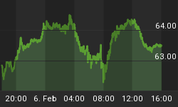
Money supply (M3)
The money supply chart was provided by Gordon Harms. Money supply has been growing rapidly over the past 2 weeks.

Conclusion
The markets lack of responsiveness to the sharp decrease in new lows leads me to think we may be in for a real bear market not a short term correction.
I expect the major averages to be lower on Friday September 11 than they were on Friday September 4.
This report is free to anyone who wants it, so please tell your friends. They can sign up at: http://www.stockmarket-ta.com/signup.html. If it is not for you, reply with REMOVE in the subject line.
These reports are archived at: http://www.safehaven.com/
Good Luck,
YTD W 14 / L 13 / T 8


