


The good news is:
• The secondaries have been outperforming the blue chips.
The negatives
The first chart shows the S&P 500 (SPX) in red and a 40% trend (4 day EMA) of NYSE new highs divided by new highs + new lows (NY HL Ratio), in blue. Dashed vertical lines have been drawn on the 1st trading day of each month. Dashed horizontal lines have been drawn at 10% levels for the indicator, the line is solid at the 50%, neutral level.
Prices have risen over the past 3 weeks, but this indicator has remained at an extremely low level.

The next chart is similar to the one above except it covers the past year.
You can see how the indicator typically moves sharply upward when prices are coming off a low. That has not been happening this time.

The next 2 charts are similar to the first 2 except they show the NASDAQ composite (OTC) in blue and OTC HL Ratio has been calculated from NASDAQ data.
OTC HL Ratio has been stronger than NY HL Ratio, but it has remained in negative territory.

Both OTC HL Ratio and NY HL Ratio have been in a well defined down trend for the past 3 months.

The next chart covers the past 6 months showing the SPX in red and a 10% trend (19 day EMA) of NYSE new highs (NY NH) in green
NY NH has continued to fall in spite of the rally in prices.

The next chart is similar to the one above except it shows the OTC in blue and OTC NH, in green has been calculated with NASDAQ data.
The decline of OTC NH has been arrested, although at a very low level.

The positives
Bottoms are usually defined by the disappearance of new lows, but, this time that has not been working out very well
The chart below covers the past 6 months showing the SPX in red and a 10% trend of NYSE new lows (NY NL), in blue. NY NL has been plotted on an inverted Y axis so decreasing new lows move the indicator upward (up is good).
NY NL began moving sharply upward nearly 3 weeks ago, but prices, although rising have not been keeping up.

The next chart is similar to the one above except it covers the past year for a longer term perspective.

The next chart is similar to first one in this group except it shows the OTC in blue and OTC NL, in orange, has been calculated from NASDAQ data.
The OTC has been doing a little better job of following OTC NL upward.

Seasonality
Next week includes the 5 trading days prior to the 3rd Friday of September during the 3rd year of the Presidential Cycle. The tables below show the daily change, on a percentage basis for that period.
OTC data covers the period from 1963 to 2014 while SPX data runs from 1953 to 2014 There are summaries for both the 3rd year of the Presidential Cycle and all years combined. Prior to 1953 the market traded 6 days a week so that data has been ignored.
Average returns for the coming week have been positive by all measures and slightly stronger during the 3rd year of the Presidential Cycle than other years.
Report for the week before the 3rd Friday of September.
The number following the year is the position in the Presidential Cycle.
Daily returns from Monday through 3rd Friday.
| OTC Presidential Year 3 | ||||||
| Year | Mon | Tue | Wed | Thur | Fri | Totals |
| 1963-3 | 0.03% | -0.34% | -0.36% | -0.39% | 0.37% | -0.70% |
| 1967-3 | 0.23% | 0.07% | -0.17% | 0.50% | -0.06% | 0.57% |
| 1971-3 | -0.18% | -0.41% | 0.02% | -0.01% | 0.29% | -0.29% |
| 1975-3 | -0.33% | -0.93% | 0.12% | 1.23% | 2.15% | 2.25% |
| 1979-3 | -0.07% | -0.84% | 0.17% | 0.51% | 0.30% | 0.07% |
| 1983-3 | -0.49% | -0.94% | 0.14% | -0.39% | 0.36% | -1.31% |
| 1987-3 | -0.15% | -0.80% | -0.25% | -0.02% | 0.02% | -1.19% |
| 1991-3 | -0.20% | -0.10% | 0.66% | 0.79% | 0.86% | 2.02% |
| Avg | -0.25% | -0.72% | 0.17% | 0.43% | 0.74% | 0.36% |
| 1995-3 | 0.62% | -0.15% | 0.23% | -0.04% | -1.49% | -0.83% |
| 1999-3 | -1.46% | 0.83% | -1.89% | -0.27% | 2.24% | -0.55% |
| 2003-3 | -0.50% | 2.25% | -0.22% | 1.40% | -0.20% | 2.73% |
| 2007-3 | -0.79% | 2.71% | 0.56% | -0.46% | 0.64% | 2.66% |
| 2011-3 | 1.10% | 1.49% | 1.60% | 1.34% | 0.58% | 6.11% |
| Avg | -0.21% | 1.42% | 0.05% | 0.40% | 0.35% | 2.02% |
| OTC summary for Presidential Year 3 1963 - 2011 | ||||||
| Avg | -0.17% | 0.22% | 0.05% | 0.32% | 0.47% | 0.89% |
| Win% | 31% | 38% | 62% | 46% | 77% | 54% |
| OTC summary for all years 1963 - 2014 | ||||||
| Avg | 0.02% | 0.20% | 0.03% | 0.20% | 0.35% | 0.80% |
| Win% | 44% | 56% | 61% | 63% | 71% | 63% |
| SPX Presidential Year 3 | ||||||
| Year | Mon | Tue | Wed | Thur | Fri | Totals |
| 1955-3 | 0.68% | 1.38% | 0.42% | -0.53% | 0.76% | 2.71% |
| 1959-3 | -0.73% | -0.54% | 0.07% | -0.55% | -0.57% | -2.32% |
| 1963-3 | -0.14% | 0.07% | -0.44% | 0.58% | 0.11% | 0.18% |
| 1967-3 | 0.19% | 0.48% | 1.05% | 0.22% | 0.07% | 2.01% |
| 1971-3 | -0.35% | -0.73% | 0.43% | -0.11% | 0.30% | -0.45% |
| Avg | -0.07% | 0.13% | 0.31% | -0.08% | 0.14% | 0.43% |
| 1975-3 | -0.50% | -0.95% | 0.34% | 2.05% | 2.17% | 3.10% |
| 1979-3 | 0.07% | -0.77% | 0.26% | 2.06% | -0.04% | 1.58% |
| 1983-3 | -0.86% | -0.41% | 0.34% | -0.59% | 1.13% | -0.39% |
| 1987-3 | 0.34% | -1.65% | -0.91% | 0.02% | -0.02% | -2.22% |
| 1991-3 | 0.57% | -0.07% | 0.37% | 0.16% | 0.09% | 1.13% |
| Avg | -0.08% | -0.77% | 0.08% | 0.74% | 0.67% | 0.64% |
| 1995-3 | 0.21% | 0.45% | 0.39% | 0.84% | -0.04% | 1.85% |
| 1999-3 | -0.55% | -0.59% | -1.37% | 0.04% | 1.28% | -1.19% |
| 2003-3 | -0.38% | 1.43% | -0.33% | 1.33% | -0.32% | 1.74% |
| 2007-3 | -0.51% | 2.92% | 0.61% | -0.67% | 0.46% | 2.81% |
| 2011-3 | 0.70% | 0.91% | 1.35% | 1.72% | 0.57% | 5.25% |
| Avg | -0.11% | 1.03% | 0.13% | 0.65% | 0.39% | 2.09% |
| SPX summary for Presidential year 3 1955 - 2011 | ||||||
| Avg | -0.08% | 0.13% | 0.17% | 0.44% | 0.40% | 1.05% |
| Win% | 47% | 47% | 73% | 67% | 67% | 67% |
| SPX summary for all years 1953 - 2014 | ||||||
| Avg | 0.08% | 0.13% | 0.09% | 0.16% | 0.18% | 0.63% |
| Win% | 52% | 55% | 64% | 56% | 58% | 63% |
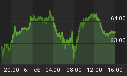
Money supply (M3)
The money supply chart was provided by Gordon Harms. Money supply growth has been holding above its trend.

Conclusion
New lows have declined, but not disappeared as they typically do coming off a bottom making me suspicious of the recent rally.
I expect the major averages to be lower on Friday September 18 than they were on Friday September 11.
Last weeks negative forecast was a miss.
This report is free to anyone who wants it, so please tell your friends. They can sign up at: http://www.stockmarket-ta.com/signup.html. If it is not for you, reply with REMOVE in the subject line.
These reports are archived at: http://www.safehaven.com/
Good Luck,
YTD W 14 / L 14 / T 8


