


We believe it is important to look at return and volatility risk in both absolute and relative terms. For relative performance, we think the 10-year US Treasury bond is a good base to use, because is it relevant to all asset classes.
It relates as well to stocks as to bonds, to real estate, to commodities or to just about any asset class.
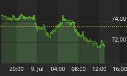
Tables of numbers have their place and use, but we also believe a picture is worth a thousand words. We try to put important data into visual formats to make it easier to see meaning. Some people do better with numbers in tables and some do better with pictures. Here is our way of visualizing risk adjusted return.
We call our proprietary way of calculating returns and volatility relative to government bonds "Treasury Indexed Quotients (TIQ)", a registered trademark.
Each month, we calculate the TIQ for the mean return and the standard deviation of a variety of asset classes and sub-classes (such as countries and industrial sectors), and then index them to the same measures for the 10-year US Treasury bond. We do it for different time periods, as well as for different classes.
Both return and volatility are different for different lengths of time; and for all period lengths, the risk and volatility levels change over time.
The chart is a sample of the work we do internally for certain of our research clients and in a monthly subscription publication of the Treasury Index Quotients.
This particular chart measures the performance of investable securities that represent major asset classes:
-
US stock market (proxy SPY)
-
Non-US developed stock markets (proxy EFA)
-
Non-US emerging stock markets (proxy EEM)
-
US REITs (proxy VNQ)
-
Global commodities (proxy DJP)
-
US aggregate bonds, ex muni (proxy AGG)

Securities to the right of the red vertical have a higher return than the T-bond, and those to the left have a lower return.
The higher the vertical position, the higher the volatility is relative to the T-bond.
The most favorable risk/reward position on the chart for a security is to the right of the red vertical and below the solid blue diagonal line. Securities in that area would have a higher return than the T-bond, but proportionately lower volatility.
The solid blue line represents a 1:1 relationship between return and volatility. The dotted blue lines represent 1:2 and 1:3 relationships between return and volatility.
In the last 52 weeks, emerging markets and global commodities had more favorable risk/reward attributes than US aggregate bonds, the US stock market, non-US developed markets and US REITs.


