


As the markets have cascaded lower, the individual major Indices have established various price objectives derived from traditional price pattern analysis. One such index is the DJIA. Looking at chart 1, notice there is a symmetrical triangle with 4 reversals of the minor trend. Also notice that price has broken out of the bearish continuation pattern to the downside, closed below the lower boundary line and has officially established a lower price objective for the DJIA of 6850.00 on a graphically or log-scale basis. Arithmetically, the lower objective is 6531.00.

Moving on to the S&P 500 and looking at chart 2, notice there is a similar continuation pattern but more in the form of a descending triangle. Notice that price has broken below the lower boundary line, and now has a lower price objective of 648.70 based on the height of the pattern. On the log-scale, the price target is closer to 680.

Taking a look a the Dow Jones Transportation Index in chart 3, notice the long term monthly trendline is in the process of being tested with the latest close as of Nov. 21, 2008. It will be interesting to see if or how far the Transportation index falls below this line as the DJIA, the S&P 500 and the other major indices possibly reach their lower price objectives. Depending on how well this support line holds up could be a signal as to the severity of the current selloff or if a bottom is near.

Another index that could signal a possible bottom is the DJ Utility. Looking at chart 4, notice the October 10 low is still holding on the weekly chart and that the momentum index has turned up and could possibly stay positive.

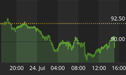
Another interesting chart is that of the US Dollar. Looking at chart 5, notice that the last weekly closing price has come up to an overhead resistance line near the 90 level. Technically, the domestic currency is in a strong up-phase and it would not surprise this classical bar chartist if the greenback tested the high made at 92.55 before retreating and creating a more complicated price chart in the future.

The next chart I want to cover is Gold. Notice gold is holding above it's long term weekly trendline in chart 6 and the current descent from the 1000 area could possibly meet this line near the 600 dollar region in the future. Question: will the greenback top-out with the bottoming of the yellow metal next year? If so, what will the Dow/Gold ratio be? 600.00

Turning to chart 7, notice the monthly chart is nearing 10 to 1 and accelerating lower. According to theory, when the ratio reaches parity or 1 to 1, it is time to buy stocks and sell gold. Question: How close are we to this unity? Two years out? Three?

The last chart I want to show you is the 10 year MA return for the DJIA since the roaring '20's of the last century. Notice there are three peaks in the long term moving average that correspond chronologically with the historic bull market tops of 1929, 1966 and 2000. Also notice that once a top in the 10 year MA is believed to have been reached, it has swung back below the long term average return of 7.4% and bottomed near the 0 % return level of 1942 and 1982. If the return on the Dow Industrials should revert back to the previous levels shown, holding stocks for the next 10 or so years looks bleak and a fixed income investment like treasuries looks much more attractive. We will see!


