• 747 days Will The ECB Continue To Hike Rates?
  • 747 days Forbes: Aramco Remains Largest Company In The Middle East
  • 749 days Caltech Scientists Succesfully Beam Back Solar Power From Space
  • 1,149 days Could Crypto Overtake Traditional Investment?
  • 1,154 days Americans Still Quitting Jobs At Record Pace
  • 1,156 days FinTech Startups Tapping VC Money for ‘Immigrant Banking’
  • 1,159 days Is The Dollar Too Strong?
  • 1,159 days Big Tech Disappoints Investors on Earnings Calls
  • 1,160 days Fear And Celebration On Twitter as Musk Takes The Reins
  • 1,162 days China Is Quietly Trying To Distance Itself From Russia
  • 1,162 days Tech and Internet Giants’ Earnings In Focus After Netflix’s Stinker
  • 1,166 days Crypto Investors Won Big In 2021
  • 1,166 days The ‘Metaverse’ Economy Could be Worth $13 Trillion By 2030
  • 1,167 days Food Prices Are Skyrocketing As Putin’s War Persists
  • 1,169 days Pentagon Resignations Illustrate Our ‘Commercial’ Defense Dilemma
  • 1,170 days US Banks Shrug off Nearly $15 Billion In Russian Write-Offs
  • 1,173 days Cannabis Stocks in Holding Pattern Despite Positive Momentum
  • 1,174 days Is Musk A Bastion Of Free Speech Or Will His Absolutist Stance Backfire?
  • 1,174 days Two ETFs That Could Hedge Against Extreme Market Volatility
  • 1,176 days Are NFTs About To Take Over Gaming?
The Problem With Modern Monetary Theory

The Problem With Modern Monetary Theory

Modern monetary theory has been…

Another Retail Giant Bites The Dust

Another Retail Giant Bites The Dust

Forever 21 filed for Chapter…

  1. Home
  2. Markets
  3. Other

Danger and Safety Levels: Where Are We Now?

Danger/Safety Zones: Danger, risks, fear, safety, greed, confidence and bravery are perceived or emotional components that investors have to deal with.

It was with this in mind that we worked on a model that would show the market's danger and safety levels simultaneously on a graph.

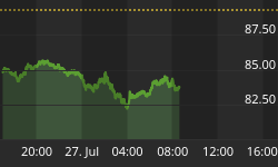
The Danger/Safety Zone chart model ...

The way this chart works, is that the green bars reflect the safety level, and the red bars reflect the danger level.

The color of the bars above the horizontal line is the predominant condition. The other bar should be below the bottom horizontal line reflecting the diminishing opposite condition. (When a bar level is in between both horizontal lines, it indicates a higher-risk, mixed condition.)

So, what is the model saying today?

It says that we just came out of a Danger Zone condition and now have a Safety Zone condition. That is because the green bars are above the top horizontal line and moving higher, and because the red bars are now below the bottom red horizontal line and moving lower.

*** Comments: So, Safety levels will continue to improve as long as the green bars stay positive and move higher, while the red bars stay negative and move lower.

I would like to see the red bars a lot lower than they are now, but the MACD-C is just starting to turn positive, so a healthy condition would be for the red bars to start moving down faster on their descending process.

[This chart is brought to you as a courtesy today, and is posted daily on our paid subscriber website. In fairness to our subscribers, this chart will only be posted a couple of times per year on this free site.]


Back to homepage

Leave a comment

Leave a comment