


Yesterday the market reversed from almost a 200 point decline as probabilities favoured a rise on Monday in which declining action offered a low risk Buy.
Of course after Monday's action closed with a near flat session which direction is next?
The Four Hour time frame charts have always been king for the interpretation of the short term direction as a lot of the noise with smaller timeframes is not removed.
Tradingmarketsignals.com would like to show you unbiased technical analysis for the Dow Jones in the form of Channels.
Looking at a chart can of course be similar to looking at a blank canvas but the significant factor is that anything can be drawn!
Look at the charts below:
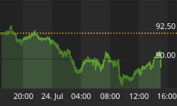
Dow Four Hour Chart: Channel 1
Firstly on the first three charts the light blue line is a mark for the highs of 2010 for the Dow Jones which can be currently seen as declining highs.
Of course all lines are parallel in which this chart shows the scenario of prices rising higher and justifies why prices held the channel yesterday and staged a turnaround. If prices continue to climb higher then perhaps last week's highs may be too much to handle which if conquered would of course give us nearing problems with the blue line. This chart implies a snap of the channel would produce a breakdown in prices for the Dow Jones.
Dow Four Hour Chart: Channel 2
Once again the blue line denotes the declining 2010 high line.
Of course trading takes place in a market, a market full of opposing interpretations. This chart is very different to the first one. No rising channel can be seen in this chart, instead we have a declining channel which also marks yesterday's turnaround but not in the same significance, instead this chart believes there is not much room for upside before a decline kicks in.
However if the upper channel line got blown away then once again the market may well come under pressure at the high line. Clearly in accordance with this chart the Dow Jones is expected to revisit those 'Flash Crash lows'.
Dow Four Hour Chart: Channel 3
This chart is now another rising channel but a lot different to the first chart in which the gradient differs vastly. Therefore this chart of course expects upside for the Dow Jones but not with the same pace and aggression. A snap of the channel of course implies significant downward action.
Finally we have a chart which gives us a lasting verdict but one which again paints a differing scenario to the ones above.
Dow Four Hour Chart: Heikin Ashi
The immediate thing to notice on this chart is that the candles remain in similar direction for longer. This is because this is a Heikin Ashi chart. The first three charts were candlestick charts which were devised by in the 18th century by the legendary Japanese rice trader, Homma Munehisa.
So what are Heikin Ashi charts? Heikin Ashi in Japanese means 'average bar' in which the candlesticks are a weighted version.
This can be of great benefit when trying to reduce the noise from a chart and from an interpretation perspective it can be easier to identify technical patterns as and when they emerge.
In the chart above the trends appear to be cleaner in the four hour chart but notice how we embedded two channels in which we have a rising channel and a declining channel. This would imply that a rise in prices over the short term would likely be followed by declining action later.
Of course you could ignore the technical interpretations and flick a coin as to where prices are heading next but your trading career won't last. Stick with unbiased technical analysis to give you the answers to trade successfully.
At Trading Market Signals we are ...'the hub of unbiased technical analysis'
The doors are open to retail traders but not for long. Obtain technical unbiased information for the direction of major markets such as the Dow Jones, Crude Oil, EUR.USD, GBP.USD & FTSE100.
To join our technical hub at the flash crash rate, please click on the link: http://tradingmarketsignals.com/#/special-client-100-members/4540799314


