


The U.S. markets were struggling and literally were skating on thin ice! Yes we rallied at the open on Tuesday but the upside didn't stick into the close.
At TMS on the 7th of July our members will all remember that we had the following to state about the way the U.S. stock markets were moving. It was concise as any trading plan would require and with it a chart was posted. It's amazing how easy the markets can appear when the chart can literally map it out with such unbiased ease:
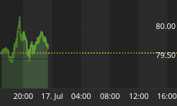
Last week's update for the 07/07/10
The markets are pretty much skating on thin ice and until a real bounce/rally does not emerge one with institutional participation the markets face downside pressure. The seasonality and upward price action probabilities did not materialise and as a consequence the market sits virtually at the lows of the year.
The current situation is denoted by the following chart.
If you are currently sitting flat on the market then it would be advisable to watch the following pattern unfold before unleashing a trade.
At TMS we are not discounting the downside risk BUT we have ONE issue. We agree: the charts are looking ugly. We agree: the price action is looking weak. We agree: the markets are sitting virtually at the lows of 2010. We agree: bounces and rallies are not emerging BUT our one issue is that everyone is expecting this crash! Crashes occur thick and fast when the unexpected becomes reality.
Yes we agree with all the factors pointing down for prices and yes we agree that markets will eventually topple over but for now with the crowd pointing down TMS is bringing the contrarian out and trying to look up.
Either way the chart below is key and it will no doubt decide the direction. It is a four hour chart and one way or another the channel in red must snap either for a bounce/rally or for another leg down.

Well in this update we can state that whilst everyone had been talking about crash mode we held our nerve and looked up. The chart above also showed the simple breakout we needed for the next trade plan which prompted immense move.
The upside was size of the rally or the size of the decline was also labelled on the chart above along with the timescale in which it would occur...
So when the session on Friday the 9th and the Dow Jones hits 10201.77 and closes at 10198.03 you just have to look at the chart again and see where prices were when the chart was compiled and where they ended up in line with the projection of the move of the week...
Well the markets completed the action for the short week of trading last week but where do we head next?
Well for the moment we will just like to remind you of the fact that we just have not crashed like the expectation out there was. For now can we mention 11000 again? Yes we can BUT equally can we mention last week's lows again? Yes we can!
So as we sit at 10200 are you wondering if TMS is contradicting itself? Well No. We are simply stating that in light of last week's rally the direction now is not clear. For the moment we are sitting at crossroads and with this in mind the Dow Jones must deal with 10200 for Monday's entire session in which the market would need to close above this area. Even then though, no confirmation for 11,000 would be delivered, as the market may well encounter mega problems at 10400.
The chart below needs to be studied carefully to see how TMS is ‘technically' mapping out 10400.
We're not marrying the following scenarios but it's a something that TMS will be watching out for over the next week or so...
Scenario 1
If we take out 10200 and head to 10400 and stall, we could still pullback to the 10200 region and rally to 11000 with ease.
HOWEVER
Scenario 2
The market could take out 10200 face problems at 10400 AND when everyone's supreme bullish again with the crash talk quietening we could literally crash in a fast move to strong new lows when the expectation of crash will be near enough switched off.
Scenario Conclusion
At this moment in time we are simply at crossroads and like any good traders we would simply like the market to decide and signal the way for us so that we can either follow the snowball down or the up thrusting rally to 11,000!
The chart below needs to be looked at again and again so that the information can be digested. It is mapped out clearly and concisely.
Chart Notes: Dow Jones Four Hour Chart;
First of all you have the green line and with it the representation shows how 10200 is a problematic are for the Dow Jones. We have the largest green circle highlighting the area with current price action and all the smaller green circles showing how the market has battled with the 10200 number over the past few months.
Secondly you'll see a large red channel which is mapping out the current price action which we have seen over the past few months. This channel is keeping the scenario of lower price action alive HOWEVER 11,000 is ignited should the market take out the upper boundary of this channel.
The upper yellow line shows how many times the market has had issues with this line and how it may halt the current price action should we get to 10400.
The lower yellow line is somewhat premature on the chart as price action has only been involved with it a few times BUT it ties in well with the large dark blue line pattern which also ties in well with the LARGE red channel in which prices may collapse by month end.
Lastly the light blue line keeps 11,000 alive in which a fake stop at 10400 may occur coupled with a pullback to 10200 after which higher price action surges should be on the cards.

Once again we would like to see how the Dow Jones reacts to 10200 in the opening sessions for this week before eyeing failure, progression or pullback at 10400.


