


On April 30th of this year I wrote an article entitled "Today's Most Important Price Points in Gold." This is a follow up to that article. Before presenting an updated version, there are a few key points worth review. Feel free to Google the report or check this websites archives: (At some sites it was called "The most important price point in gold." In the April article we wrote:
- Gold has arrived at what is most likely its most important turning point of not only this year, but perhaps of its entire bull market. We can see now just how important the 1175-1225 area is for gold bullion. We can infer that gold is at the greatest risk/reward price zone of the entire bull market. The resistance lines meeting our current price point (or just above it) is where every major price high for gold has appeared in the past 10 years. (The high since then has been 1265 and the trend lines are still valid)
- If the past is to repeat then gold is nearing a correction into the middle portion of this year. Admittedly, this is what usually occurs at this time of year. (12 days later gold hit 1254 and was exceeded once on June 17th at 1265)
- Price lows for the year usually occur in the July/August time period. Not always, but more so than not. (The price low for the summer occurred on July 27th - It was not the low of the year (February) but was the lowest point since the report and the low of the summer).
- As long as price remains above the lows we've established over the past few weeks - the 1125 -1135 area - the potential for a further move higher will still be in play. (The low since that update has been 1156 and this week we hit 1254 as a high again)
- For five months gold has been going sideways and has yet to establish a downtrend. The three blue dots at the bottom of the chart suggest that gold has potentially formed a strong base from which to attempt a continuation of the current rally. (Gold remained sideways all thru this time - and the dots that were mentioned have never been breached)
- And, should gold close below the lower trend line on the chart, then the potential for gold to reach the 980-1000 area this year will gain credibility. (Gold has held the lower trend line from 2008 - see chart below)
- There is a line under price in this chart that is drawn off of the 2008 deflation crash low. This second line has now reached and is touching the upper 17 year trend line. In between both of these two lines lodged up into this upper boundary is PRICE. (Price has remained within the boundaries of these lines for the entire time since April 30th ) See chart below.
- There is one observation about this latest rise that is different than the corrective phases in January and March---The momentum strength tends to favor a bullish outcome. (This comment is still in play)
- The price chart tells us that winter corrections have a tendency to last about 9 weeks and that a spring rally then develops. On average (but not always) the spring rally is where a price peak is likely to develop. (The price high from December to low in February was exactly 9 weeks and was the lowest price of the year) (The price high for the year thus far was registered 4 days before spring ended.) The chart below is the same one used in the last report --- with updated prices.

Courtesy of: http://www.freestockcharts.com/
In order to recalibrate, this update will use the following monthly chart below. The difference is that the upper trend line is drawn off the 1999 first big monthly gain instead of 1993. The chart above still remains valid in every respect. We want to present a fresher view of the parallel channels that have been defining gold throughout this bull market and measure from the LOWS of the start of this bull market.
One of the most important aspects of the long term chart is that is shows how gold has coiled itself within the upper trend line and the uptrend line from the 2008 lows. This provides a technical explanation as to why gold has drifted sideways since June and why it is only 25 dollars higher than the high established last December (2009). Simply put, gold has been trading within the major boundaries established by the trend lines and as these lines are now converging gold is once again at the upper boundary levels (or range if you will) that this bull market has established from the very beginning. This view shows only the MAJOR Price points of the long term trend lines. They are the most important lines that the MARKET ITSELF has defined as its standard price deviation range. It is the market itself speaking. It cannot be improved upon. It is the least arbitrary way of looking at the market.
There are no technical indicators on this chart as the data input to those are decided by humans - and not the market. Not that they do not work well at times, they often do. But they can sometimes put a spin on the way we look at the market -- most likely when a strong TREND develops and lasts and lasts. For this chart, price is the only factor considered. All known fundamentals (at this moment) have been built into price. PRICE is the ultimate determinant. Price is what matters. Price is how the score is determined. Price is how gain or loss is determined. In the final analysis, price is all that really matters. Price is REALITY. Technical indicators are good - but I like to use them as a coincidental or confirmation as to what I see on the price chart. Do not think I suggest they are not GOOD to use, they are. If they match up or confirm what price is telling me then it gives me confidence that I'm on the right track. And they sometimes PROVIDE a guide to where tops and bottoms occur when used correctly. (That is the key).

Courtesy of: http://www.netdania.com/Products/live-streaming-currency-exchange-rates/real-time-forex-charts/FinanceChart.aspx
The parallel price channel must also be determined by human interaction. What we are trying to do is the LEAST ARBITRARY thing for our analysis. Since the market determines the price bars we at least are using the markets symettry to define our trendlines. The upper channel line was drawn off of the first rally from the lowest point of the bear market. What better place to draw it from? The lower trendline is a parallel copy of that upper trend line which just so happens to fit perfectly with the lows of 2007 and the 2008 crash low. There is no better place to fit that parallel channel without pushing it into a price zone. The best evidence of the upper line validity is that the line drawn off of those two first bars of the bull market in 1999 just happen to touch the price high of 2008,2009, and 2010. Thus these lines provide us with the current maximum and minimum velocity or momentum of the bull market to date.
The other channel on this chart is the sideways dotted channel that defined the 2007 breakout and also the 2009 breakout. The 2007 breakout Dotted lower line channel provided the support for the 2008 crash low. The upper dotted line, a parallel to the lower line has thus far provided the breakout for the rally once the highs of 2008 were taken out. Should there be a large correction in the gold market, it should provide major support for the gold market. Notice how it is catching up with the lower long term line and only 100 dollars separate the two lines at this point in time. These two trendlines are the most important LOWER end support areas of the bull market. The lower dotted line is the worse case scenario - and is near a zone where some Elliot Wavers still project the market could move down to. While not entirely impossible, we rank it as a very low probability.
So what does the long term chart provide for us in potential? The upper trend line tells us that the maximum velocity or momentum of the long term bull market is at hand and has been for 8 months now. The 2008 uptrend line that price has been supporting on tells us that the market is progressing at a HIGHER velocity or momentum since the crash low and that these two converging lines with price in between them, is telling us that the market is about to decide which VELOCITY level is about to win out. It is probably the most likely point where the BREAKOUT that you've heard other analysts tell you is at hand for the past year should develop from - or should have a failure. We have maintained since April (and even as way back as last December) that the real breakout should only occurr if price can vault above these lines in the SAME FASHION ( a long range bar) as occurred when price broke above the dotted lines. In other words, with conviction. This is a key area---- and a pullback from here can't be ruled out.
We know that "breakout" imminent gets attention and subscriptions, but we opt to let PRICE tell us when the event is most likely happening. We think there are two types of investors out there. Those who subscribe to newsletters to hear what they want to hear, and those who want to hear what is most likely happening at the moment and what the odds favor so they might gain an edge in their investments.
Right now the market is telling us that it is on the VERGE of a major breakout. Should it fail and drop below the 2008 uptrend line, that breakout will be delayed. If we think about it - a REAL BREAKOUT can only happen IF the upper trend line is exceeded with CONVICTION. That is not suggestive that one should not hold gold unless the BREAKOUT is confirmed. It does say we should be cautious in ADDING to existing positions here unless we trust our own convictions and have plenty of staying power. But this is a long term view only. Let's look at a medium term view (below). In this case, we will use the gold ETF (GLD) as it is a very popular way of owning gold. (The best way is to own physical gold, especially if you're a long term investor. This way, you'll be holding it in your OWN hands (it won't be lent out) and your much more likely to hold on to it for the long run. If your not a long term investor - GLD is a good vehicle - for trading. But don't expect it to hold out should a real CRUNCH in supply develop.

Courtesy of: http://www.freestockcharts.com/
The above chart is a WEEKLY chart view of gold via the ETF. It is much busier than the monthly because it is more a medium term view than it is a long term view and is therefore more prone to change.
Many players think that a penetration of channel or trend lines is an immediate sign to either a breakout or a breakdown in trend. Our view over the years is that trend lines are made to be BROKEN. What is important is what price does ONCE the line is broken. Most analysts ADJUST their trend lines to curve fit but we try and maintain some semblance of original lines so as to understand price dynamics at the lines themselves and not be faked out on a penetration. In this view we have the main CHANNEL - the 5 year support line and the 5 year resistance. As market dynamics unfold, we have added (in order of importance) a GREEN MOMENTUM channel which the lower line provides the CURRENT momentum since the 2008 crash low and an upper parallel green line if we get a breakout above the 5 year resistance to project where maximum velocity on the upper end should occur. Since the 2008, 2009 and 2010 peaks were above the 5 year resistance line, we added an upper white line to gauge the new peaks. That line has provided the last three peak bursts of momentum. The interesting dynamic in this chart shows that GOLD is attempting to INCREASE the velocity at which it is rising and FORM A NEW CHANNEL to represent that new momentum. The STEEPER the line however, the more likely it is to fail.
The other thing that is good (well -- perspective is everything) is when we look at the LOWER trend lines. For instance, the lower 5 year support line has been touched on every occaision after the UPPER line resistance was hit with the EXCEPTION of the 2009 high. The perspective it brings is that it IS POSSIBLE for gold to reach that lower line and yet still maintain the momentum of the long term bull market. In other words -- it's the ULTIMATE place to buy. For the past 22 months - the best place to buy is the LOWER GREEN uptrend line from 2008. The JULY low penetrated that line during the week of July 27th but ended the week closing right on it. Thus the best buy opportunity of the year so far is each time price hits that lower green line. The moving averages have risen along with this lower trend line and the low of July 27th was right at the moving averages. For the most part, the best time to buy is at the lower trend lines and on occaision when a breakout occurs.
So where does that leave gold for the future?
There is a fixation we have as humans to know the future and it has been this way since the dawn of mankind. The reason most analysts make projections is simply because the AUDIENCE demands it !!!! It is usually the most difficult of tasks. Sometimes the market lets you project correctly and other times one can be way off. There is no one who knows the Future. One can only LOOK at the past and try and deduce the MOST likely events to unfold. For instance - in our original update of April, we picked the price highs we did because the long term trend line had CURTAILED ALL price probes above that line. It was no esoterical or mystical chrystal ball method. For a price low, we picked July/August becaue that is where price usually bottoms during the year. Nothing else. We stated that as long as we held 1135 that the uptrend would remain intact. That was because our SUPPORT lines indicated that it was the most likely event. Sometimes the simplest and repeating things are what work best.
One of the things I have learned over the years is that the real money is made FOLLOWING the market. This is not to say we should not have price projections or know when to enter or exit the market. On the contrary, ENTRY and EXIT is the bottom line. It is the only thing that counts in the end. Where we get confused is whether we are in for the long, medium or short term. Without that definition, we tend to PANIC, jump the gun, and often hold on too long - or get out too soon. So it is paramount to understand and define your time horizion on your purchases.
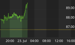
The one thing that is nice about channels is that they are just as relevant on an hourly basis as they are on a monthly basis. The channel line below is the one we have been using on our short term trend. It was drawn off the last corrective phase of July and a parallel channel line was copied to provide the lower trend line. Throughout the August move we have been able to maintain a bullish stance for two reasons. The first of course is the channel itself and the second is that the price pattern is not choppy and overlapping. To get an understanding of what we mean take a look at the uptrend attempts in July. See how the uptrends were choppy and overlapping? Note how the look of the pattern is drastically different since the low. This is the other way to determine the main trend. It is usually not CHOPPY or overlapping. Did we get in at the bottom? NO. We got in at 1186. We got in once price provided the odds that a new trend had developed. Will we get out at the top? Probably not. Once the trend gets choppy and overlapping, or once the trendline is broken with conviction (in this case 1225, we will exit). The last two highs this week is starting to get choppy and overlapping. Should we get a rally that fails the last two highs, and then starts to trend down we'll look to take short term profits. (Not long or medium term).

The same then can be said about the medium term trend. Should prices fail to move above the upper trend lines, we will look to lighten up. The same medium term stops we discussed in the April issue---circa the 1135 area is our medium term stop.
Does anyone really know when the top will occur? NO. If they did, you'd already be rich by following them. Do I really know the top? No. Thus the best thing we can try to do is FOLLOW price. When we think about it, FOLLOWING PRICE is much more powerful than trying to pick a top or a bottom. Ask yourself, are you making money picking tops and bottoms? Yes, the market lets you pick a few, just enough to keep you hooked on it. I'm talking about the longer term.
The current bull market is either going to continue HIGHER and set a new momentum channel (the green channel line we discussed in the GLD chart, or it is going to correct back down to one of the lower trend lines. It is as simple as that. It is one of the two. It is either going to stay in the current velocity that it has for the past 10 years, or the "breakout" boys are finally going to have their day. SHOULD GOLD EXCEED the upper trend lines - and do it with conviction, then a breakout to higher ground will develop and a new momentum line in gold will occur. Should gold fail at these upper trend lines or slightly beyond them, then a correction in the Nov/December timeframe should take place. The majority of highs in this bull market have occurred in December. And that is the final point of this missive. Our best guide to the future is to look at what has happened in the past. These are not my words, but the words of W.D. Gann - one of the greatest traders of our time.
What would gold look like if it does breakout?
The current momentum from the last two major lows suggest this channel line below. If the breakout boys are right, then the upside has plenty of room. Since the last major correction was $330 dollars, and the rally from the 2008 low to the dotted line was $320 dollars, and the rally from that first correction (850-1225) was $375 and the rally from the last low started at 1040, we should assume the next peak to be in the 1350-1425 area. I have seen other trendlines that point to the 1650 area.
Finally, should gold break below the lower trend line the potential to pullback to the upper dotted line at circa the 1135 area has potential. The other option is the lower dotted line below 1000. At this point in the pattern, we think it would be unlikely for gold to hang around the 1250 area this long if this were a peak. Thus the odds favor that gold makes a higher price point in the coming months, but price is the ultimate determinate. THE JULY - AUGUST lows are the key. Price must remain above that area in order to keep the medium term bullish. As long as we are above the 1135 area, we favor the upside in gold in the medium term, and as long as we hold the 2008 uptrend line we favor higher prices in the shorter time frames. The current point in gold is once again at the major breakout point - a point that if the upper trend lines are finally breached with conviction, then another upleg will be underway.

From our point of view, we will continue to FOLLOW price as much as possible and will take each leg (up or down) as it comes. We also follow silver and the key gold stock indexes.
But until price stops going higher, we will respect this rally. If we falter near here we will respect historical precedence and look for a pullback into late autumn by calling an end to this rally.
We are now at a critical juncture in gold's bull market. At www.goldtrends.net we monitor the price pattern on an hourly, daily, weekly and monthly chart basis. And we offer extensive commentary on what it all means, along with support and resistance levels in advance of each day's trade. We also follow silver and the key gold stock indexes.
If you would like to join us for the month of September and follow along with a free pass, send us an email at goldtrends@gmail.com we'd like for you to join us. May you all prosper in the coming year.


