


The good news is:
• The market got into the Christmas spirit and did what it was supposed to do last week, i.e., go up on low volume.
The negatives
Nothing serious, but, no real direction for the past several months.
The positives
All of the sellers finished their business for the year on Monday and went home, probably for the rest of the year.
Seasonal biases are overwhelming so indicators have little meaning.
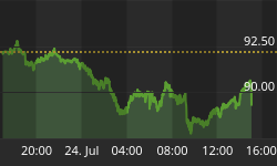
The chart below was the prettiest chart I saw and it was even in red and green.
The chart covers the past 6 months showing the S&P 500 (SPX) in red and a 10% trend (19 day EMA) of NYSE new highs (NY NH) in green. Dashed vertical lines have been drawn on the 1st trading day of each month.
There were over 100 NYSE new highs on each of the last 4 trading days of last week. The most we have seen since late October.

Seasonality
Next week includes the last 4 trading days of the year during the 3rd year of the Presidential Cycle.
The tables below show the return on a percentage basis for the last 4 trading days of the year during the 3rd year of the Presidential Cycle.
NASDAQ composite (OTC) data covers the period from 1963 - 2010 and SPX data covers the period from 1928 - 2010. There are summaries for both the 3rd year of the Presidential Cycle and all years combined.
Average returns for the coming week have been positive by all measures and stronger during the 3rd year of the Presidential Cycle than other years.
Report includes the last 4 days of December.
The number following the year represents its position in the Presidential Cycle.
The number following the daily return represents the day of the week;
1 = Monday, 2 = Tuesday etc.
| OTC Presidential Year 3 | |||||
| Day4 | Day3 | Day2 | Day1 | Totals | |
| 1963-3 | 0.20% 4 | 0.83% 5 | 0.34% 1 | 0.96% 2 | 2.34% |
| 1967-3 | -0.17% 2 | 0.08% 3 | -0.05% 4 | -0.16% 5 | -0.30% |
| 1971-3 | 0.21% 2 | 0.57% 3 | 0.36% 4 | 1.02% 5 | 2.15% |
| 1975-3 | 1.00% 5 | -0.25% 1 | -0.35% 2 | 1.24% 3 | 1.64% |
| 1979-3 | 0.03% 3 | 0.15% 4 | 0.40% 5 | 0.21% 1 | 0.78% |
| 1983-3 | 0.05% 2 | -0.04% 3 | 0.18% 4 | 0.56% 5 | 0.74% |
| 1987-3 | -2.28% 1 | -0.02% 2 | 1.28% 3 | 0.23% 4 | -0.78% |
| Avg | -0.20% | 0.08% | 0.37% | 0.65% | 0.91% |
| 1991-3 | 1.77% 4 | 1.14% 5 | 2.48% 1 | 1.14% 2 | 6.54% |
| 1995-3 | 0.24% 2 | -0.12% 3 | -0.56% 4 | 0.95% 5 | 0.50% |
| 1999-3 | -0.08% 2 | 1.75% 3 | -0.11% 4 | 0.80% 5 | 2.35% |
| 2003-3 | 0.20% 5 | 1.69% 1 | 0.17% 2 | -0.32% 3 | 1.73% |
| 2007-3 | 0.40% 3 | -1.75% 4 | -0.09% 5 | -0.83% 1 | -2.26% |
| Avg | 0.51% | 0.54% | 0.38% | 0.35% | 1.77% |
| OTC summary for Presidential Year 3 1963 - 2007 | |||||
| Averages | 0.13% | 0.34% | 0.34% | 0.48% | 1.29% |
| % Winners | 75% | 58% | 58% | 75% | 75% |
| MDD 12/29/2000 3.41% -- 12/31/1968 1.70% -- 12/29/2008 1.30% | |||||
| OTC summary for all years 1963 - 2010 | |||||
| Averages | 0.19% | 0.12% | 0.29% | 0.30% | 0.91% |
| % Winners | 70% | 51% | 66% | 74% | 72% |
| SPX Presidential Year 3 | |||||
| Day4 | Day3 | Day2 | Day1 | Totals | |
| 1931-3 | -2.51% 1 | 2.58% 2 | 1.76% 3 | 0.25% 4 | 2.07% |
| 1935-3 | -0.08% 5 | -0.61% 6 | 2.07% 1 | 0.98% 2 | 2.36% |
| 1939-3 | -0.57% 3 | 0.89% 4 | 0.32% 5 | 0.24% 6 | 0.89% |
| 1943-3 | -0.95% 2 | 0.00% 3 | 1.83% 4 | -0.17% 5 | 0.71% |
| 1947-3 | -0.13% 6 | -0.40% 1 | 1.20% 2 | 0.53% 3 | 1.19% |
| Avg | -0.85% | 0.49% | 1.44% | 0.36% | 1.45% |
| 1951-3 | 0.90% 4 | 0.17% 5 | 0.00% 6 | 0.34% 1 | 1.40% |
| 1955-3 | -0.62% 2 | -0.38% 3 | 0.22% 4 | 0.73% 5 | -0.04% |
| 1959-3 | -0.03% 1 | 0.54% 2 | 0.79% 3 | 0.20% 4 | 1.50% |
| 1963-3 | 0.47% 4 | 0.16% 5 | 0.16% 1 | 0.62% 2 | 1.41% |
| 1967-3 | 0.06% 2 | 0.68% 3 | -0.02% 4 | 0.60% 5 | 1.33% |
| Avg | 0.16% | 0.24% | 0.23% | 0.50% | 1.12% |
| 1971-3 | 0.99% 2 | 0.26% 3 | -0.42% 4 | 0.30% 5 | 1.13% |
| 1975-3 | 0.88% 5 | -0.13% 1 | -0.40% 2 | 0.47% 3 | 0.82% |
| 1979-3 | 0.11% 3 | 0.17% 4 | -0.11% 5 | 0.09% 1 | 0.26% |
| 1983-3 | 0.94% 2 | 0.35% 3 | -0.29% 4 | 0.04% 5 | 1.05% |
| 1987-3 | -2.56% 1 | -0.40% 2 | 1.34% 3 | -0.31% 4 | -1.94% |
| Avg | 0.07% | 0.05% | 0.02% | 0.12% | 0.26% |
| 1991-3 | 1.38% 4 | 0.40% 5 | 2.14% 1 | 0.47% 2 | 4.39% |
| 1995-3 | 0.38% 2 | 0.04% 3 | -0.07% 4 | 0.29% 5 | 0.65% |
| 1999-3 | 0.04% 2 | 0.40% 3 | 0.07% 4 | 0.33% 5 | 0.84% |
| 2003-3 | 0.17% 5 | 1.24% 1 | 0.01% 2 | 0.21% 3 | 1.63% |
| 2007-3 | 0.08% 3 | -1.42% 4 | 0.14% 5 | -0.69% 1 | -1.88% |
| Avg | 0.41% | 0.13% | 0.46% | 0.12% | 1.12% |
| SPX summary for Presidential Year 3 1931 - 2007 | |||||
| Averages | -0.05% | 0.23% | 0.54% | 0.28% | 0.99% |
| % Winners | 60% | 65% | 65% | 85% | 85% |
| MDD 12/31/1996 2.12% -- 12/30/1968 1.28% - 12/29/1980 1.13% | |||||
| SPX summary for all years 1929 - 2010 | |||||
| Averages | 0.14% | 0.31% | 0.47% | 0.19% | 1.08% |
| % Winners | 63% | 60% | 75% | 64% | 77% |
| MDD 12/28/1937 3.55% -- 12/29/1987 2.95% -- 12/28/1931 2.51% | |||||
Money supply (M2)
The money supply chart was provided by Gordon Harms. M2 growth picked up again last week.

Next year
Since 1964 the OTC has been up 75% of the time in the 4th year of the Presidential Cycle with an average gain of 7.6%. The best 4th year for the OTC was 1980 (+33.7%), the worst 2008 (-40.5%) followed by 2000 (-39.3%).
The chart below has been calculated by averaging the daily percentage change of the OTC over the 4th year of the Presidential Cycle. Dashed vertical lines have been drawn on the 1st trading day of each month.

Since 1928 the SPX has been up 71% of the time in the 4th year of the Presidential Cycle with an average gain of 6.7%. The best 4th year for the SPX was 1928 (+38.7%), the worst 2008 (-38.5%).
The chart below shows the average performance of the SPX during the 4th year of the Presidential Cycle.

Since 1980 the Russell 2000 (R2K) has been up 63% of the time in the 4th year of the Presidential Cycle with an average gain of 6.9%. The best 4th year for the R2K was 1980 (+33.8%), the worst 2008 (-34.8%).
The chart below shows the average performance of the R2K during the 4th year of the Presidential Cycle.

Since 1888 the Dow Jones Industrial Average (DJIA) has been up 68% of the time in the 4th year of the Presidential Cycle with an average gain of 6.9%. The best 4th year for the OTC was 1928 (+48.2%), the worst 2008 (-33.8%) followed by 1920 (-32.9%).
The chart below shows the average performance of the DJIA during the 4th year of the Presidential Cycle.

If you want more information about the 4 year Presidential Cycle go to: http://alphaim.net/research/Pres_Cycle/index.html
Conclusion
The market followed the seasonal pattern last week and is likely to continue next week.
I expect the major averages to be higher on Friday December 30 than they were on Friday December 23.
This report is free to anyone who wants it, so please tell your friends. They can sign up at: http://alphaim.net/signup.html. If it is not for you, reply with REMOVE in the subject line.
In his latest newsletter (The Big Skew) Jerry Minton looks at the uneven history of equity markets over time. To read it and subscribe to his free newsletter go to http://www.alphaim.net/.
I hope you have a great Christmas,
McClellan Financial Publications offers a free weekly newsletter called 'Chart in Focus" that often explores unusual correlations. This week they look at correlations of solar radio flux and 'S Class" solar flares to the DJIA. You can read about it or subscribe at: http://www.mcoscillator.com/learning_center/weekly_chart/?utm_source=McClellan+Chart+In+Focus+-&utm_campaign=93fc4a0b8a-CIF_Are_Traders_Driven_By_Sun_12_23_2011&utm_medium=email


