


The good news is:
• The Dow Jones Industrial Average (DJIA) and NASDAQ composite (OTC) both hit multi year highs last week.
The negatives
The market is overbought.
For the past 2 months the market has been on a tear. The mid and small cap indices have risen at a rate, that if sustained, would generate annual returns of 145% while the blue chips have been the laggards at 95%. These rates are unsustainable.
The chart below shows the major indices from the December low through last Friday plotted on log scales to show their relative performance. Dashed vertical lines have been drawn on the 1st trading day of each month.
The legend shows the date range and 2 lines for each symbol. The first line beginning with the symbol shows percentage change of the index over the period shown, followed by the lowest low from the starting point and the highest high from the starting point. The second line begins with the Maximum Draw Down (MDD), the date it occurred and the annualized return over the period shown CAR.
The Russell 2000 (R2K), after leading the way up, now appears to be leading the way down.

New highs have been expanding, but not as much as I would like.
The chart below covers the past year showing the S&P 500 (SPX) in red and a 10% trend (19 day EMA) of NYSE new highs in green.
Thursday the SPX closed less than 1% off its previous high, but NY NH remained well below its previous high.

The next chart is similar to the one above except it covers the past 3 years.
The deterioration of new highs has been going on for some time and indicates a deterioration of leadership. There is no immediate concern because tops take time to develop, but you can see how the pattern played out over the past year.

The positives
Multi month and multi year index highs and no new lows are signs of strength.
The chart below covers the past year showing the NASDAQ composite (OTC) in blue and a 40% trend (4 day EMA) of NASDAQ new highs divided by new highs + new lows (OTC HL Ratio) in red. Dashed horizontal lines have been drawn at 10% levels of the indicator; the line is solid at the neutral 50% level.
The value of OTC HL Ratio is at 86%, down 5% from a week ago, but still very strong. There are trading systems that impose a NO SELL filter when variations of this indicator are above 80%.

The chart below is similar to the one above except it shows the SPX in red and NY HL Ratio has been calculated from NYSE data.
At 98% this indicator is very strong.

The chart below is similar to the one above except it covers the past 3 years.
You can see that significant declines have usually been preceded some deterioration in this indicator.

Seasonality
Next week includes the 5 trading days prior to the 3rd Friday of February during the 4th year of the Presidential Cycle.
The tables below show the return on a percentage basis for the 5 trading days prior to the 3rd Friday of February during the 4th year of the Presidential Cycle.
OTC data covers the period from 1963 - 2010 and SPX data covers the period from 1953 - 2010. There are summaries for both the 4th year of the Presidential Cycle and all years combined. Prior to 1953 the market traded 6 days a week so that data has been ignored.
For the coming week, average returns have been modestly negative by most measures.
Report for the week before the 3rd Friday of February.
The number following the year is the position in the Presidential Cycle.
Daily returns from Monday through 3rd Friday.
| OTC Presidential Year 4 | ||||||
| Year | Mon | Tue | Wed | Thur | Fri | Totals |
| 1964-4 | 0.46% | -0.05% | -0.05% | 0.32% | -0.27% | 0.41% |
| 1968-4 | 0.00% | -1.11% | -0.91% | 0.21% | 0.34% | -1.47% |
| 1972-4 | -0.49% | 0.29% | 0.60% | 0.07% | -0.03% | 0.44% |
| 1976-4 | 0.00% | -0.16% | -1.79% | 3.34% | 0.98% | 2.36% |
| 1980-4 | -0.48% | 0.07% | 0.25% | -0.87% | -0.60% | -1.63% |
| 1984-4 | -1.37% | 0.74% | 0.12% | -0.35% | -0.20% | -1.06% |
| 1988-4 | 0.00% | 0.42% | 0.15% | 0.10% | 0.42% | 1.09% |
| Avg | -0.78% | 0.27% | -0.13% | 0.46% | 0.11% | 0.24% |
| 1992-4 | 0.00% | -1.57% | -0.64% | 1.58% | -0.39% | -1.03% |
| 1996-4 | 0.07% | -0.75% | 0.07% | 0.23% | 0.02% | -0.35% |
| 2000-4 | 0.53% | 0.05% | 0.16% | 2.74% | -3.02% | 0.45% |
| 2004-4 | 0.00% | 1.30% | -0.19% | -1.47% | -0.39% | -0.74% |
| 2008-4 | 0.66% | 0.00% | 2.32% | -1.74% | -0.46% | 0.78% |
| Avg | 0.42% | -0.19% | 0.35% | 0.27% | -0.85% | -0.18% |
| OTC summary for Presidential Year 4 1964 - 2008 | ||||||
| Avg | -0.09% | -0.06% | 0.01% | 0.35% | -0.30% | -0.06% |
| Win% | 57% | 50% | 58% | 67% | 33% | 50% |
| OTC summary for all years 1963 - 2011 | ||||||
| Avg | 0.06% | -0.15% | 0.08% | 0.14% | -0.16% | -0.05% |
| Win% | 58% | 46% | 57% | 61% | 49% | 57% |
| SPX Presidential Year 4 | ||||||
| Year | Mon | Tue | Wed | Thur | Fri | Totals |
| 1956-4 | -0.14% | -0.37% | 1.43% | -0.50% | 1.60% | 2.02% |
| 1960-4 | -0.52% | -0.80% | 0.55% | 1.40% | 0.79% | 1.42% |
| 1964-4 | 0.08% | 0.00% | 0.24% | -0.32% | 0.23% | 0.23% |
| 1968-4 | 0.00% | -0.88% | 1.20% | 0.18% | -0.38% | 0.12% |
| 1972-4 | -0.47% | 0.42% | 0.56% | -0.03% | -0.29% | 0.19% |
| 1976-4 | 0.00% | -0.62% | 0.81% | 1.56% | 0.68% | 2.43% |
| 1980-4 | -0.70% | 0.67% | 0.46% | -1.45% | -1.12% | -2.15% |
| 1984-4 | -0.86% | 1.07% | -0.23% | -0.08% | -0.25% | -0.35% |
| 1988-4 | 0.00% | 0.85% | -0.24% | -0.50% | 1.43% | 1.55% |
| Avg | -0.68% | 0.48% | 0.27% | -0.10% | 0.09% | 0.33% |
| 1992-4 | 0.00% | -1.24% | 0.22% | 1.38% | -0.59% | -0.23% |
| 1996-4 | 0.77% | -0.14% | -0.74% | -0.65% | -0.51% | -1.28% |
| 2000-4 | 0.20% | 0.88% | -1.03% | 0.04% | -3.04% | -2.94% |
| 2004-4 | 0.00% | 0.98% | -0.45% | -0.41% | -0.26% | -0.14% |
| 2008-4 | 0.59% | 0.73% | 1.36% | -1.34% | 0.08% | 1.42% |
| Avg | 0.52% | 0.24% | -0.13% | -0.20% | -0.86% | -0.63% |
| SPX summary for Presidential Year 4 1956 - 2008 | ||||||
| Avg | -0.12% | 0.12% | 0.30% | -0.05% | -0.12% | 0.16% |
| Win% | 44% | 54% | 64% | 36% | 43% | 57% |
| SPX summary for all years 1953 - 2011 | ||||||
| Avg | -0.16% | -0.46% | 0.26% | -0.23% | -0.15% | -0.70% |
| Win% | 45% | 47% | 60% | 40% | 47% | 40% |
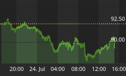
Money supply (M2)
The money supply chart was provided by Gordon Harms. M2 growth continued at its elevated trend.

Conclusion
The blistering pace of market advances over the past 2 months appears to be slowing down. The market has been following the seasonal pattern quite closely and that pattern is weakening.
I expect the major averages to be lower on Friday February 17 than they were on Friday February 10.
Last weeks positive forecast was a miss.
This report is free to anyone who wants it, so please tell your friends. They can sign up at: http://alphaim.net/signup.html. If it is not for you, reply with REMOVE in the subject line.
In his latest newsletter, Jerry Minton focuses on the "January Effect". To find out what it is and what causes it, go www.alphaim.net to read the newsletter and sign up for a free subscription.
Good Luck,
YTD W 3 /L 2 /T 1


