


"And now," cried Max, "let the wild rumpus start!" - Where the Wilds Things Are - Maurice Sendak
For many different reasons, silver has been an important asset to follow and contrast over the last decade. From appraising inflationary and disinflationary pressures, to the respective risk appetites of the collective - silver, and more importantly, silver relative to gold - has been a key asset and relationship to follow. I went over a number of these and my variant perspective on them in my last note of 2011 (see Here).
I often use ratio charts because it gives you more information than just price. And while price alone has paid in spades lately - there's still a great deal of truthiness in determining the underlying asset's risk profile and trajectory based on price alone. Ratio charts, when used appropriately - can add another dimension to the picture.
As apparent in the chart below, silver gave the impression (through price) last summer of breaking out of the consolidation range that developed after the May crash. And although things looked promising for the silver bulls for the balance of the summer, the ratio charts told a different story and foreshadowed the eventual swoon that followed in September.
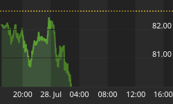
Eight months later, the set-up, both viewed through price and the ratio - looks very much the same.

For a little more perspective, here is the same contrast for 2010, which included the breathtaking breakout for silver and the ratio that coincided with the hint and then deployment of QEII.

So goes silver (relative to gold)... so goes the SPX.


