


On April 26, we mentioned the chart of the VIX "Fear Index" (VXX) relative to the S&P 500 (SPY) represented a good way to monitor risk in an environment with some conflicting signals. An updated version of the chart, as of Thursday's close, is shown below. The bulls made some progress with the blue upward-sloping trendline being violated, which shows decreasing levels of fear relative to the willingness to take on risk (see red arrow).

Obviously, Friday's GDP report can flip the chart above one way or another, but another bullish signal was given on Thursday. Near the blue arrow above, notice that RSI (Relative Strength Index) made a lower low and closed below 50. The lower low represents a short-term bearish divergence for the VIX relative to the S&P 500 (bullish for risk). The divergence increases the odds of continued VIX weakness.
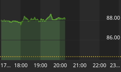
We originally posted the chart below on April 23. If you look closely, price moved to/slightly above the trendline below 1,400 on Thursday. There is some white space above the chart, which could be filled by price.

Just as the odds of rain increase when skies shift from clear to cloudy, a bullish turn in market breadth increases the odds of a sustainable bullish turn in stocks. Keep in mind, cloudy skies do not guarantee rain. The chart below is an intermediate-term measure of market breadth (the Summation Index). Market breadth refers to the percentage of stocks participating in an advance. Broad participation leans bullish. On Wednesday and Thursday, the Summation Index moved higher - it had been declining for several weeks. The green arrows show where market breadth started to improve. The S&P 500 is shown at the bottom of the chart.

Commodities continue to lag stocks, which is not surprising in a deleveraging environment (a.k.a. debt reduction/less trading on margin). If you are a silver or gold bug, the chart below has yet to show much in the way of hope. The performance of silver (SLV) relative to the S&P 500 (SPY) has a bearish/downward-sloping 9-month exponential moving average (EMA) and a still ugly looking MACD, which measures momentum (see red arrows).


