


I could not go without writing a serious parody of the above original comedy series, so be prepared to enter this guide, which will hopefully offer a fraction of information in "the standard repository for all knowledge and wisdom".
This planet has a problem - and has had this problem repeated throughout history - a problem that made most people living through it unhappy for pretty much all of the time...and this involved periods of inflation and deflation.
The objective of this article is to provide what I think is an accurate version of inflation/deflation and what to expect over the course of the next 8 years, based upon the Contracting Fibonacci Cycle. Time points will be identified, followed by charts illustrating Elliott Wave Analysis indicating why we are on the cusp of a major breakout in the broad stock market indices and commodities. This analysis runs counter to many deflationist views, which ties into the proposed definition that will be described. This guide will be subdivided into sections that are based upon names present within the 6 novels of the Hitch-Hiker's Guide series.
As Per the Above Title
There are some deflationists who think we are in a period of deflation...one noted definition of inflation is "a net expansion of money supply and credit, with credit marked to market" and the opposite for deflation.
A problem with the above definitions is that they provide very broad definitions and often, these outcomes do not occur until a "Tipping Point" has been reached. Malcolm GladWell wrote a book titled "The Tipping Point" which I would strongly recommend everyone read. In a nutshell, different systems, problems etc. do not follow linear relationships, but rather, a "tipping point" unique to a given system under study occurs. This unique "tipping point" changes the balance of things, causing an accelerated shifted shift to the upside or downside of a trend, based upon the unit of measure under study.
Applying this thought to deflation, many things happening in the news such as job layoffs, bankruptcies etc can overwhelm senses to provide an empirical conclusion that deflation is just around the corner.
The definition of inflation or deflation I propose is a scalar model that comprises the integral of all components (summation of the slope all components chosen to include in broad economic sectors and measures) based upon the derivative of their measurements (rate of change, as an example car speed (km/h, m/s) or money velocity). The derivative components of each part of the equation represent the rate of change for each chosen item by graphical representation to form a slope ($/month positive or negative) that has an assigned probability (R2). Each item added up can provide the integral, or summation as to whether or not inflation or deflation is evident as a whole across the economy. Examination of individual components offers visualized trending to determine whether or not a given sector or defined measure is entering deflation or inflation.
A few different obvious components to be put under study are money supply, credit, housing prices, food prices (which can be broken out into sub-sectors), energy prices, precious metal prices, durable goods, retail sales (which can be broken out into clothing, electronics), dining, purchases and yes...government associated taxation. With this model, rising taxes are inflationary for government, as individual expenses rise and without any recourse, so lack of available money creates deflation in other areas, since there is less money chasing those goods.
Assigning different items for examining inflationary or deflationary trends involves taking the total summation and putting them into a final integrated answer. I do not have the computer savvy to model this so I am putting this thought out there for others to maybe try and tinker with. Whichever unit is chosen for the equation, all components thrown into the mix must be identical. All crunched numbers should reveal a shift in money, which when tilting negative or positive, would provide the short-term trend...inflation or deflation. Because fiat currency can be expanded into infinity, credit marked to market can be diluted by issuance of further credit to back it. Based upon the model, consecutive months of a negative number would suggest banking problems, which in turn would trigger deflation...the rate at which governments create new money and prevent banks from failing would be key in determining how long this period of time lasted.
This proposed definition and model allows for inflation and deflation to be occurring simultaneously in different sectors, while overall trends of inflation or deflation are noted (periods of deflation since 1932 are very very rare and have not lasted for long periods of time). What must be defined is a "Tipping Point", where the cumulative summation of all defined items will "Tip" into either inflation or deflation. The following Table below illustrates the sequence of dates of the Contracting Fibonacci Spiral for the S&P 500 Index. Whatever defined model that takes into account all of the individual trends can be examined with their slopes and how the cumulative values were present at each one of the time points before economies turned south. The CFS cycle has these dates marked out already, so identifying what value creates a tipping point with certain sectors defining start an inflationary or deflationary trend.
Fiat currencies are all about currency expansion, whether it is through issuance of currency or credit. Issuance of credit creates booms and busts, which then sees those institutions that provided funds coming up short. Money that was released into the economy is there, while the huge shortage of money at institutions create losses that if not filled, can collapse everything. As per the CFS, we are following a naturally progressive cycle that does have an ending and every time post that is marked has top within 5% of the specified time. Further defining the above model for inflation/deflation would provide a more quantitative model for aiding governments to better define and prepare for recurrences of such future events.
Table 1. Time Posts Within The Contracting Fibonacci Spiral
Notice how tight the Contracting Fibonacci Spiral dates are to 61.8% of the prior time block...this is what makes it seem inevitable that "things' just seem to happen as per the defined time posts.
There is no "Free Lunch" In the Restaurant at the End of the Universe
The Romans tried it, Germans tried it after WW1 and most recently, Zimbabwe also tried it...and that was to create prosperity out of printing money. Rome expanded to rapidly and in order to pay its soldiers and costs for maintaining an empire, gold, silver and copper could not be extracted at a rate to match those of economic requirements. As a result, new coins were minted with lesser of these metals, which in turn allowed a greater amount of currency to be issued. This in a sense was hyperinflation because a greater amount of money was chasing the same number of goods. Hyperinflation results in a loss of faith in a country to be able to pay its bills and therefore have no issuance of money from creditors.
Work by Glenn Neely has the DOW reaching over 200,00 by 2065. Someone in 1930 who ever thought seeing a DOW at 12,000 would be hyperinflation...dilute this value with time and it does not seem like hyperinflation. Hyperinflation results in a parabolic rise in prices over a shorter and shorter period of time until collapse...seeing the DOW rise by nearly 20 fold over the next 50-55 years is not hyperinflation, but more of just strong inflation.
Economic growth going forward is going to be dictated by the past, which is leading us into the future. I have thoroughly explained the CFS, so anyone wishing further information, simply Google it on the Internet. Demographics really play an important role in defining what individual will be inflationary or deflationary as the "Pig Passes through the Python"..it distorts the portion of the snake from which it passes. In the 70's is was youthful purchases...now it is medical and age related issues. Commodity prices are more of a global population issue than one based upon demographics...as seen, there are many different items that can get added to many buckets that go into comprising a total model for when inflation or deflation occur...based upon a tipping point that has yet to be defined. Examination of prior data around prior CFS turning points hopefully can be used by some astute computer programmer to determine this and share as public information, much like this article was intended.
So, there is no free lunch and we know that governments are going to print money in order to sustain economic momentum and prevent a collapse, which would result in global riots. It would be very difficult for any nation to declare war, when war would be from within. This creates many issues, such as new governments being assimilated and cause a change in power due to force, rather than democracy. For the greater good, governments will choose to keep things in motion, which ties in with the CFS that is a basic law of nature...something will continue its course until it is complete.
Life, The Universe and All the Charts
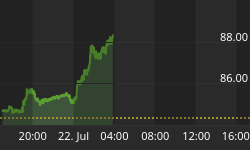
There are many different charts I could present, but will focus on short-term charts for the S&P 500 Index, Gold, US Dollar Index and the AMEX Gold BUGS Index.
The short-term Elliott Wave count of the HUI is shown below, with wave [d] of a contracting triangle making up the last portion of a double combination to end wave [C]. I chose to label corrective wave [C] with letters rather than numerals to indicate the corrective terminal impulse to avoid confusion with implying it is an impulsive decline. Based upon this count, the HUI is likely to continue rising in wave [c] for another 8-12 trading days before topping out and declining for anywhere from 3-4 weeks (mid-September) before terminating with a higher low. Subsequently, a sharp move up into between April and June 2013 is expected before a partial retracement into late 2014 occurs. The move from late 2014 into Aprilish 2016 should see a very sharp move to well above 1000 (probably 1500-1600). We are passing through time which is already is following a predefined path...the hard part is determining how things will move through that defined period of time once we arrive there.
Figure 1
![]() Larger Image
Larger Image
The short-term Elliott Wave count of the S&P 500 Index is shown below, with the thought pattern forming denoted in green. Wave (c) is thought to be forming at present, which could be forming a bullish flat pattern or triangle. So far, the wave structure has followed reasonably well to what was hypothesized nearly 2 1/2 months ago. Once we hit mid-September, expect to see a very sharp breakout to the upside, carrying the S&P to somewhere between 1600-1700 (looking for 1650-1700) sometime between December 5th 2012 and March 6th, 2013. Subsequently, commodity prices should continue to soar, along with precious metal and energy shares. Commodity stocks should top out 3-4 months after the broad stock market indices while energy and precious metals appear to be in a runaway bull market. Many will assume hyperinflation, with more and more people piling into precious metal stocks assuming it is a consolidation before screaming even higher...it will be much like 2008 where stocks topped out while the precious metals and oil screamed higher. Inflation is the new tool of the FED and the commodity inflation will stop the global economy dead in its tracks. There will be many many brokerage firms that go under and leave many who made a lot of money during this coming run up in prices with nothing. We will all have to ensure that money is pulled early enough and in secure places that are not likely to be lost from firms on the wrong side of the trade. Then when the late 2014 bottom arrives...we jump back in. The S&P is likely to decline to 800-850 if we hit 1650-1700 by late 2014, so being in cash around April 2013 could essentially be viewed doubling one's money as prices of the stock market plunge into late 2014. This is the road map and we can not see what the weather will be like, but I am forecasting gloomy.
Figure 2
![]() Larger Image
Larger Image
The short-term Elliott Wave count of gold is shown below, with the thought count forming denoted in green. The current pattern forming since mid-March appears to be that of a diametric triangle. Generally with diametrics, one leg will be longer than the other 7, with one or 2 legs being shorter to compensate for the time. Time and complexity are nearly equivalent, but price can vary dramatically between each segment. The time and complexity components of each leg have been very consistent (can not have 4x the amount of time compared to the shortest leg). So...based upon this chart, we have another 7-10 trading days of sideways to upward price action before experiencing weakness into mid-September. After this completes, we should see a very strong move up to $1900/ounce, followed by 4-6 weeks of back and fill before breaking to new highs towards the end of this year. The amount of compression cause by Central Planners trying to control interest rates and tweak things can be viewed as trying to hold a dyke in place that has rising waters...When the pressure is too great, the dyke collapses and total control is lost to the ravages of nature...this will happen and we will likely see gold hit between $2500-3074/ounce by early September 2013.
Figure 3
![]() Larger Image
Larger Image
The short-term Elliott Wave count of the US Dollar Index is shown below, with the thought pattern forming denoted in green. Originally back in mid June, I thought that early August was a likely topping point. Developments in gold, other currencies and the S&P 500 Index indirectly suggested that upside is looming in the Dollar for at least the first half of September. As such, once a bottom is put in place for the dollar within 2 weeks (target of 81.5), expect a final move to last until mid to late September. Wave A took one bar, or one month precisely and wave B will have taken 2.5 bars. Wave C is likely to be (A+B)/2, or 1.25 bars (1.25 months, or 5 weeks). If this holds true, then a top is due anywhere between mid to late September. Everything I have been looking at since last July for targets still hold true...tinkering just will cause compression of price moves that will likely overshoot and make things that much worse for the deflationary episode expected from Septemberish 2013 until late 2014 (i.e. The US Dollar Index bottoms around September 2013 and rises into late 2014).
Figure 4
![]() Larger Image
Larger Image
So Long and Thanks for All the Charts (Not Fish)
The primary purpose of this article was to provide a more thorough and appropriate definition of inflation that can hopefully aid and predict turning points with precision for financial planners to cope and deal with the current economic situation upon us to lessen the damage. Further details of the CFS were provided in order to show the basis for how it was elucidated and what will base future predictions. Finally, Elliott Wave charts were provided to illustrate what patterns are forming and what they suggest. In a nutshell, we are likely to experience oil somewhere between $150-180/barrel, gold at $2500-3074/ounce and silver at $65-80/ounce before September 2013. The broad stock markets are set to top out between December 5th and March 5th, 2013, with the HUI topping out 3-4 months after. As per 2008, high commodity prices will be the tool that causes a tipping point and throws the global economy into deflation lasting between Septemberish 2013 and late December 2014 (which ties in with Cliff Droke's fantastic work at examining cycles and weaving them all together).
That is all for this article. For anyone looking for technical analysis that fits with the CFS cycle we discovered last year and stock picks associated with timing for entry and exit, feel free to check us out at www.treasurechests.info.
People may not want to hear the above message for economic stresses we are likely to continue experiencing until 2020, but based upon the CFS the markets are in at present, that appears the direction we are headed.


