


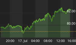


This essay was originally posted on Thursday, April 7, titled "A Picture Worth a Million Words." That title is still appropriate, but not for the reason originally implied. Unfortunately, the last three months data used for that chart was in error.
Bad data = bad chart = bad conclusion!
Corrected and updated data is used in the chart below. The sub-title says it all.
Our sincere apologies.


