


Precision timing for all time frames through a multi-dimensional approach to technical
analysis: Cycles - Breadth - P&F and Fibonacci price projections
and occasional Elliott Wave analysis
"By the Law of Periodical Repetition, everything which has happened once must happen again, and again, and again -- and not capriciously, but at regular periods, and each thing in its own period, not another's, and each obeying its own law... The same Nature which delights in periodical repetition in the sky is the Nature which orders the affairs of the earth. Let us not underrate the value of that hint." ~ Mark Twain
Current Position of the Market
SPX: Very Long-term trend - The very-long-term cycles are down and, if they make their lows when expected (after this bull market is over) there will be another steep and prolonged decline into late 2014. It is probable, however, that the severe correction of 2007-2009 will have curtailed the full downward pressure potential of the 120-yr cycle.
Intermediate trend - It is unclear if, by rising to a new bull market high, SPX has started a new intermediate uptrend or still needs to complete its intermediate correction.
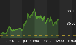
Analysis of the short-term trend is done on a daily basis with the help of hourly charts. It is an important adjunct to the analysis of daily and weekly charts which discusses the course of longer market trends.
Market Overview
From a pure cyclical perspective, it is likely that the 66-wk cycle which bottomed at the end of December continues to be the primary driver of the SPX and other indices, and that the nest of cycles due to make their lows in the first week of February have been relegated to second fiddle. That does not mean that they should be disregarded entirely unless, of course, they are making an inversion; but the odds are still against that. What can be said is that with each passing day and week that they do not assume control of the trend, their effect on the market will be more muted than originally anticipated. It is possible, however, that the correction will not end in February but continues into March.
From a projection standpoint, 1472 only produced a minor consolidation and then, the SPX moved on to the next likely projection of 1498/1500. This was achieved last week and brought about a quick 11-point pull-back; but the index quickly recovered and closed the week at 1503. The small P&F shelf which was created during this brief consolidation has the potential to move SPX to about 1508-1510 if it can clear 1503 decisively.
VIX made a new low of 12.29 last Friday and subsequently refused to go lower, closing the week at 12.89 while the SPX tacked on another 20 points. This is the kind of positive divergence behavior that we look for in this index prior to a reversal.
Besides SPX, the Dow Industrials continued their strong performance by rising another 300 points. NDX, by contrast, hampered by the severe decline in AAPL, was slightly down for the week.
The hourly indicators are helpful in determining near-term moves within the short-term trends. There has not been a confirmed hourly sell signal given for the past 8 trading days and it is long overdue. The daily indicators have exhibited plenty of negative divergence - especially in the A/Ds - but have not given a sell signal since their last buy signal on 12/31.
Chart Analysis
For a long-trend perspective, let's start by looking at a weekly chart of the FTSE since the low of the 2009 bull market. Some fears have been recently expressed that the UK was about to enter its third- dip recession. If so, the above chart has to cause some fundamental analysts to scratch their heads in confusion.
After making an initial high in February 2011, the index underwent a two-year period of consolidation in the form of a symmetrical triangle which apparently just ended with a break-out to a new bull market high of 6284 (Friday's close). Based on a simple Fibonacci projection, this move could continue to about 6756, probably making it futile to look for a top to the bull market in this index at least until that level is reached.

The break-out appears to have been accomplished in a 5-wave pattern. If it is an impulse wave, the current move should stop with an additional 20 points at the most, or the last wave would exceed the length of the 3rd wave, which is a no-no! That could mean that the index is near a short-term top. The indicators have started to flatten out after becoming overbought -- also an indication that a top could be near. This being a weekly chart, it could take a couple of weeks and not necessarily a couple of days before the index reverses. However, the daily CCI turned down on Friday from a lower level indicating that a correction could start sooner.
Since the two indices are often in sync, I am looking at what the FTSE is doing in order to get a sense of what the SPX might do over the short-term. Also, with the SPX having now made a new bull market high, I am not too concerned with a major top just now.
Now, let's analyze the daily charts of QQQ and SPX side by side, as we did last week (charts courtesy of Q-charts). The main difference is in the SPX which extended its break-out above the previous 1475 top, making a new bull market high. QQQ continues to substantially underperform and cannot afford to go lower without giving a sell signal which would be reflected in the price as well as in the indicators. Normally, this much divergence between the two indices has bearish implications for the market, but with AAPL being primarily responsible for the weakness in QQQ, does that tenet still hold?
The SPX is trading at the top of a channel line which has already six contact points. That should provide some resistance and, with the SRSI deeply overbought and the CCI showing negative divergence, it looks like a good set up for a correction. The A/D looks particularly vulnerable having been in a steady decline since the original thrust from 1398, and its ability to remain positive, dwindling. Under these conditions, how much farther can this uptrend go without a correction?

All that has been said about the indicators of the SPX applies double to the QQQ. The SRSI has already rolled over and broken a former level. If it goes negative, it will give a sell signal, as will a move below the uptrend line of both A/D's.
The hourly chart also looks vulnerable to a correction. On this chart, the SPX is shown trading above its channel line -- a very overbought condition which is not supported by the indicators which have already rolled over from a position of negative divergence. That is not a sign of strength and it most likely spells the imminent end to the move. A move below 1497 would probably start a reversal.
Once again, in spite of all these signs, we must wait for a sell signal, which could come very suddenly, and which should occur when the A/Ds fall below their rising trend lines and achieve a negative reading of 1500 or more.

Cycles
The 66-wk cycle is most likely responsible for the continued market strength, but an important cycle cluster is due during the first week of February.
Breadth
The McClellan Oscillator and Summation Index (courtesy of StockCharts.com) are posted below. The NYSI has confirmed the new high in the SPX by making a new high, itself. This bodes well for the long term. Its RSI has become super overbought and should soon need to correct.
The continued up-move in the NYSI is the result of the McClellan oscillator remaining positive, but the latter is not particularly strong and is now showing some divergence to the NYSI -- a condition which cannot continue bullishly unless the A/Ds return to much more positive levels. If they turn negative instead, this should bring about the anticipated correction.


Sentiment Indicators
Both indicators of the SentimenTrader (courtesy of same) have hardly moved since last week. This does not tell us much more about the current state of the market except that the long term indicator is elevated and consistent with the approach of a correction.

VIX
The collapse of the VIX came at the bottom of the 66-wk cycle. It was a sign that market strength lay ahead. As we can see on the next charts (courtesy of Qchart), negative divergence has now surfaced in the XIV (top left) against SPX (top right). And positive divergence is taking place in the VIX (bottom left) Vs. SPX.
Add to that the fact that there is strong negative divergence in the A/Ds (bottom right) and these conditions are signaling that a short-term top is imminent. What could invalidate these warnings would be higher highs in XIV, another retracement in VIX, and renewed strength in the A/Ds as SPX makes a new high.

XLF (Financial SPDR)
XLF started to diverge from SPX, but did not follow through and, when SPX moved to a new high, so did XLF. Nevertheless, the indicators are showing negative divergence and the MACD histogram has dwindled down to almost zero.
The index has most likely met its P&F projection which was around 17.00. A move below 17.35 would trigger a short-term sell.

BONDS
TLT could not break through its minor downtrend line and has pulled back to its consolidation low. It needs to hold over the next couple of days if it is to have another rally to re-test its former high. Odds are pretty good that if it fails to move beyond 124-125, it will be susceptible to making new correction lows.

GLD (ETF for gold)
In spite of the bottoming of its 25-wk cycle, GLD has not been able to move conclusively above its 200-DMA, or outside of its short-term down-channel. Since there is no deceleration visible in the last short-term phase and the index has an unfilled projection to 157, it is vulnerable to move a little lower before trying to resume and uptrend. Whether or not it is able to break above the 174 resistance will be crucial to a successful resumption of its long-term uptrend. It is still unclear if the index has already made a major top, or is making an intermediate consolidation for a move to a new high.

UUP (dollar ETF)

UUP normally trends opposite to SPX. This is why what UUP is doing here can shed some light on the future path of equity indices. If UUP is forming a base which will result in an upside break-out (preferred scenario), it stands to reason that SPX will go in the opposite direction.
On the P&F chart, UUP has already created a potential move to about 23.50 if it overcomes the 22.20 level. This is the level of the 200-DMA which, if you look back, has a good record of providing support and resistance to the price. UUP has now challenged its downtrend line on three separate occasions. Each time, the push back has been weaker. The next attempt at a move through will most likely succeed, especially if it starts from the current level.
USO (United States Oil Fund)
USO is trying to reverse its intermediate downtrend. It has risen to a tough level which consists of overhead resistance, an important trend line, and its 200-DMA. Although it has managed to move slightly above some of these, the upside momentum is beginning to wane and it will need to find more buyers - and soon - if it is going to push through.
A move below 34.00 would signal that the attempt has failed, at least for now.

Summary
The SPX continues to frustrate the bears by moving to new highs. However there are some preliminary signs that the supply/demand balance may be shifting. Should this increase over the next few days, a reversal into the first week of February is likely. This may only be the first phase of a correction that could extend into March.
NDX is considerably weaker and looks ready to start the "C" leg of its intermediate correction.
FREE TRIAL SUBSCRIPTON
Market Turning Points is an uncommonly dependable, reasonably priced service providing intra-day market updates, explanations, and commentary, plus detailed weekend reports. It is ideally suited to traders, but it can also be valuable to longer-term holders since price projections are provided using Point & Figure analysis along with best-time estimates obtained from cycle analysis.
For a FREE 4-week trial, Send an email to: ajg@cybertrails.com
For further subscription options, payment plans, and for important general information, I encourage you to visit my website at www.marketurningpoints.com.


