


We have one month in the books in 2013 already; my, how time flies when you're having fun! But the fun may not last much longer.
I have spent lots of time, over the last year, answering the question "why hasn't inflation responded to QE?" My response has been that it has: core inflation rose from 0.6% to 2.3% from October 2010 to January 2012, rising for a record-tying fifteen consecutive months - a feat that last happened in 1973-74, as official prices adjusted to catch up for being frozen during wage and price controls. By a bunch of measures, that was an acceleration of core inflation that was unprecedented in modern U.S. economic history. As I wrote at the time (in "Inflation: As 'Contained' As An Arrow From A Bow"), the only reason to defer panic was that Housing inflation was overdue to level out and decelerate. Fortunately, it did.
But, as I've written extensively recently, that blessing has been rescinded and the question of "why hasn't inflation responded to QE" will shortly be moot. In the next couple of months, core inflation will begin to re-accelerate, driven by the pass-through of rising home prices into rents. In our view, the best we can hope for is that core inflation only reaches 2.6% this year. Absent a change from the historical relationship between home prices and rents, some 40% of the core consumption basket is going to be rising at 3.5% or better by late this year.
So, when will markets get a whiff of this?
We are primarily motivated by valuations, and we are patient investors. Moreover, we think it makes more sense to focus effort on valuation work, because if your valuation work isn't pretty good then timing isn't going to matter much. But nevertheless, it is helpful to look for signs and signals that indicate time may be drawing short. So I'd like to go all 'techie' for a few minutes and show three charts that suggest markets are preparing for a new, higher-inflation reality.
The first one is the dollar index (see chart, source Bloomberg). This one is interesting, because I am not convinced that U.S. QE will cause a uniquely American inflation. After all, everybody's doing it. This chart is technically of a head-and-shoulders pattern, but I'm just pointing to that trendline that keeps bringing in buyers.

A break below the current level (and as a trader, I'd be tentative until the September lows broke as well) projects to a test of the bottom end of a much bigger consolidation pattern that has been forming since the beginning of the crisis in 2008 (see next chart, source Bloomberg - the green oval is the area of detail in the prior chart). Below there be dragons.

Now, at the same time we have inflation breakevens (the compensation, in nominal bonds, for expected inflation - represented as the raw spread between the Treasury yield and the TIPS real yield). I've shown this uptrend in breakevens and/or inflation swaps in a number of ways recently, but the chart below (source: Bloomberg) shows a long-term view. In the last three months, the 5-year breakeven has risen about 35bps (and you get a similar picture from inflation swaps, but the data isn't as clean that far back). Right now, bond investors are demanding a fairly high level of expected inflation compensation over TIPS and their guaranteed return of actual inflation. We've got a ways to go before we hit all-time highs on the 5y BEI, but the 10-year BEI is only about 22bps away from all-time highs.

Those prior charts haven't yet broken out, and so while the timer is buzzing the alarm might ultimately not be set off. But in commodities, there are some interesting signs that the lows may be in even though sentiment remains very negative. The chart below (source: Bloomberg) illustrates that in January, the DJ-UBS commodity index gapped through trendline resistance not once, but twice.

In my experience, technical analysis of commodity indices is a fraught exercise, but commodities have quietly been doing quite well lately. Although the S&P rose 5% in January to only 2.4% for the DJ-UBS, that's mostly due to the first trading day of the year. Since January 9th, the DJ-UBS is +3.7% while the total return of the S&P is only +2.6%. Surprised?
Now, the conventional wisdom is that stocks are a great place to hide if there is inflation. That conventional wisdom is wrong. Stocks may do okay if starting from modest valuations, but a rise of inflationary concerns (especially if accompanied by rising interest rates) while stocks are at high valuations would likely be less than generous to equity investors.
So, of course, retail investors have been breaking their piggy banks open to rush into stocks, in a rush not seen for many years. It is tragic, but it is the natural result of the Fed's misguided[1] crusade to stimulate the economy via the portfolio balance channel (see my discussion and illustration of this topic here). Where does the retail investor turn, when he sees rising gasoline prices, rising home prices, and a shrinking paycheck due to higher withholding rates? The television is telling him that it's time to jump aboard the equity train. Although he has been prudently suspicious of equity markets for much of the last decade, he is also aware that the cash he has in the bank is evaporating in real value.
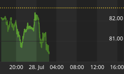
And perhaps that's why total savings deposits at all depository institutions (the main component of non-M1 M2) has fallen more in the last two weeks than in any two-week period...ever. About $115bln has fled from savings accounts in the last fortnight. Now, that's a volatile series, and it might mean nothing unless we happened to see it show up somewhere.
Like, perhaps, here?

The chart above (source: ICI, via Bloomberg) shows the net new cash flows into equity funds, which just happen to be at the highest level over the past three weeks (about $30bln) of any time during the period of data available on Bloomberg.
Again, it isn't because the future suddenly looks bright. Initial Claims today was 368k, above expectations and unfortunately putting a big dent in the notion that the 'Claims data over the last few weeks was signaling a meaningful shift in the rate of new claims. The number is probably still going to go lower, but it is likely to be a drift, not a break. And we will see a similar story tomorrow, probably, when the Payrolls figure (Consensus: 165k) and Unemployment Rate (Consensus: 7.8%, but I think it might tick up to 7.9%) will paint the same sort of picture. No, people are not reaching for their wallets to invest in stocks because they are suddenly flush. More likely, it's because they're frustrated and confused; they feel they're being left behind. Perhaps there is a bit of desperation, if retirement is getting further away as the cost of retirement rises and take-home pay stagnates.
In any event, what you do not want to see, four years and 125% above the S&P lows, is people taking money out of savings to put into stocks. If you are not one of the people putting money in, then consider being one of the people taking your profits out - and looking to those markets that actually do tend to keep up or outperform inflation. I hasten to remind readers that they don't ring a bell at the top of the market, and so one ought to be careful to rely too much on the "signs" and "timing signals" suggested above. But the sharp-pencil work suggests that core inflation is going to head back up in the next 2-3 months; in my opinion, you don't necessarily need signs to position for that - you need excuses.
.
Did you like this article? Consider following me on Twitter: @inflation_guy.
[1] One is tempted to say 'evil,' but I don't believe the Fed actually is anticipating the pain they are likely to cause to the little guy. Indeed, they may believe that the impact of their actions may fall disproportionally on the rich: an economist at the Federal Reserve Bank of St. Louis recently co-published a paper entitled "Understanding the Distributional Impact of Long-Run Inflation," which concludes in part that "When money is the only asset, a faster rate of monetary expansion acts as a progressive tax that lowers wealth inequality; when bonds can be traded, wealth inequality is less affected by inflation because the rich hold more illiquid portfolios than the poor." [emphasis added]


