


Spike in Rates Could Spook Stocks
In recent weeks, interest rates have moved significantly higher. Rising interest rates are typically a good sign for the economy and stocks, but one of the exceptions is when interest rates rise too quickly. From Friday's Wall Street Journal:
The recent spike in rates conjured up fears of a bursting bubble in bonds, a rapid and disruptive increase in interest rates that would produce big losses for individuals and institutions with big bond portfolios and raise borrowing costs across the economy. There were more than a few references this week to 1994, when Alan Greenspan's Fed raised short-term rates after a long hiatus, bond markets around the world tanked and Orange County, Calif., ended up in bankruptcy court.
1994: Ugly Period For Stocks and Bonds
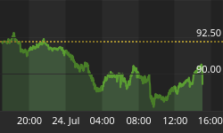
Since a picture is worth a thousand words, the chart below shows what a very sharp spike in interest rates looks like.

The next chart shows what a very significant spike in interest rates can do to your stock portfolio. The S&P 500 dropped 7% during the first quarter of 1994.

Yields: 1994 vs. 2013
Friday's Wall Street Journal article throws some cold water on an imminent repeat of the 1994 script:
But the Fed remembers that, too (1994). Fed officials stress almost daily that they won't move abruptly and they aren't going to move unless most policy makers are confident the economy really is doing better.
"We are not sitting in Jan 1994 about to get hit with the first rate hike," David Zervos of investment bank Jefferies wrote clients Thursday. "We still have a long road to recovery and there will be fits and starts. But most importantly, we are not dealing with a Volcker or early 90s Greenspan Fed here," both of whom raised interest rates aggressively at times.
While moving from much lower levels, the percent change in interest rates today is very similar to 1994 (30% vs. 31%). Therefore, we will monitor our stock holdings with a very close eye over the coming days and weeks.

Long-Term Hurdle Has Been Cleared
Is it different this time for stocks? Only time will tell, but there is no debating the clearly bullish breakout shown below. Stocks peaked in similar regions in 2000 and 2007. In terms of the chart below, this time has been different. Anything can happen in an environment where supply and demand metrics are being altered significantly around the globe by central banks, but a 13-year breakout in stocks is something that needs to be respected.

Markets Spooked By Fed
The stock market has looked vulnerable since the Fed minutes were released on May 22. Those minutes increased fears of a sooner rather than later reduction in the Fed's bond buying program. The daily chart of the S&P 500 below shows the last six trading sessions have seen a spike in volatility. As of Thursday's close, the pullback looks rather tame. Using the intraday low from April 18, the market has held above the 31.8% retracement level (1629). Retracement levels are used by traders to identify possible levels of buying support.

Volatility: Ignore It or Respect It?
Volatility is the enemy of investors. If a bull market rose in a consistent manner, investing would be easy. We all know investing is not easy. As shown in the chart below, several episodes of volatility since late 2012 have fallen into the "ignore it" category. Each period of volatility has been followed by higher highs.

Bulls Still Control Trend
From a probabilistic perspective, there are numerous ways to differentiate between volatility that should be ignored and volatility that should be respected. One of them is to use weekly moving averages (red and blue lines below). A "bullish look" is described via the green text below. A "bearish look" is described in red. As long as the market maintains a bullish bias, the volatility is classified as "ignore it". As of Thursday's close, the volatility still falls in the "ignore it" category. Could the chart below morph into a "respect it" look? Sure it can, but until it does, we will give the bullish trend the benefit of the doubt.

Stocks or Bonds?
As we noted on May 28, all investing involves opportunity costs. The chart below shows the performance of stocks (SPY) relative to intermediate-Treasuries (IEF) clearing a two-year base. The breakout tells us the longer-term trend currently favors stocks over bonds.

Bonds Weak, Semiconductors Strong
Semiconductors are used in the ever-growing consumer electronics segment. When demand for semiconductors picks up, it is driven in large part by consumer demand for cell phones, tablets, and computers. Bonds are typically in greater demand when investors are concerned about future economic outcomes. It is fair to say it leans toward the bullish economic camp when semiconductors are strong and bonds are weak.
We have shown examples of weakness in bonds above. How do semiconductor stocks look right now? The longer-term outlook is positive. The weekly chart below of the semiconductor ETF (SMH) shows a recent bullish break above resistance dating back over two years. The upper blue trendline below acted as resistance four times (see red arrows). The trend of reversals at the blue line was broken in a bullish manner several weeks ago. As of Thursday's close, the breakout is holding.

Market's Tone Changed In April
On April 23 we noted a positive shift in the market's tone based partly on the belief that central bankers in Europe would lower interest rates, and thus pump even more printed money into the financial system. The market got what it wanted when the European Central Bank announced an interest rate cut on May 2.
The bullish shift was evident on the chart below, which shows the performance of economically-sensitive materials stocks (XLB) relative to defensive consumer staples (XLP). When the ratio rises, materials are in greater demand relative to consumer staples. Conversely, when the ratio falls, investors have more interest in defensive XLP relative to XLB.

Not Overly Concerned Yet
Are their reasons to be concerned about the stock market? Yes, central bank intervention has played a key role in the market's bullish push higher. If the markets believe a significant shift in policy is in the not too distant future, a stock market correction could be in the cards. As illustrated with the 1994 example above, the recent spike in interest rates is also concerning for both stocks and bonds.
Implications: Damage Is Not Significant
The purpose of monitoring markets and using the charts above is to have guideposts for making allocation decisions. We are concerned, but the charts above still give stocks the benefit of the doubt, especially when compared to bonds. Therefore, as long as the previous statement applies, we will continue to hold our ground in the stock market, including stakes in the S&P 500 (SPY), semiconductors (SMH), and the NASDAQ 100 (QQQ).


