• 876 days Will The ECB Continue To Hike Rates?
  • 876 days Forbes: Aramco Remains Largest Company In The Middle East
  • 878 days Caltech Scientists Succesfully Beam Back Solar Power From Space
  • 1,278 days Could Crypto Overtake Traditional Investment?
  • 1,283 days Americans Still Quitting Jobs At Record Pace
  • 1,285 days FinTech Startups Tapping VC Money for ‘Immigrant Banking’
  • 1,288 days Is The Dollar Too Strong?
  • 1,288 days Big Tech Disappoints Investors on Earnings Calls
  • 1,289 days Fear And Celebration On Twitter as Musk Takes The Reins
  • 1,291 days China Is Quietly Trying To Distance Itself From Russia
  • 1,291 days Tech and Internet Giants’ Earnings In Focus After Netflix’s Stinker
  • 1,295 days Crypto Investors Won Big In 2021
  • 1,295 days The ‘Metaverse’ Economy Could be Worth $13 Trillion By 2030
  • 1,296 days Food Prices Are Skyrocketing As Putin’s War Persists
  • 1,298 days Pentagon Resignations Illustrate Our ‘Commercial’ Defense Dilemma
  • 1,299 days US Banks Shrug off Nearly $15 Billion In Russian Write-Offs
  • 1,302 days Cannabis Stocks in Holding Pattern Despite Positive Momentum
  • 1,303 days Is Musk A Bastion Of Free Speech Or Will His Absolutist Stance Backfire?
  • 1,303 days Two ETFs That Could Hedge Against Extreme Market Volatility
  • 1,305 days Are NFTs About To Take Over Gaming?
  1. Home
  2. Markets
  3. Other

A Powerful, Market Bias Indicator ...

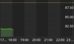
It is Courtesy Day, so we are posting one of our daily subscriber charts. Today's chart is part of our Multi-Indicator Model for paid subscribers.

The upper part of the chart shows our bias indicator for the Volatility Index (VIX), and the bottom part shows the NYA Index. Note the (fast) thin red indicator on the upper graph. Whenever it rises above its blue horizontal line and there is a cross-over on the thick red and blue trend lines, then that is a trigger for up movement in the market.

Last week, the indicator was rolling over, and as you can see it continued on its down path with the market joining in. This is supporting the fact that Options Money flows are a reflection of some pretty sophisticated knowledge about what will happen in the market within the next 30 days.

(Note the blue arrows: When the fast red line is above the blue horizontal signal line, and at the red/blue trend line cross-over, then ... Together, these two indicate when there is a new upside shift in the market. As you can see, there is still work to be done at this time for any sustainable up move.)

Also note that the faster, thin red line was butting up against the edge of the solid red line yesterday, so that keeps the door open for Boehner to not shut the government down today. So, this (proprietary) Indicator has been doing a good job of telling where the markets are going.

VIX Timing Indicator Chart


Back to homepage

Leave a comment

Leave a comment