


With last week's emerging markets currency crisis still fresh I thought I would bring back two previously shown charts that everyone should be aware of. First the currency crisis.
Currency crises are not new. Currency crises were at the heart of the Great Depression. Since the world came off the gold standard with the end of Bretton Woods in August 1971, there have been a series of currency crises. The British Pound (1992), the Thailand Bhatt (1997), the Mexican Peso (1994), the Russian Ruble (1998), and the Euro (2011) were some of the more notable ones. The US$ went through its own crisis period although few would call it that. But from 1971 through 1980 then again from 1985 through to 1995 the US$ went through a prolonged slide. Since 2000 the US$ Index has fallen 33%.
The current currency crisis has seen a number of emerging markets (I would term them more as middle-income markets) currencies devalue. Argentina and Venezuela have seen their currencies fall because they have been propping up their currencies through artificial means for years. Many of the other currencies could be termed as commodity currencies. Some commodity-based countries have seen their currencies under pressure for some time. Included in this category is the South African Rand, the Brazilian Real, the Indonesian Rupiah and even the Canadian and Australian Dollars. Others such as the Turkish Lira are suffering because of a huge current account deficit and a large foreign bank exposure.
The trouble with currency crises is that take on a life of their own and suddenly the crisis is global not only hitting currencies but affecting stock markets as well. During the Russian Ruble crisis of 1998, the S&P 500 fell 23%. The 2011 Euro crisis saw the S&P 500 fall 20%. Ongoing rumours (now fact?) of Fed "tapering" are not helping. Many believe that the middle-income countries have benefitted from Fed QE so any pullback or exit from QE would be negative. The international banking system is still burdened with bad loans and countries remain exposed to the potential for another international banking crisis as was seen in 2008. The problems that caused the 2008 financial collapse were largely papered over. Growth in the developed countries (US/Canada, the Eurozone, and Japan) remains tepid at best. China has been slowing and could have its own banking crisis develop.
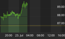
Now that the Fed has announced that they will "taper" an additional $10 billion month (bringing the "taper" now to $20 billion a month) the reaction was almost predictable. The stock market fell and surprisingly gold, which fell in 2013 because of rumours that the Fed would "taper" is now responding positively to the actual "taper". Gold's rise did not last long as it was "hit hard" on January 30, 2014. The "tapering" announcement seemed to set aside the concerns over currency turmoil. More currency turmoil could follow. Turkey hiked their interest rates in an attempt to stem the slide and it appeared to be having little impact.
The chart below is the bear. Since 2000, the US stock market has been in a rolling cyclical bear market. The stock market topped in early 2000 and while the Dow Jones Industrials (DJI) made nominal new highs in 2007 and again in 2014 on an inflation adjusted basis the DJI has not yet taken out the 1999/2000 high. The rallies of 2002-2007 and 2009 to date have been (were) impressive. But the 2002-2007 rally impressive as it was, ended badly with a 50% plus collapse in barely a year.

Charts created using Omega TradeStation 2000i. Chart data supplied by Dial Data
Analyst Robert McHugh www.technicalindicatorindex.com the calls the DJI pattern the "Jaws of Death". It certainly has that look, like a shark or a whale getting ready to swallow something. If 2000 was the top of the market then the pattern that has emerged has the look of a huge ABCDE type. So far, ABC has completed and the market may be at the end of the D wave. Still to come is the E wave that could take the market down to the bottom of the "Jaws of Death". Currently that is near 6,100 for the DJI. North American stock markets have been forming bearish patterns during the last wave up to the recent highs. This past week following the currency crisis was noted as one of the reasons global stock markets cracked.
The DJI has been trading along the top boundary of the "Jaws of Death". The market could pull back then rebound and make slight new highs again. But these long-term channel lines and patterns are powerful and they tend to be fulfilled. The currency crisis may only be the first "shot across the bow" with a banking crisis still to come at a later stage.
The stochastics on the monthly DJI are showing similar patterns that were seen at both the 2000 and 2007 tops. The stochastic has turned down although it is not officially in a sell mode. But it can be interpreted as a warning. The 23-month exponential moving average has acted as a reasonable long-term support/resistance line. In 2008, it broke that line in January months ahead of the actual collapse. Since it has broken below in both 2010 and 2011 but in both instances it failed to hold and the market continued its advance. A new round of QE was behind each new advance.
If one believes in the January barometer than one may wish to be wary of 2014. Since the January barometer was devised, it has an incredible 89% accuracy rate. If all holds for the markets the DJI and the other stock markets will record a down January. Grant you the market saw a down January in both 2009 and 2010 and in both instances the market closed higher on the year. As noted, it doesn't always work and 2014 could once again prove the barometer wrong.

Charts created using Omega TradeStation 2000i. Chart data supplied by Dial Data
Gold has its own January barometer. No, it is not quite as good as the DJI January barometer but with a 77% accuracy rate, it is a reasonable predictor. Gold appears poised to close the month of January to the upside despite the fall on January 30, 2014. Like the DJI both 2009 and 2010 went in the opposite direction of the January barometer. In both instances, January was a down month for gold but gold closed higher on the year. In 2013, the January barometer was spot on and both January and 2013 were lower.
If the DJI is "gripped" in the "Jaws of Death" Gold appears to be in the throes of a "Bullhorn" pattern. Bob Cote at Thirdeyeopentrades noted this potentially very bullish pattern. Bob posts some public charts at http://stockcharts.com/public/3267041. It is a rare pattern and quite interesting as gold's chart should attest. If the "Bullhorn" pattern is correct, gold has been testing the lower channel of the "Bullhorn" with a possible double D bottom. The labeling comes courtesy of the Aden Sisters www.adenforecast.com. The Aden Sisters have not yet bought into the double D bottom. That labeling was from Bob Cote. The pattern does appear to have further room for gold to fall possibly down to potential objectives between $1,050 to $1,150. Until gold breaks above $1,300 and especially above $1,428 risks remain to the downside.
Gold's stochastics are in deep oversold territory. Since gold became free trading with the introduction of futures in 1974, the stochastics have been this low in the past. Notable occurrences were in 1976, 1982, 1985, 1989, 1997, and, 2001. Not all proved to be the final bottom. During gold's long winter from 1980 to 2001, the monthly gold chart saw major positive divergences form following the initial reading of stochastics under 20. This was certainly the case in 1989 and 1997 where the lows in the stochastic did not coincide with the final low price. The final low price did not come until 1993 and 2001. While the drop from 2011 has seen a considerable shakeout, gold remains in a cyclical bull market.
The 23-month exponential moving average has largely defined the bull market since 2002. There have been only two exceptions - the 2008 financial collapse and the current market. The 23 month EMA is currently at $1,428 which ironically was the high recorded in August 2013. Breaking above the 23 month EMA would be an important event and most likely confirm that a new bull market is underway. If the "Bullhorn" pattern is correct then the C wave could take us to $3,000 or higher.
Two charts. Both are at crossroads. One is a bear chart and one is a bull chart. The message appears to be get out of stocks and into gold.


