


Fed Minutes Fail To Spook Bulls
While it is next to impossible to discern what made stocks rally after the Fed minutes were released, we can offer a few plausible explanations:
- The market knows an interest rate hike is coming. Therefore, talk of rate hikes has a greatly diminished shock value at this point.
- The minutes were more concerned with the "how to" of rate hikes rather than the "when".
Observable Shifts In Risk Tolerance
Why do traders and investment managers use charts? They provide a method to monitor the market's risk-reward profile. For example, the colored moving averages in the chart below help us filter out day to day noise, allowing us to focus on the underlying trend. When the slopes of the moving average are up, it indicates a bullish and lower-risk trend (see green arrow below). When risk starts to increase, the slopes start to flatten out (orange arrow). When the slopes of the moving averages begin to roll over, it tells us the market's risk-reward profile is deteriorating (red arrow).

Higher Risk Period In 2010
In the 2010 chart below, notice how changes start to take place before the "Flash Crash". The slopes of both the blue and red moving averages have rolled over, and price is below the blue, red, and green moving averages. Did the moving averages predict the Flash Crash? No, they simply said "risks are higher now than they were about a week ago".

2014: Higher Risk Look Two Weeks Ago
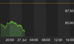
The chart below is as of the close on August 7, 2014. It told us "the probability of bad things happening is higher today than it was about eight trading days ago." From a general risk-management perspective, if the probability of bad things happening is higher, it might be prudent to reduce risk until conditions improve. The key term here is probability. Probabilities speak to flexibility; they acknowledge that the outcome could be bullish or bearish.

Even with the lower-probability look of the chart above, we noted on August 7 that possible support was close by and some patience might be in order to see how things played out.
Improvements Noted In Recent Sessions
Patience was rewarded as support did hold after the close on August 7. On August 18, we posted a chart showing the S&P 500 breaking above an area of potential resistance, which also spoke to improving probabilities for the sustainability of the rally attempt. The chart as of August 20 below looks much better than it did on August 7, telling us "the probability of bad things happening has decreased and the probability of good things happening has increased."

Investment Implications - The Weight Of The Evidence
Are these moving averages the holy grail of investing? No, but they do add value and help illustrate the basic concepts of using observable evidence to manage portfolio risk. As noted Monday, our market model began increasing equity exposure as the market's risk-reward profile improved.

We added to our stock holdings on Monday, Tuesday, and again Wednesday, allowing us to get aligned with the evidence we have in had as of Wednesday's close. Thursday is a new day. Therefore, we will enter the session with a flexible, unbiased, and open mind, especially considering Jackson Hole remains on the weekly agenda.
How About 1987 and 2008?
If you are skeptical about using observable evidence to manage risk-and-reward, the links below illustrate the concepts during two of the more difficult periods for investors:
Fed Minutes: Key Passages
If you want to dig a little deeper into Wednesday's minutes from the Federal Reserve Open Market Committee, some key passages are provided below:
Meeting participants continued their discussion of issues associated with the eventual normalization of the stance and conduct of monetary policy, consistent with the Committee's intention to provide additional information to the public later this year, well before most participants anticipate the first steps in reducing policy accommodation to become appropriate.
Most participants supported reducing or ending re- investment sometime after the first increase in the target range for the federal funds rate. A few, however, believed that ceasing reinvestment before liftoff was a better approach because it would lead to an earlier reduction in the size of the portfolio.
Participants agreed that the Committee should provide additional information to the public regarding the details of normalization well before most participants anticipate the first steps in reducing policy accommodation to become appropriate. They stressed the importance of communicating a clear plan while at the same time noting the importance of maintaining flexibility so that adjustments to the normalization approach could be made as the situation changed and in light of experience.
Help image from Marc Falardeau. The image used in this post has been slightly altered.


