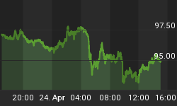
We have a conflict in time, this weekend, so we are presenting charts only, since they provide the best information about what the market is doing, especially when almost all fundamental data has not produced the positive results they appear to indicate.
The fiat Federal Reserve "dollar" remains the antithesis of gold, since the elite's central bankers do all they can to discredit the metal that makes a lie out of all the fiats issued and without taking responsibility for its ultimate destructive outcome. After all, the sole objective of the elites is to steal as much wealth from the masses as possible during their quest for a New World Order, well on its way.
The chart notes indicate a greater likelihood for another rally higher, and an additional reason comes from the base out of which this fiat paper currency has rallied. You can see how the "dollar" index has been in a base TR since 2006, on this chart, and said base provides the impetus to carry price much higher than has developed, to date.
The demise of the corporate federal government is pretty much a foregone conclusion, but the timing will take much longer than most people believe, as the potential for higher prices show on the charts. For as long as the toxic fiat Federal Reserve Note can prevail, so too will the elite's fading corporate federal government.
As an aside, the elites could care less about the fate of the US and its population, for it has already moved East, to be covered at a later date. The US has been depleted of all of its wealth. China is now in early process. Where Russia and its vast natural wealth fits in remains to be seen.
The net results of the chart comments is to expect more backing and filling, and we are of the mind that higher fiat prices may been seen, at least until the charts indicate otherwise.
Higher time frame charts are for a truer reflection of market context and direction, for it takes considerably more time and effort to change the direction of monthly, and even higher time frames, to change. Charts can be like a mosaic where you can see something unseen from one viewing to another. We attribute this to the fact that when one makes a presentment of a particular point of view, that view takes on a bias, and that bias will block out information that does not support what is being presented. This point of view may be too in-house, but there is a sound basis for it.
The fact that price has not rallied higher since the December swing low, coupled with a demonstrated inability to break overhead resistance [horizontal line], keeps the December low in question and positioned to be broken. Too soon to tell but something of which to be aware.
One cannot make out of the available information more than what is there. Price is at the lower ranges within a down trend, and also in the middle of a trading range where the level of knowledge is least reliable [because price can continue to move to the upper and lower areas of the TR and not exceed them, thereby staying within the established TR].
Sometimes, all one can do is let the market continue to develop until there is greater clarity for a move, one way or the other. This is one of those times. There is little to be gained from pushing on a string.
The pushing on a string theme is really prevalent throughout the gold/silver charts. There is nothing that indicates a shift from the down trend to one that can and will go higher. Almost everyone's expectations are for gold and silver to move dramatically higher. The charts do not support that collective opinion, at least not at this time.
The comments made about the fiat Federal Reserve Notes apply here. The expectations for a change in the trend for PMs will take longer than most have expected, a fact we have been pointing out for the past 2 years. One's belief that gold and silver have to rally to considerably higher price levels is nothing more than a belief about reality, but few take into consideration that a belief about reality does not mean the belief reflects existing reality. The belief is real to the one who maintains it, but it is dysfunctional. The reality is that PMs prices remain low and will likely continue to remain low, at least for now, based on current price behavior patterns.
NMT = Needs More Time. Enough said.
Little can be added to what has already been discussed from previous charts.


