


Sorry goldbugs, it is not the gold chart.
There are a lot of opinions out there on the US Dollar. Many of them are bearish in the short medium and long term time frames.
So lets see what the Charts are whispering.
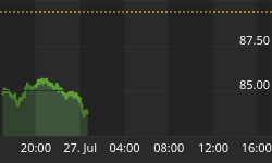
With all the volatility this week in markets around the world the US dollar made an interesting move. The long term daily chart below shows the five point rectangle, at the bottom left hand side of the chart, that launched the big breakout and impulse move higher in May of 2014. If you look at reversal point #5 with a question mark on it you'll see the comment I made at the time which I noted, this could be a false breakout to the downside and we might see a big move in the opposite direction, which was up. Keep in mind the chart was much bigger back then and the false breakout also looked much bigger. As you can see that indeed was a false breakout to the downside which led to the impulse move up we found ourselves in until the US dollar topped out earlier this year and has been building out the next consolidation pattern.
It's still not completed yet but the consolidation pattern is taking on the formation of a triangle consolidation pattern. Right now I'm looking at the last dip below the bottom rail of the black triangle consolidation pattern as a possible false breakout which if that turns out to be the case then this triangle consolidation should be finishing up and we should expect a big move in the opposite direction of the false breakout, which would be up. Until the top rail is touched tho this possible fourth reversal point is still under construction with no confirmation yet that the triangle has completed its job of giving the US dollar time to consolidate that big impulse move up.

Below is a daily line chart which shows the three smaller consolidation patterns that made up the last impulse move higher to our most recent high. Many times you will see at least three smaller consolation patterns form that make up a strong impulse leg. After you see the third small consolidation pattern form you generally know the end is getting near. The daily line chart shows the US dollar has some overhead resistance to contend with in the near term. If the bull's are really in charge the US dollar will need to take out all the above overhead resistance, moving averages, small neckline and the top rail of the black triangle.

The monthly candlestick chart for the US dollar shows it massive base it broke out of. Note the string of white candlesticks all in a row which shows us how strong that first impulse leg up was. Now look at the candlesticks since the US dollar topped out earlier this year. You can see there are some white and back candles with the price action going nowhere which tells us the US dollar is still consolidating. Remember a big base leads to a big move which the US dollar has.

I have been watching the 40 year monthly chart for the US dollar , since we opened the doors here at Rambus Chartology, http://rambus1.com/?p=11237
This all important chart shows a massive falling wedge with the two big fractal bases, base #1 and base #2. The breakout from big base #1 shows a backtest to the the big base trendline well over a year later but it didn't alter the inevitable outcome to its bull market top in 2000. Now note the current breakout from big base #2 which was more vertical than big base #1. Instead of getting a backtest to the big base #2 trendline we are getting the backtest to the top rail of the bullish falling wedge which we've been following ever since the US dollar broke out above it. The backtest to the top rail of the blue bullish falling wedge has been picture perfect which includes this months bar with a long tail. So far the breakout and backtest is exactly what we wanted to see. Sorry or the late Friday Night Charts. All the best...Rambus


