


The good news is:
• There will be great opportunities when this decline is over.
The Negatives
In the early years of this century housing was the only game going. The Fed kept the game going by keeping interest rates too low for too long. When housing finally collapsed of its own weight it took the financial system with it. Since the collapse of 2008 - 2009 health care and energy have been the big winners and the Fed has kept that game going by keeping rates too low for too long. The financial system is again in jeopardy.
The first chart covers the past 6 months showing the S&P 500 (SPX) in red and a 40% trend (4 day EMA) of NYSE new highs divided by new highs + new lows (NY HL Ratio), in blue. Dashed vertical lines have been drawn on the 1st trading day of each month. Dashed horizontal lines have been drawn at 10% levels for the indicator, the line is solid at the 50%, neutral level.
NY HL Ratio declined to 14% last week.

The next chart is similar to the one above except it shows the NASDAQ composite (OTC) in blue and OTC HL Ratio, in red, has been calculated from NASDAQ data.
OTC HL Ratio remarkably went from very bad to worse again last week.

The next 2 charts show how the indicators above behaved in the 2008 - 2009 period.


The positives
New lows increased to levels high enough to turn the new low indicators downward, but, on the bright side, the indicators failed to confirm the new low in the indices.
The chart below covers the past 6 months showing the SPX in red and a 10% trend (19 day EMA) of NYSE new lows (NY NL) in blue. NY NL has been plotted on an inverted Y axis so decreasing new lows move the indicator upward (up is good).
NY NL clearly did not confirm the lower low in the SPX.

The next chart is similar to the one above except is shows the OTC in blue and OTC NL, in orange, has been calculated from NASDAQ data.
OTC NL is showing a similar pattern to NY NL.

The next 2 charts show how the new low indicators looked during the 2008 - 2009 period. There were multiple non confirmations as the indices continued their fall.


Seasonality
Next week includes the 5 trading days prior to the 3rd Friday of February during the 4th year of the Presidential Cycle. The tables below show the daily change, on a percentage basis for that period.
OTC data covers the period from 1963 to 2015 while SPX data runs from 1953 to 2015 There are summaries for both the 4th year of the Presidential Cycle and all years combined. Prior to 1953 the market traded 6 days a week so that data has been ignored.
Average returns for the coming week have been modestly positive.
Report for the week before the 3rd Friday of February.
The number following the year is the position in the Presidential Cycle.
Daily returns from Monday through 3rd Friday.
| OTC Presidential Year 4 | ||||||
| Year | Mon | Tue | Wed | Thur | Fri | Totals |
| 1964-4 | 0.46% | -0.05% | -0.05% | 0.32% | -0.27% | 0.41% |
| 1968-4 | 0.00% | -1.11% | -0.91% | 0.21% | 0.34% | -1.47% |
| 1972-4 | -0.49% | 0.29% | 0.60% | 0.07% | -0.03% | 0.44% |
| 1976-4 | 0.00% | -0.16% | -1.79% | 3.34% | 0.98% | 2.36% |
| 1980-4 | -0.48% | 0.07% | 0.25% | -0.87% | -0.60% | -1.63% |
| 1984-4 | -1.37% | 0.74% | 0.12% | -0.35% | -0.20% | -1.06% |
| 1988-4 | 0.00% | 0.42% | 0.15% | 0.10% | 0.42% | 1.09% |
| 1992-4 | 0.00% | -1.57% | -0.64% | 1.58% | -0.39% | -1.03% |
| Avg | -0.92% | -0.10% | -0.38% | 0.76% | 0.04% | -0.05% |
| 1996-4 | 0.07% | -0.75% | 0.07% | 0.23% | 0.02% | -0.35% |
| 2000-4 | 0.53% | 0.05% | 0.16% | 2.74% | -3.02% | 0.45% |
| 2004-4 | 0.00% | 1.30% | -0.19% | -1.47% | -0.39% | -0.74% |
| 2008-4 | 0.66% | 0.00% | 2.32% | -1.74% | -0.46% | 0.78% |
| 2012-4 | 0.95% | 0.02% | -0.55% | 1.51% | -0.27% | 1.65% |
| Avg | 0.55% | 0.12% | 0.36% | 0.25% | -0.82% | 0.36% |
| OTC summary for Presidential Year 4 1964 - 2012 | ||||||
| Avg | 0.04% | -0.06% | -0.03% | 0.44% | -0.30% | 0.07% |
| Win% | 63% | 54% | 54% | 69% | 31% | 54% |
| OTC summary for all years 1963 - 2015 | ||||||
| Avg | 0.08% | -0.13% | 0.05% | 0.18% | -0.14% | 0.02% |
| Win% | 58% | 48% | 57% | 64% | 47% | 58% |
| SPX Presidential Year 4 | ||||||
| Year | Mon | Tue | Wed | Thur | Fri | Totals |
| 1956-4 | -0.14% | -0.37% | 1.43% | -0.50% | 1.60% | 2.02% |
| 1960-4 | -0.52% | -0.80% | 0.55% | 1.40% | 0.79% | 1.42% |
| 1964-4 | 0.08% | 0.00% | 0.24% | -0.32% | 0.23% | 0.23% |
| 1968-4 | 0.00% | -0.88% | 1.20% | 0.18% | -0.38% | 0.12% |
| 1972-4 | -0.47% | 0.42% | 0.56% | -0.03% | -0.29% | 0.19% |
| Avg | -0.26% | -0.41% | 0.80% | 0.15% | 0.39% | 0.80% |
| 1976-4 | 0.00% | -0.62% | 0.81% | 1.56% | 0.68% | 2.43% |
| 1980-4 | -0.70% | 0.67% | 0.46% | -1.45% | -1.12% | -2.15% |
| 1984-4 | -0.86% | 1.07% | -0.23% | -0.08% | -0.25% | -0.35% |
| 1988-4 | 0.00% | 0.85% | -0.24% | -0.50% | 1.43% | 1.55% |
| 1992-4 | 0.00% | -1.24% | 0.22% | 1.38% | -0.59% | -0.23% |
| Avg | -0.78% | 0.15% | 0.20% | 0.18% | 0.03% | 0.25% |
| 1996-4 | 0.77% | -0.14% | -0.74% | -0.65% | -0.51% | -1.28% |
| 2000-4 | 0.20% | 0.88% | -1.03% | 0.04% | -3.04% | -2.94% |
| 2004-4 | 0.00% | 0.98% | -0.45% | -0.41% | -0.26% | -0.14% |
| 2008-4 | 0.59% | 0.73% | 1.36% | -1.34% | 0.08% | 1.42% |
| 2012-4 | 0.68% | -0.09% | -0.54% | 1.10% | 0.23% | 1.39% |
| Avg | 0.56% | 0.47% | -0.28% | -0.25% | -0.70% | -0.31% |
| SPX summary for Presidential Year 4 1956 - 2012 | ||||||
| Avg | -0.04% | 0.10% | 0.24% | 0.03% | -0.09% | 0.24% |
| Win% | 50% | 50% | 60% | 40% | 47% | 60% |
| SPX summary for all years 1953 - 2015 | ||||||
| Avg | 0.06% | -0.04% | 0.16% | 0.00% | 0.00% | 0.16% |
| Win% | 47% | 55% | 57% | 51% | 48% | 59% |
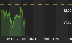
Money supply (M2)
The charts were provided by Gordon Harms. Money supply growth is back above its trend line.

Conclusion
Violent rallies are a characteristic of bear markets and we may have seen the beginning of one Friday. However the extreme numbers of new lows suggest the bear market has not been exhausted.
I expect the major averages to be lower on Friday February 19 than they were on Friday February 12.
This report is free to anyone who wants it, so please tell your friends. They can sign up at: http://www.stockmarket-ta.com/signup.html. If it is not for you, reply with REMOVE in the subject line.
These reports are archived at: http://www.safehaven.com/
Good Luck,
YTD W 4 / L 2 / T 0


