

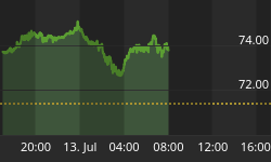


Before we look at tonight's charts I would like to thank Sir Plunger for putting on the short oil trade this week while I was recovering from surgery. You won't find a more through and in depth look at oil than what Sir Plunger offered. And wouldn't you know it his timing as usual was impeccable. Oil dropped almost 4% today.
Now lets turn our attention to the sector which many members have a love hate relationship with.
There is a potential new pattern forming on some of the precious metals stock indexes which is only coming to light today. Before today's price action there was only a guess of what may be forming with no confirmation. After today's big gap breakout another piece of the puzzle is falling into place. Nothing is ever guaranteed when it comes to the markets, so all we can do is get the odds in our favor and try to recognize a potential pattern as soon as possible. Once you think you may have something figured out you then put together a game plan and work it until it either plays out or fails.
Lets start with the 60 minute chart for the GDX which shows the now completed bearish rising wedge. We got the H&S top which formed at the top of the rising wedge as the 4th reversal point making the rising wedge a consolidation pattern to the downside. It's still possible we could see a backtest to the 24 area before the impulse leg down begins in earnest, but there are no guarantees. Note the inverse H&S bottom that formed in March which reversed the decline from the August 2016 high, a H&S at the bottom and a H&S at the top, both of which are reversal patterns.

This next chart is a one year look we were watching during the big impulse leg up out of the January 2016 low to the August 2016 high. Here you can see another H&S top which reversed the 2016 rally. After forming several smaller consolidation patterns the GDX bottomed out in December of 2016. That 2 month rally produced the first blue bearish rising wedge with the 200 day ma offering resistance. If you recall we went short on the backtest to the underside of the rising wedge until the Fed announcement, which spiked GDX higher at the beginning of our current and smaller blue rising wedge. Today we shorted the PM stock indexes again, as the price action is in a similar spot to the bigger blue bearish rising wedge.

During the formation or any consolidation pattern there needs to be at least 4 reversal points to make it valid. Sometimes there are 6, 8 or more reversal points before a consolidation pattern is finished building out. Many times a consolidation pattern can be created with several smaller patterns which shows the reversal points. With today's breakout below the bottom rail of the smaller blue bearish rising wedge it puts a possible triangle consolidation pattern in play. Now you can see how a potential game plan may start to develop.
The first thing we'll look for is a possible backtest to the underside of the blue rising wedge and then a fall away. Next we'll need to see how the price action interacts with the bottom rail of the nearly 4 month black triangle consolidation pattern, which still needs to complete the 4th reversal point. One piece of the puzzle at a time, but as long as the game plan keeps playing out there is no need to change things.

The weekly chart for the GDX shows how the potential triangle consolidation pattern fits into the big picture.

Lets look at one more PM stock index to see how its price action is building out. The 60 minute chart for the HUI shows it broke out today below the bottom rail of its bearish rising wedge.

In a confirmed downtrend one needs to see lower lows and lower highs. This daily chart below shows the August 2016 high, followed by the Feb 2017 high, followed by our most recent high in April, all lower highs. As you can see there is still more work to be done in building out the black triangle, but as long as things keep following the script we need to let things play out.

Below is the $XAU and its potential black triangle consolidation pattern.

This weekly chart shows how the triangle consolidation pattern has built out just below the neckline, which has been holding resistance.

Below is the daily chart for the SIL which shows its downtrend channel firmly in place.

Lets change it up a bit and look at gold. If I had only one chart to use it would be this weekly chart which shows gold's bear market downtrend channel. Since the first of the year I've been waiting patently for gold to rally back up to the top rail of the downtrend channel. I've been showing 1305 as the price objective for close to a year, which is now at hand. This is where the neckline and the top rail of the downtrend channel intersect. If gold can trade above that area then the bulls will be in charge.

Ironically enough SLV is also testing the top rail of its bear market downtrend channel. The top rail of the downtrend channel may also be part of the 6 point diamond consolidation pattern.

Below is a longer term weekly chart for SLV which shows the top rail of the downtrend channel holding resistance at the 6th reversal point in the blue diamond. To say this is a critical spot on this chart is an understatement.

If the HUI is going to show some bullish price action the first thing it will need to do is trade above the top rail of its major bear market downtrend channel.

The same can be said for the GDX.

Below is the downtrend channel for the GDXJ.

This next chart is a ratio chart which compares the GDX to the SPX. When the ratio is falling GDX is under preforming the SPX. After another backtest to the neckline this week we could be seeing a potential triangle consolidation pattern building out.

Lets look at one last chart for tonight which is a weekly combo chart which has the US dollar on top and gold on the bottom. The brown rectangle shows the H&S bottom on the US dollar and the H&S top on gold. Both are at important inflection points at their respective trend channels.
The charts above show a game plan that will need to be followed. As long as the game plan continues to play out having some patience will be important. That is much easier said than done. There are usually a couple of times a year when one can get the intermediate term trend right and ride it for all its worth. Hopefully we are on the brink of such a move. All the best...Rambus

Â


