


The following article was originally published at The Agile Trader on February 24, 2008.
Dear Speculators,
The Dynamic Trading System garnered a 33% NET YEAR-TO-DATE PORTFOLIO GAIN for The Agile Trader's auto-traded futures account.
If you would like a free one-month trial to our futures service, which allows you to auto-trade our service through our auto-trade broker, just CLICK HERE, then click the red "subscribe" button, and use the coupon code provided for your FREE TRIAL.
There are at least a couple of compelling bearish arguments floating around the zeitgeist these days. I'd like to point out that at least 2 of these arguments are incompatible.
One story that's pretty much dominating the popular imagination is the popping of the housing bubble. On February 11 in this space we examined the size of this price bubble in some depth and concluded that it was, in essence, not particularly large relative to other cyclical price-appreciation phases, dating back to 1960. (The implications of this conclusion being that the working off of the bubble should probably take about 2-3 years, of which at least one year has already passed.)
A second story that has fired the minds of the populace is the soaring price of gold.

(Note the similarity in structure of the current parabolic rise in the price of gold and that which took place in the latter '70s. The resolution of the parabolic rise in the '70s is a very common one subsequent to parabolic upside moves. And I don't think we should be surprised if we see something similar when the current exponential launch is completed.)
Now, Gold Bugs hold roughly that gold is a store of value, an objective measure of both worth and sanity in an insane world. If so, then we should be able to measure the true value of things as denominated in units of gold. That is, if gold is the scale against which all values should be measured, then we should be able to best understand the prices of other things in terms of gold.
Toward that end, let's look at the median home price in the US as denominated in ounces of gold.

Back in 1989 the median home ($94,600) cost bout 248 ounces of gold ($381.40/oz). By 1996 the median home ($122,600) had risen to about 316 ounces of gold ($387.8/oz).
In 2001 the gold-denominated housing bubble peaked with the median home ($156,600) costing about 578 ounces of gold ($271/oz.). And by 2007 the bubble had popped with the median home ($217,800) dropping back to just 313 ounces of gold ($695.40/oz).
Is denominating homes in units of gold the "right" way to do things? Personally, I don't think so. But I think this study points up that you can't simultaneously and coherently believe both that a) there's a huge housing bubble and that b) gold is the proper store of value by which all other things should be measured.
If the Gold Bug's argument is true, then, on a gold-adjusted basis, the cost of goods and services is undergoing an unprecedented rate of DEFLATION! How so? Well, look at the gold-denominated PCE Deflator on a cumulative basis since 1989. (In this chart if inflation is up, say, 3% in a given year, and gold is up 10%, then cumulative PCE Inflation Denominated in Gold would fall by 3% - 10% = -7%.)

If gold is the proper measure of all prices, then, in those terms, the PCE Deflator has fallen from a cumulative +60% in 2000 to -62% in 2008 (assuming the current $940 price of gold and 2.5% PCE inflation for 2008).
Does that make any kind of sense? Not really, in my mind. But I think it points up the problem with believing that gold at $940/ounce is a safe haven, a store of value, and the proper measure against which all prices should be gauged.
Either, on the one hand, gold is in a speculative bubble phase, or, on the other hand, gold is properly priced. If the former is true, then there is no housing bubble and we are suffering shocking broad "real" deflation. (Which deflation only happens to be disguised because the Fed is printing so much money, debasing the currency in order to prevent us from recognizing that deflation).
I don't think you can have it both ways. But, if we can't have it both ways, then why is gold (which is a real asset, as opposed to a paper asset) APPRECIATING while homes (which are ostensibly real assets) DEPRECIATING? The answer to that question lies in a problem with one of its premises. In the U.S., homes are not such "real" assets as we would imagine. Indeed they're only about half real, and half "paper (chimerical) because of all the mortgage debt that's outstanding on the asset class.
The problem with homes is not their "real" value, but all the bad paper (mortgage bonds) that's floating around. And, for the moment, that bad paper is not showing signs of recovering its value.
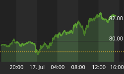
This chart of the ABX Index shows a tranche of Triple A mortgage bonds issued in 2007.

The mark-to-market price has broken down below the November and January lows near 65, and has opened the door to a downside technical target near 55. Absent a rally on this chart back up over 65, that target will remain on the table, which suggests further problems in the credit market.
But that said, keep an eye out for this week for headlines regarding a possible bailout of Ambac Financial Group Inc., one of the major bond insurers. Rumors were flying fast and furious about this bailout Friday afternoon. And over the weekend Bloomberg.com wrote on the subject, though sources were only identified as "a person with knowledge of the discussions." (Not the most reliable.)
Should such a bailout be announced, Financial stocks are likely to find a significant bid. However, if hopes and dreams are disappointed, and no bailout hits the newswires, then the disappointment factor may exacerbate selling pressure in stocks.
The story on earnings for the SPX continues to be problematic. The trends in expected operating earnings (blue line), trailing operating earnings (yellow line), and reported earnings are all continuing to trend lower. (Note: The blue line presumes that earnings in 1Q09 will show 0% growth from 1Q08. In all probability, that estimate is too low, but Standard & Poors has not yet published quarterly estimates for 2009.)

The lion's share of the decline in estimates continues to come from the Financial sector, as write-downs on mortgage bonds dominate the headlines.

Zooming in on the 8 sectors besides the Financials and Energy, we see that deterioration also continues in the Consumer Discretionary and Materials sectors as well.

The other 6 sectors (7 if you include Energy on the chart above) continue to look robust in terms of maintaining the elevations of their sector estimates.
In terms of valuation, the SPX PE on forward earnings is near its cyclical low, now at 13.7, up from a multi-year low of 13.2 on 1/18/08.

The yield curve has recently been steepening in response to the Fed's rate-cutting regime. The 10-Yr Treasury Yield is now 0.78% above the Fed Funds Rate. And, historically, a positive slope to the yield curve tends to allow the market to expand its Price/Earnings Ratio (PE). But, that having been said, right now, the yield curve is not steepening for the "right" reasons.
Looking at the 5-Yr Treasury Inflation Protected Securities (TIPS) market, we see that expectations embedded in this price are for real annual economic growth to come in at about +0.64% (Real Yield is a proxy for growth).

Meanwhile the Breakeven Inflation Rate has risen from just below 2% earlier this month to about 2.17% on Friday.
While that relationship (rising inflation expectations and falling growth expectations) is not constructive for the stock market, it remains my view that the odds are extremely strong that this market is currently mis-pricing forward growth. The slowest real growth the U.S. economy has generated over any 5-year period since WWII is +1.3%, more than twice of what's currently discounted in the 5-Yr TIPS market.
One last chart before I go watch the Oscars...
Here we plot the SPX on a log scale in the top pane. In the bottom pane we see the 10-Yr Treasury yield (TNX, now 3.79%) in black, and the SPX forward earnings yield (7.3%) in pink.

In the middle pane (green) we see Equity Risk Premium (ERP), which is the difference between SPX forward earnings yield and TNX (7.3% - 3.79% = 3.51%). That line represents the expected excess earnings yield demanded by investors for taking the risk of investing in the SPX as compared to investing in the risk-free TNX.
Yellow highlights show up wherever on this chart ERP is at or above 3.5%.
As you can see, since 1962 there have been 4 episodes of such elevated ERP, including the current one. The first one, in July and October, 1962 occurred before and around the Cuban Missile Crisis. The 2nd one occurred in the summer of 1974, around the time of Nixons' resignation. The 3rd one occurred in 1977-1979 (it was protracted), and was accompanied by the 10-Yr Treasury yield's rising from about 7.5% to about 13%, with concomitant galloping inflation. And the last episode is accompanied by the sub-prime mortgage fiasco.
While ERP is not a short-term stock-market timing tool, historically an extremely elevated ERP is much more closely associated with major market lows than with major market tops...especially in the absence of extremely elevated inflation (which, currently we see no evidence of).
Best regards and good trading!


