


Much has been made of the "Death Cross" that happened on July 2, 2010 in the S&P500. The "Death Cross" occurs when the 50 day moving average of price crosses below the 200 day moving average. Many interpret this technical "phenomena" bearishly, but as usual, folks are only reading the headlines and not critically looking at the numbers. There is more to this story. So what does the data say?
Let's design a study where we buy the S&P500 when the 50 day moving average crosses below the 200 day moving average. We sell our position when the 50 day moving average crosses back above the 200 day moving average. With this strategy, we want to see what happens to prices when they are under the "death cross". We will look at data going back to 1962, and commissions and slippage are not considered in the analysis.
Figure 1 is a daily chart of the S&P500 with 50 and 200 day moving averages; some of the buy and sell signals are noted on the chart. The "death cross" (labeled #1) led to a 6.48% gain (with minimal draw down) in the S&P500; the next "death cross" (labeled #2) was the 2007 to 2009 bear market leading to a 39.7% loss; the current "death cross" (labeled #3) would have had you buying the S&P500 almost at the lows of the current down swing suggesting so far that the "death cross" is a better buy signal then sell signal.
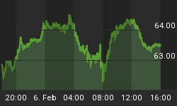
Figure 1. S&P500/ daily
So what is going on here?
To answer this question let's look at the maximum adverse excursion (MAE) graph for this strategy. See figure 2. The MAE graph assesses each trade from the strategy and determines how much a trade had to lose in percentage terms before being closed out for a winner or loser. You put on a trade and if you are like most traders the position will move against you. MAE measures how much you have to angst and squirm while you are in that position. As an example, look at the caret in figure 2 with the blue box around it. This one trade lost 9% (x-axis) before being closed out for a 14% winner (y-axis). We know this was a winning trade because it is a green caret.
Figure 2. MAE Graph
From this strategy, there have been 25 trades or "death crosses" since 1962. 17 trades were winners and 8 were losers yielding a negative 662 S&P500 points. So in general it is a good idea to avoid the death cross. Of course, the real truth lies in the details. Looking at the MAE graph, we note that 12 trades had a very acceptable draw down of less than 4%; two thirds of these trades gained more than 5%; these are the trades to the left of the blue line. Now look to the right of the red line. These 10 trades had draw downs in excess of 10%, and these are the trades that went on to have the big losses. In fact, if a trade had an MAE greater than 15% it was unlikely to recover and more likely to go on to a big loss.
So the MAE graph shows us that 12 out of 25 signals were actually good buying opportunities and 10 out of 25 were seriously hazardous to your bottom line. From this data, it is clear that the presence of a "death cross" doesn't necessarily mean the end of the world. Of course, this is all backwards looking data and the real concern is how should we interpret the current "death cross" going forward?
To answer this question we need to look at the this strategy's equity curve. See figure 3. As it turns out, the "death cross" was a good buying opportunity from the start of the bull market in 1982 to its end in 1999. The rest of the time 1962 to 1982 and 2000 to the present (i.e., secular bear markets) we can see that the "death cross" had very mixed results or led to continued selling (obvious as these are bear markets).
Figure 3. Equity Curve
Conclusion: 1) most would agree that we are in a secular bear market; 2) "death crosses" in secular bull markets are buying opportunities; 3) "death crosses" in secular bear markets need to be respected.


