


With the recent action of the Semiconductor Index (up about 12% in 3 days), it is reasonable for market participants to wonder if "the bottom" is in. After all stocks have stopped going down, and now that the semiconductors are leading the charge, well stocks can only go higher.
But I don't buy that view - yet. There is some good technical evidence that the semiconductors have put in a bottom. The fundamental picture, on the other hand, suggests otherwise as this would be the first "bottom" in about 5 years that was not accompanied by a rising yield curve.
More on that below but first the technical evidence.
Anatomy of a Bottom- Technical Evidence
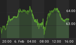
Looking at the price action through my proprietary Price Structure Analysis™ indicator, we can see that support in the Semiconductor Index was at the 360 level. This is shown on the weekly chart (figure #1). Support was being tagged at a time when there was plenty of bearish sentiment towards higher prices in the stock market (see the sentiment section on the website, thetechnicaltake.com). In my opinion, this made for a good low risk entry.
Figure #1/ Semiconductor Index/ weekly
Semiconductor sector internals, such as new highs and new lows and advancing and declining issues, give some credence that this might be a good time to take a position in the semiconductors as well.
The weekly semiconductor sector chart (figure #2) is shown below. This chart is comprised of the 15 largest stocks in the semiconductor universe. The top panel is the price bars; the second panel is the percent of stocks above their 200 day moving average. Ignoring the lines on the graph, this indicator tells me if I should be playing offense or defense. Being so oversold, it appeared to me that the semiconductors would be trying to establish a bottom; therefore this would a good time to go on offense and look to establish a long position.
Figure#2/ Semiconductor Sector Chart/ weekly
The third panel is the trading index (or Arms Index) which is a calculation that utilizes volume and advancing and declining issues. Essentially, the trading index tells you where the trading volume is going. Being below the center line, suggests that the flow of volume is going into advancing issues, and this supported my notion that the Semiconductor Index was putting in a bottom.
The bottom panel is a McClellan Oscillator of the weekly advancing and declining issues. I have highlighted on the chart (point 1) a divergence between this oscillator and the price action. Divergences can be a powerful tool, and they may pinpoint when the current trend is weakening and when prices may reverse direction. I have also noted the previous divergence (point 2) that occurred in October, 2002.
Staying with the technical picture, look at the daily sector chart of the Semiconductor Index (figure #3). Like all sector charts posted to thetechnicaltake.com, this chart is constructed utilizing the 15 largest capitalized stocks in a particular sector or index. The top panel is the price action; the bottom panel measures the number of new highs and new lows over the past 40 days in this particular sector. As prices headed lower, the number of stocks in this sector making new lows was decreasing. This also is a divergence, and one that I find rather powerful. Even though price is falling in the index, the stocks that make up that index are doing better on a relative basis. In any case, downside momentum was decreasing.
Figure #3/ Semiconductor Sector Chart/ daily
In summarizing the technical picture, utilizing the sector charts on the website, I was able to pinpoint a possible turning point in the Semiconductor Index. I used the concept of Price Structure Analysis™ to determine support and my entry point.
Ok that was then and this is now? So tell me why you don't think this move in the semiconductors will stick?
Anatomy of a Bottom - Fundamental Evidence
These comments refer to the general market. {I will discuss the general market in greater detail later this week.} The price action has been good and various levels of resistance have been cleared. Yes, volume has dried up but who is noticing when prices are moving higher? Despite most of the intermediate term breadth indicators (see the web site: thetechnicaltake.com) being near their overbought extremes, prices can move higher for one reason: this rally has not been embraced by investors.
The chart (figure #4) below shows that the Rydex investors - a group of market participants that are assumed to be wrong at market turning points – still have not jumped on board. The top panel is a daily chart of the QQQ, and the bottom panel is composite indicator looking at the assets in bullish and bearish Rydex funds. The total assets in all the bullish funds still remain below that of the total assets in bearish funds. Furthermore, the bullish assets haven't reached an extreme relative to past levels. All this tells me is that there are buyers out there. What you should notice from the chart as well is how the rally that started in March, 2003 was not fully embraced by investors until almost November, 2003!!!! When this group of investors (ie., the Rydex market timers) determined it was safe to wade into the market, the party was just ending.
Figure #4/ Rydex Sentiment/daily
Ok that is the general market. What about the semiconductors? After all it is hard to envision the market going higher without the Semiconductors leading the advance.
Is the action in the semiconductors an oversold bounce fueled by short covering or is it a new round of speculative interest that will propel prices higher? I believe it is the former because the ratio of long term to short term interest rates (otherwise known as the yield curve) continues to fall suggesting a slowing in growth and a slowing in the economy.
The yield curve is an excellent barometer of future expectations in economic growth. Investors demand higher yields at the long end of the curve when there is economic growth and the prospect of future inflation. Or the yield curve could also rise because short term interest rates are falling. Currently, neither of these scenarios is occurring. This flattish yield curve suggests a slowing economy where large capitalized growth stocks should outperform the more speculative issues like the semiconductors.
Looking at figure #5, the top panel is a daily chart of the NASDAQ composite. The bottom panel is 14 day rate of change indicator of the yield curve. The yield curve is calculated by taking the yield on the 10 year treasury and dividing it by the yield on the 3 month T- bill. Today's ratio is then compared to the value 14 days ago. I have highlighted with blue ovals the six major "trade-able" bottoms since 2000. Each was associated with a rise in the yield curve. The yield curve has not confirmed this latest bounce. Is the rise in stock prices forecasting better times ahead? The action in the bond market suggests otherwise.
Figure#5/ Yield Curve/ daily
Another thing that I am monitoring is the asset flows into the electronics sector fund offered by Rydex. Once again, when these market timers generally oversubscribe to an issue, the party is about to end. As seen in figure #6 below, absolute levels are not high but the relative levels are in an extreme overbought position. I have highlighted other times through out the past year where this was the case, and in general, these highs have led to some short to intermediate term sell offs. The one instance that was not true to form was the thrust off the bottom in March, 2003. So may be this time will be different.
Figure#6/ Rydex Electronic Sector Assets/ daily
Ok what would make more bullish? Three things: 1) a rising yield curve; 2) a mild pullback in the semiconductor index; 3) Rydex market timers continuing to remain on the sidelines.
That is The Technical Take, and I hope you have found this analysis informative and profitable!


